Pricing Testing & Strategy
Partnering with our Digital team, the Creative team set out to ideate, design, build, test and implement a new pricing section to our global Marketing website. Our mission was to create an experience that is less confusing for the end user, increase conversions on individual product pricing pages, better understand how clearly we presenting and messaging our Platform offering, and learn as much as possible about what users need in order to make a purchasing decision.
- Challenge
- Make Formstack's pricing less confusing, raise conversions on product pricing pages, and find out whether buyers understood the Platform offering.
- Outcome
- The variation scored higher on clarity (94% vs. 85% externally, 89% vs. 49% internally) and lower on confusion, and 98% of internal stakeholders preferred it. It became a final set of easier-to-digest pricing pages.
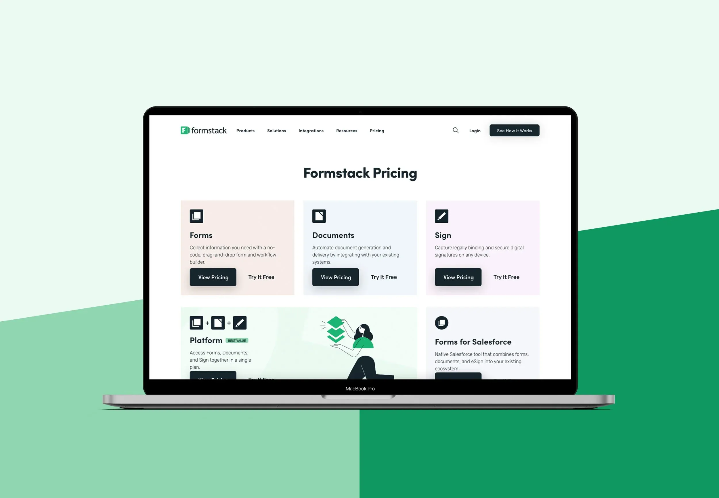
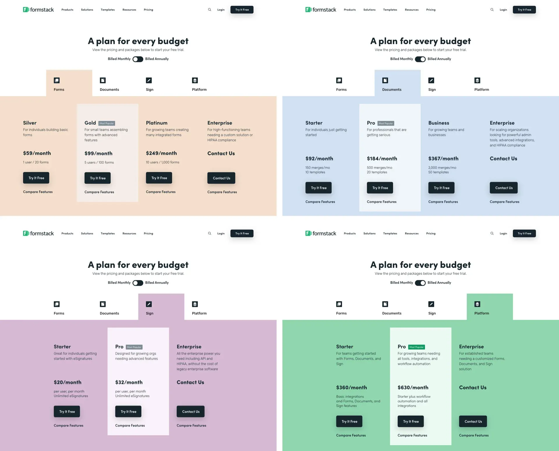
The active pricing section was redesigned as part of a larger website redesign and migration six months prior. While redesigning the website, we made a number of design decisions based on the performance of the pricing section that was active before the redesign. In this test, one of our goals is to validate decisions made during the design of the new website.
Does a tabbed structure allow users to navigate efficiently? How important is that?
Does having a secondary & independent page for feature comparison help or hinder the user?
Are customers aware of our Platform product offering (SKU)? Do they understand what the Platform is and how it can benefit them?
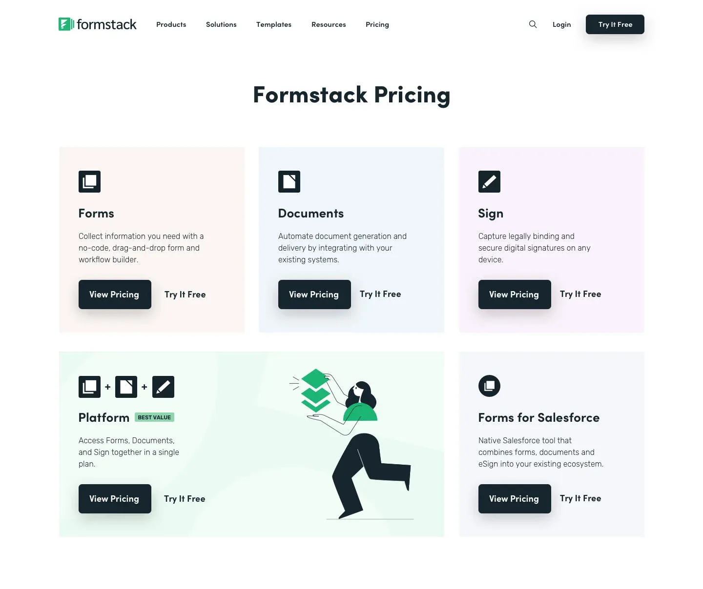
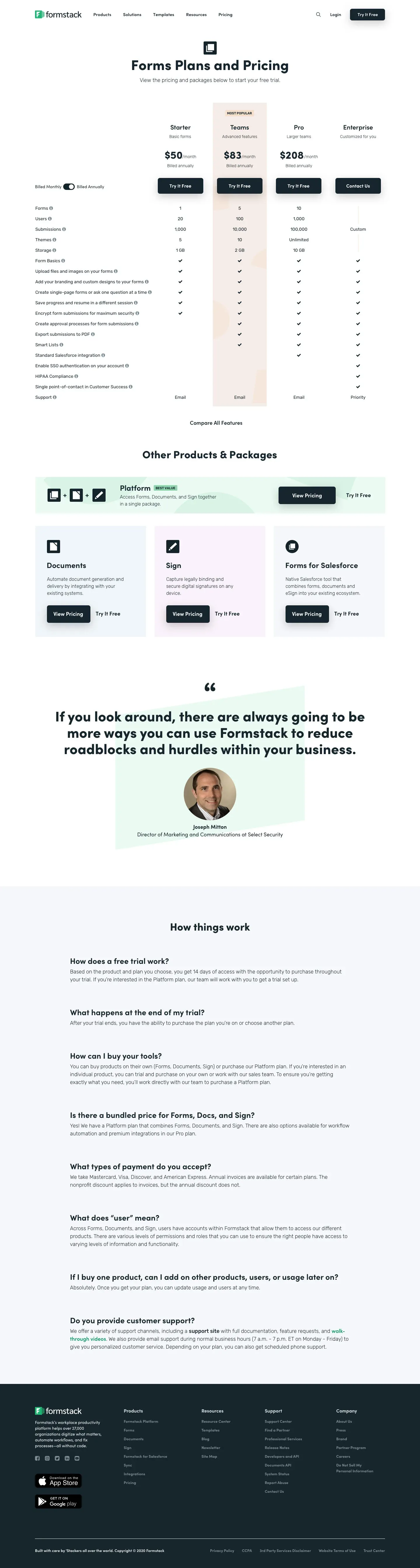
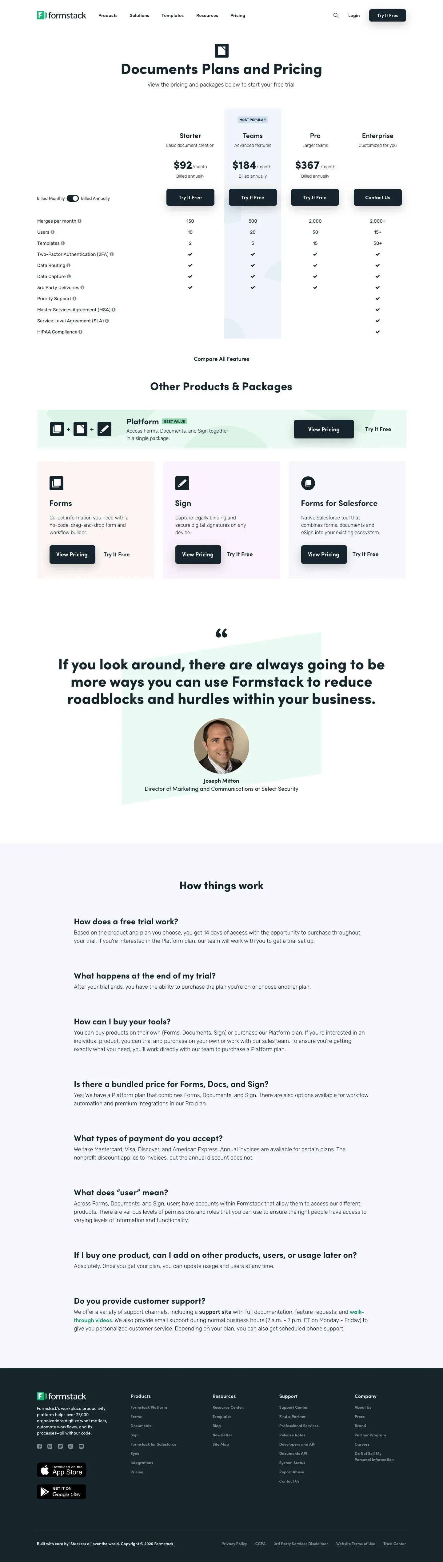
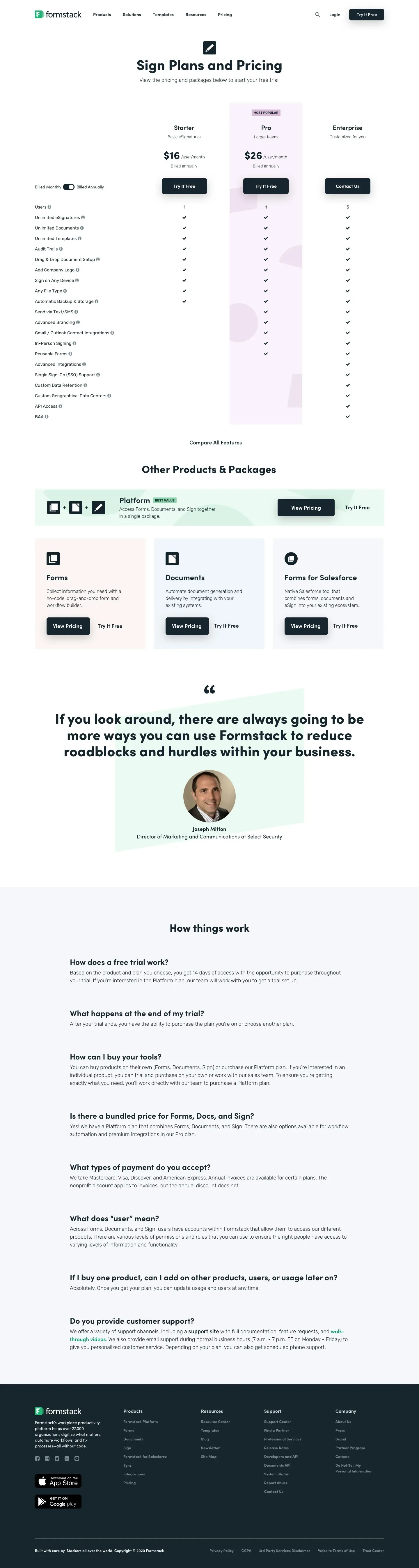
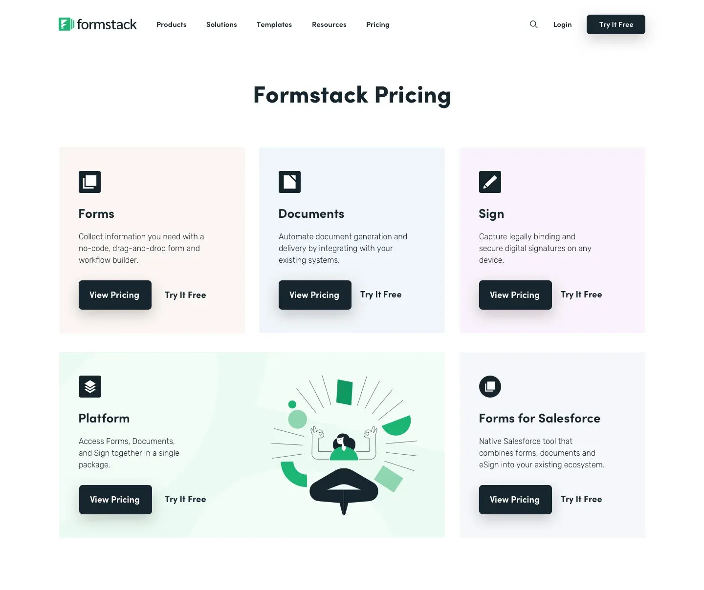
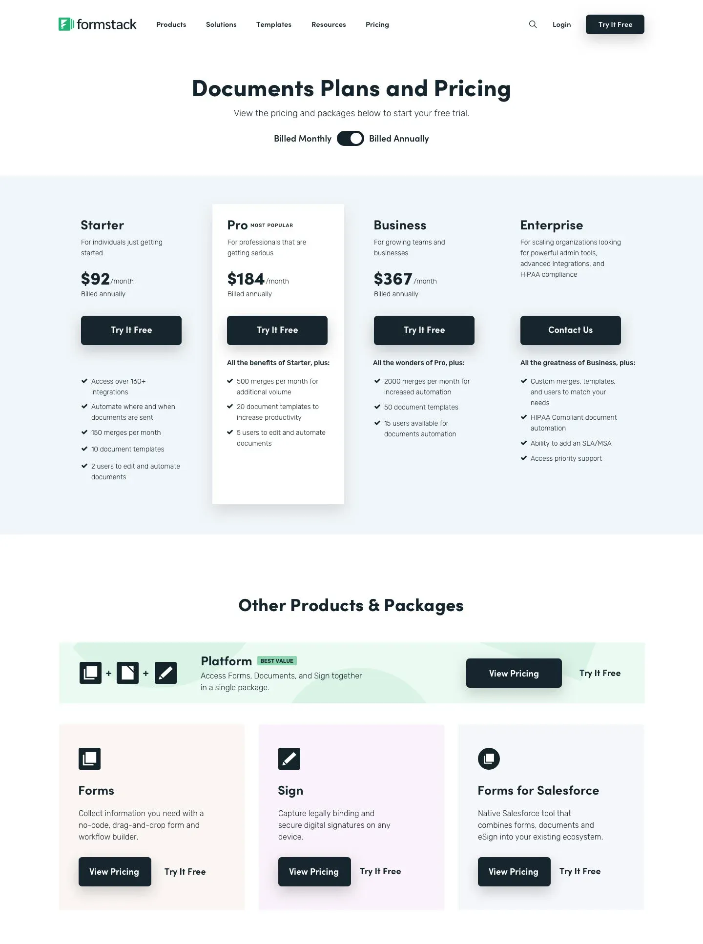
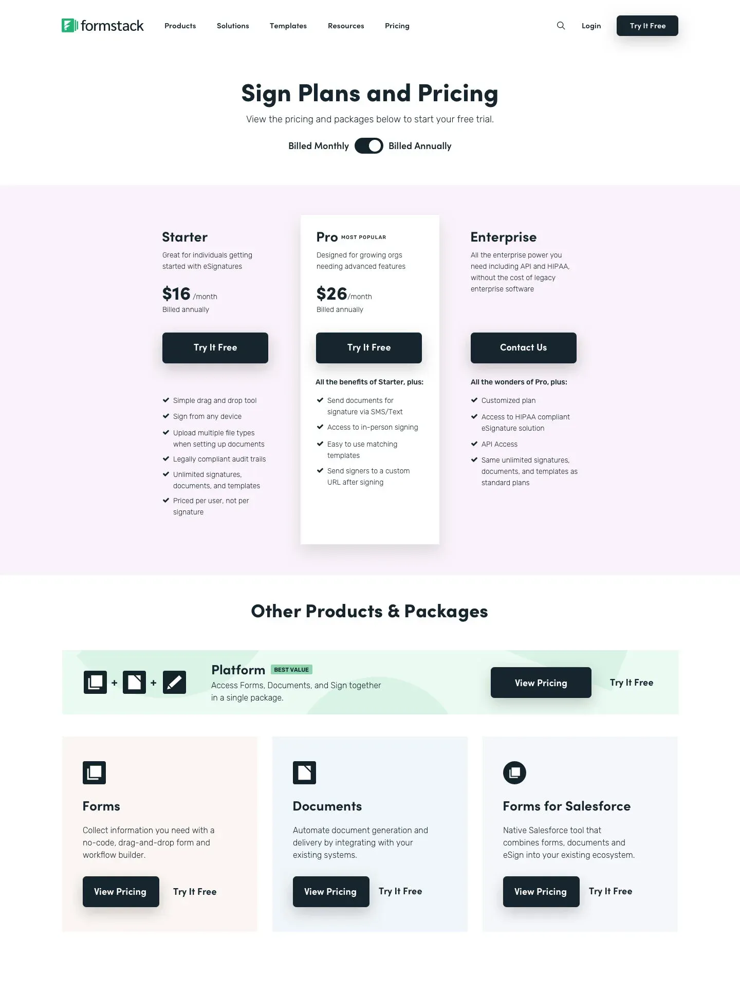
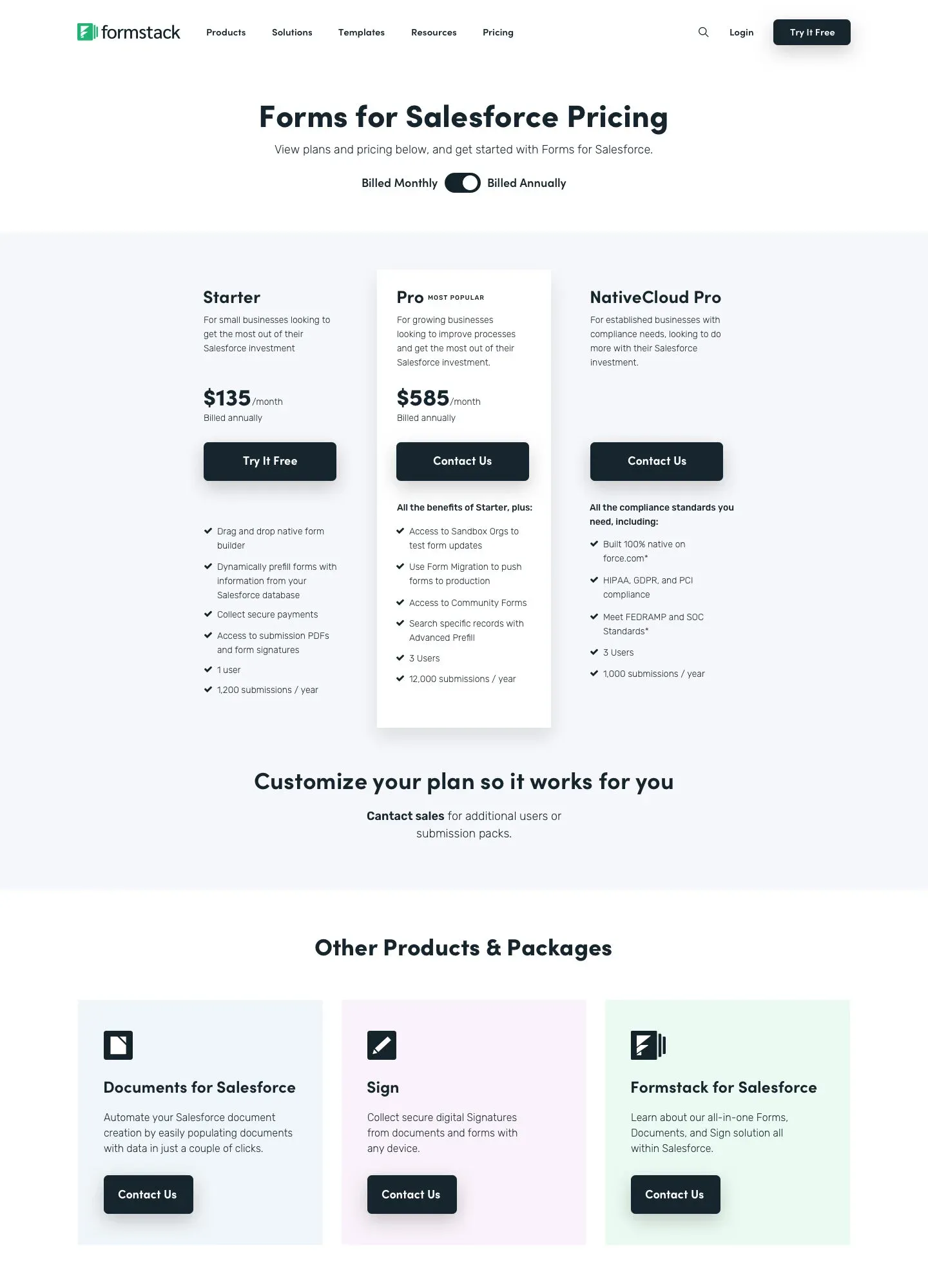
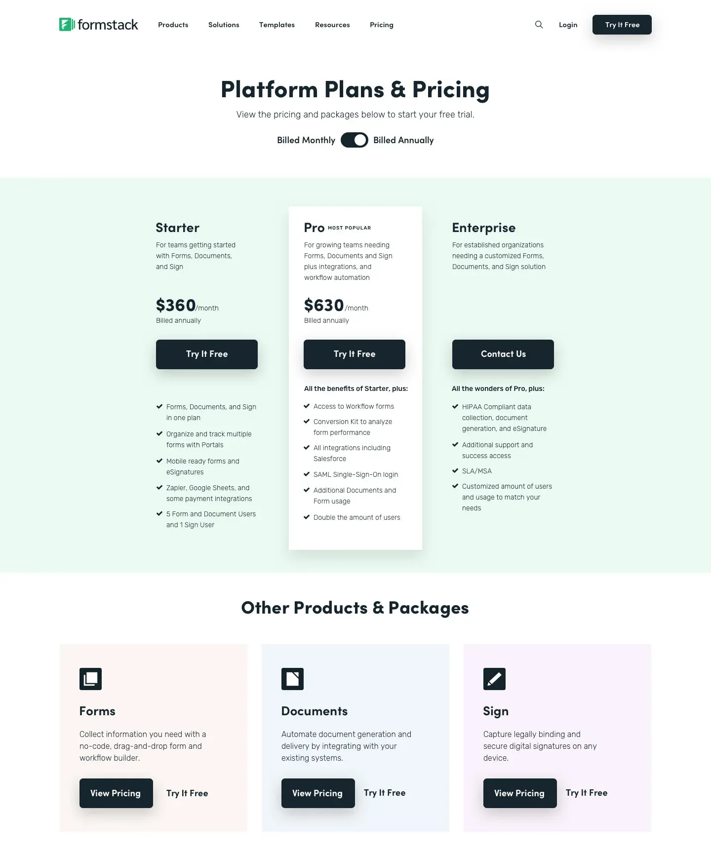
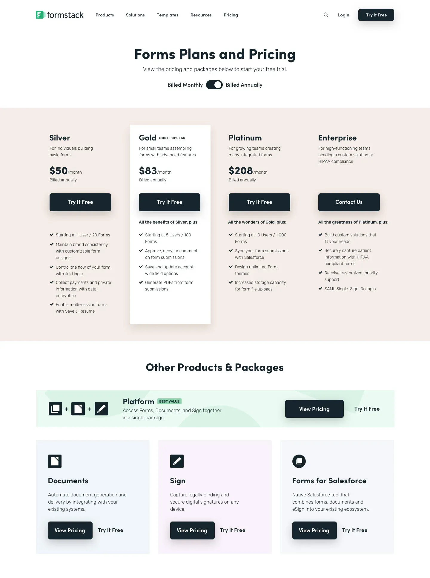
The variation of this particular design test was a completely new version of the pricing section that introduces a main “routing” page for pricing. We also created individual pricing pages for each product, which had not previously existed.
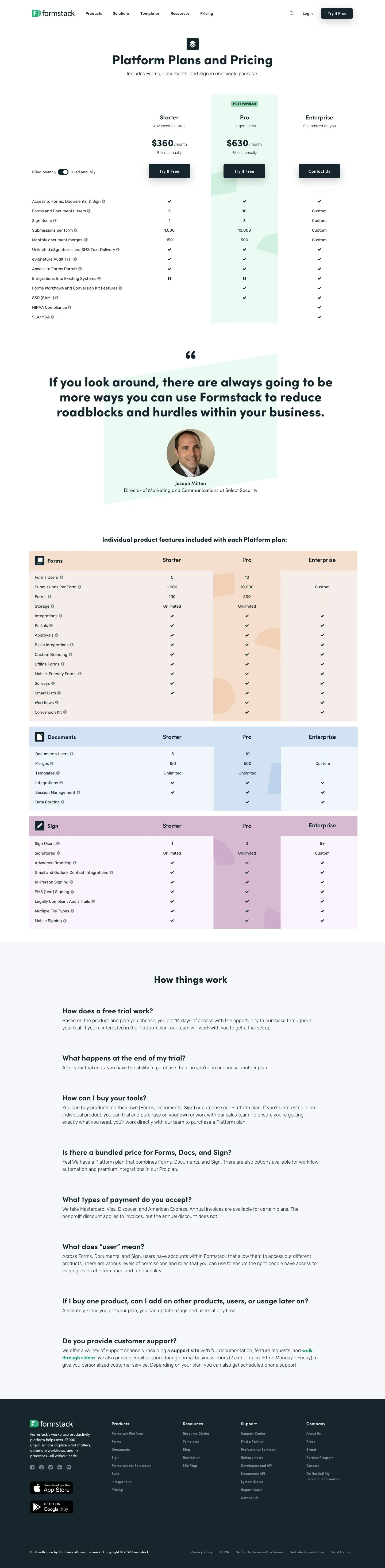
On these individual pricing pages, we removed the the tab structure, added bigger product callouts below the pricing table, and added the full feature comparison table near the bottom of the page.
External Usability Test
| Type | Description | Control | Variation |
|---|---|---|---|
| Average Usability Score | The Usability Score measures the design's usability based on these KPIs: success, bounce, duration, and misclicks. Score is out of 100. | 87.5 | 84.5 |
| Average Clarity | Qualitative, based on a number of yes/no questions. | 85% | 94% |
| Average Confusion | Qualitative, based on a Likert scale. 1 is not confusing, 5 is very confusing. Lower is better. | 1.65 | 1.55 |
| Version Preference | In both focus groups, the "What version did you prefer" question was asked at the very end. Note: users tended to favor the second version they were shown. | 52% | 48% |
Overview
Using Maze, testers were divided into two groups with each seeing both prototypes. To reduce the odds of bias, the order of variants shown to participants is randomized. One group saw the new version (variation) first, followed by the control version. The other group saw the control version first. These users were asked to complete a few missions to test usability, and then asked to share their observations by answering a short questionnaire after each.
Results
We saw split results between the control and the variation. The control version scored better on usability and overall version preference. The variation scored better on clarity & confusion. Collecting feedback from our audience enabled us to build exactly what these users would want to see, and ultimately help them make a purchasing decision.
Internal Usability Test
| Type | Description | Control | Variation |
|---|---|---|---|
| Average Usability Score | The Usability Score measures the design's usability based on these KPIs: success, bounce, duration, and misclicks. Score is out of 100. | 92 | 93 |
| Average Clarity | Qualitative, based on a number of yes/no questions. | 49% | 89% |
| Average Confusion | Qualitative, based on a Likert scale. 1 is not confusing, 5 is very confusing. Lower is better. | 2.7 | 1.6 |
| Version Preference | In both focus groups, the "What version did you prefer" question was asked at the very end. Users tended to favor the second version they were shown. | 2% | 98% |
Using Maze, we created a slightly different version of the test, which was sent out to several groups (pricing council, Sales leadership, Marketing leadership, Executive leadership) within Formstack. This version included a few more open-ended, qualitative prompts:
- Do you think this design does a good job describing the platform?
- Is there anything that should change? (asked for each design)
- What do you think of the current pricing section?
- What do you think of the new pricing section?
The variation scored better on usability, clarity, confusion, and version preference. We received incredibly useful qualitative feedback from the open answer questions.
Potential Design Improvements
We discussed several iterative changes to Version B before executing a Version C.
Individual pricing pages
- Clarify annual vs. monthly pricing
- Make it easier to move between products, or back to the routing page
- A more concise comparison table that shows what each plan adds
- Make each platform plan’s features easier to understand
Pricing routing page
- Move the platform to the top row
- Update the platform graphic to show Forms, Docs, and Sign as one package
- Make Forms for Salesforce feel less isolated
- Add the Salesforce logo to the Forms for Salesforce box
Final Versions
For the final version of the designs we revised only the platform pricing page by making it clear what features were part of the platform, as well what features you get with each product within the platform. We also decided to add tooltips to each feature listed in order to provide a description of each feature. The end result was a collection of pricing pages that were much easier to digest, removing friction and confusion from the plan selection process for our end users.