GoodTime Enterprise Alignment
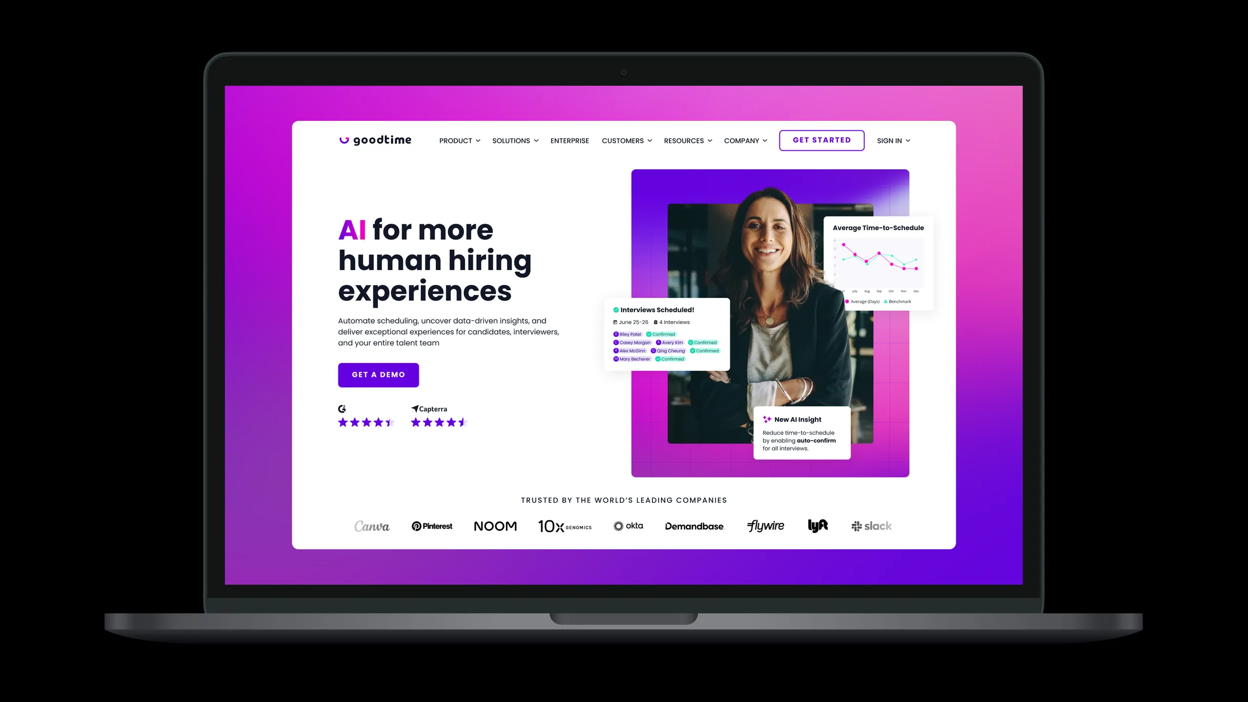
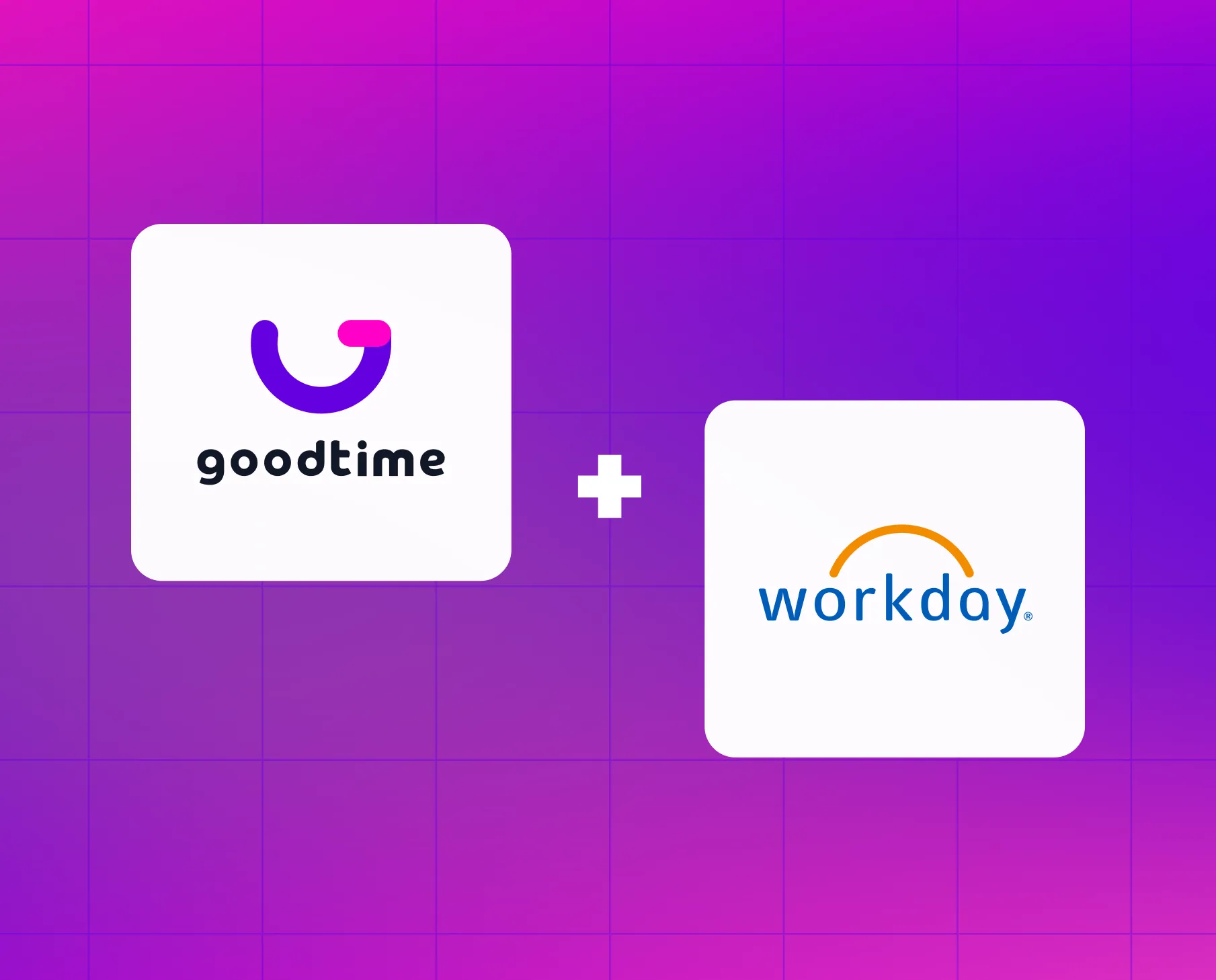
To strengthen our position in the enterprise market, we refined our messaging, visual identity, and web presence in the first half of 2024, focusing on aligning with large enterprise organizations that use our key enterprise integration partners: Workday, SAP SuccessFactors, and iCIMS. Our objective was to resonate with Directors of TA Operations at companies with 250+ employees—highlighting our ability to scale, integrate seamlessly, and enhance operational efficiency.
- Challenge
- GoodTime moved upmarket, but its bold, playful brand didn't match what enterprise buyers expected. There were four weeks to refine it without a full rebrand.
- Outcome
- A refined, enterprise-ready visual system across web, ads, and product marketing. Since then, MQLs from 250+ and 500+ employee companies, including Manager-and-above leads, have trended up quarter over quarter.
Before the alignment
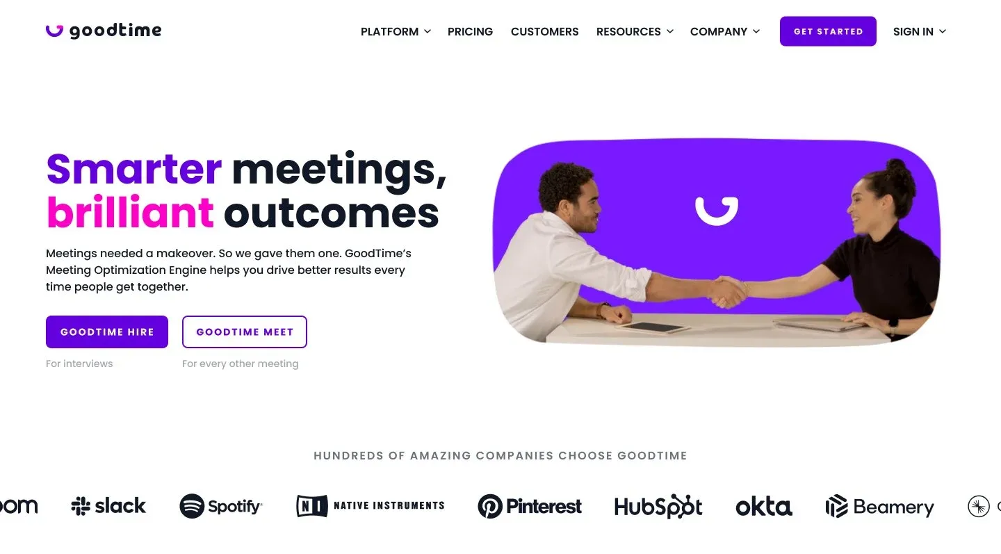
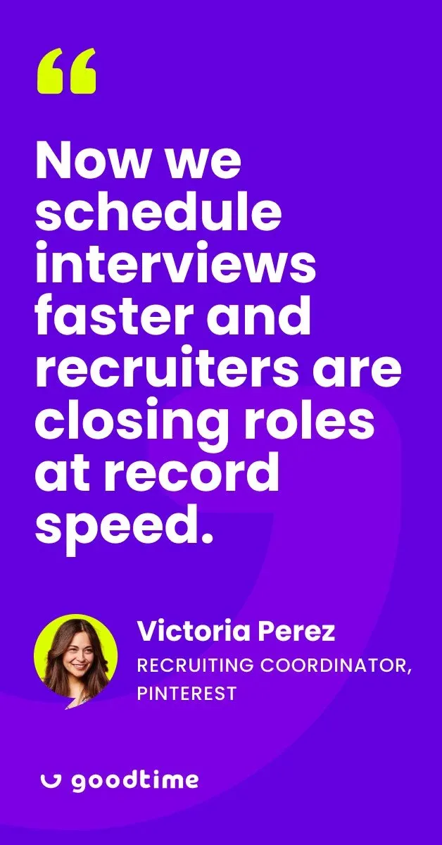
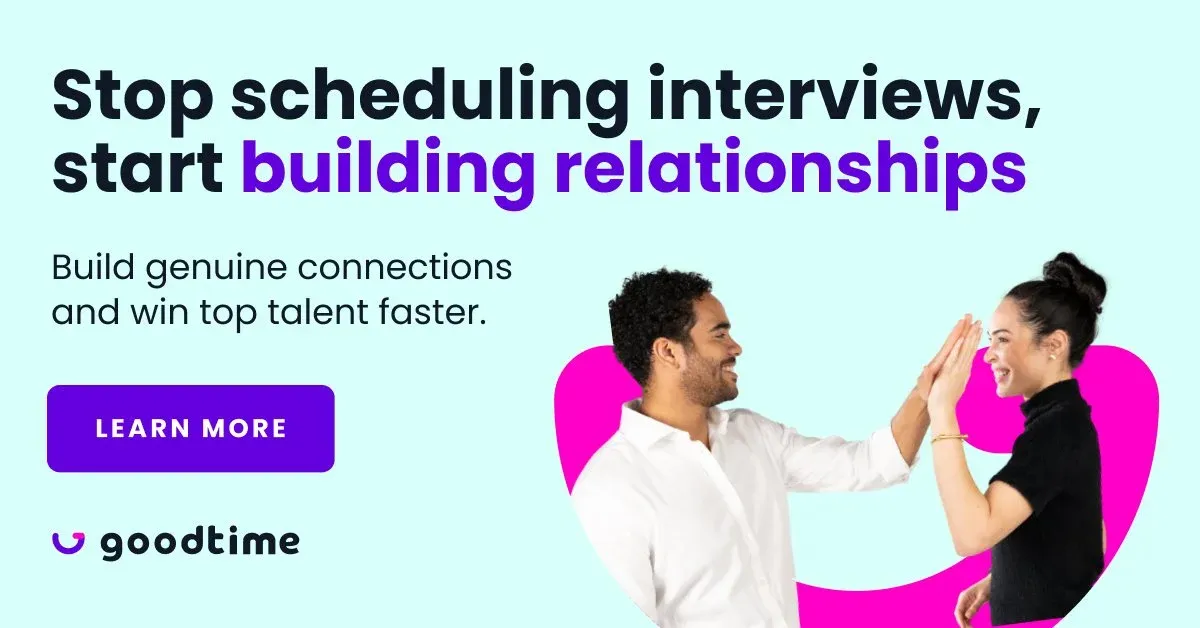
In 2022, GoodTime underwent a rebrand while expanding its product offerings—GoodTime Hire and GoodTime Meet—targeting SMB to enterprise. However, the high-touch support needs of smaller businesses led us to shift our focus upmarket, prioritizing fewer, higher-ACV customers in late 2023. While our brand style was bold and playful, it didn’t align with the expectations of enterprise buyers. To position ourselves more competitively, we set out to evolve our visual identity to better resonate with this audience.
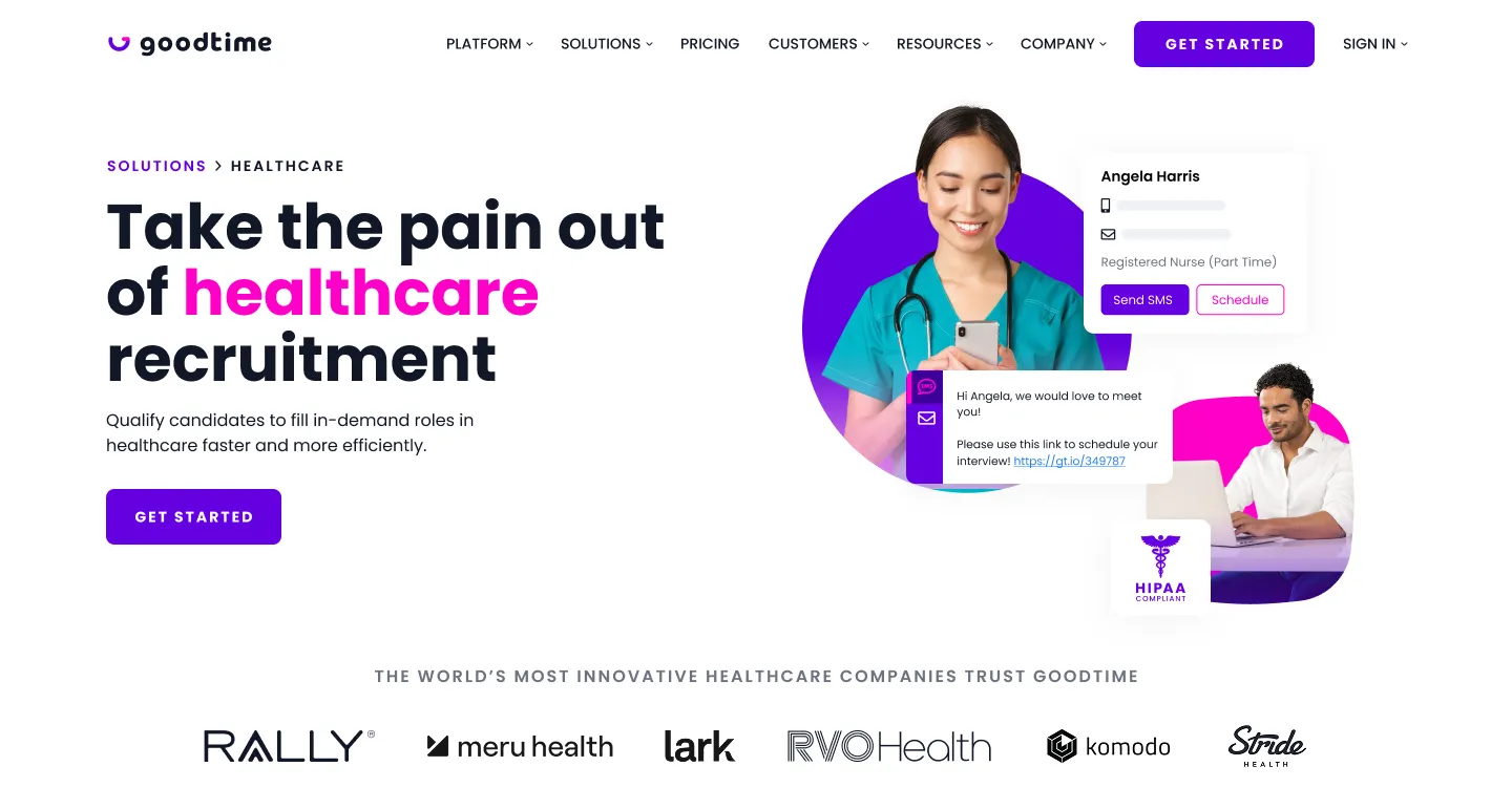
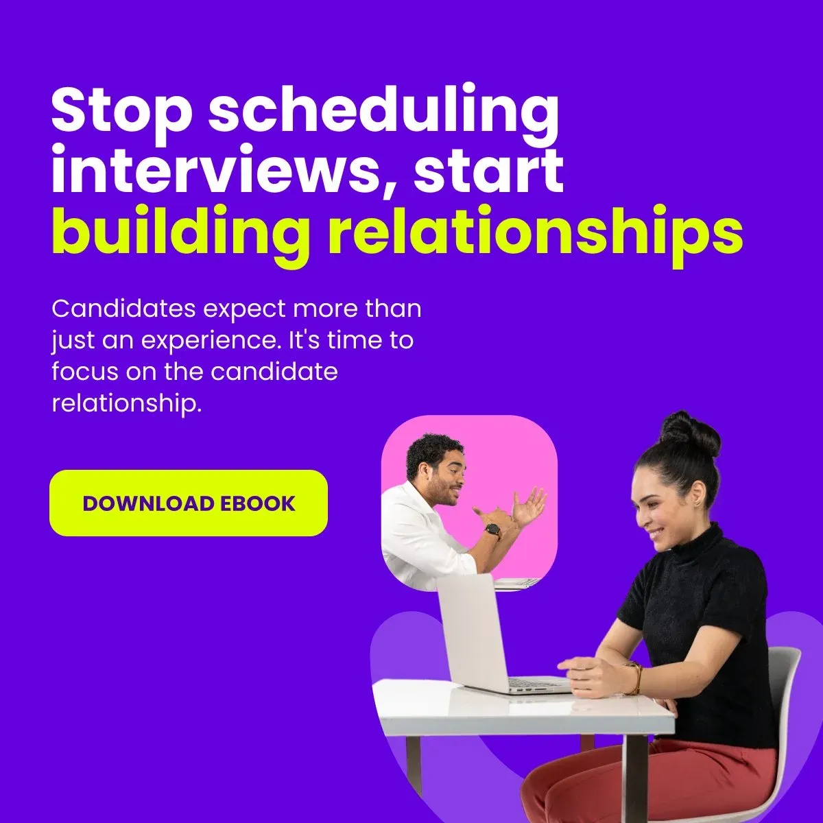
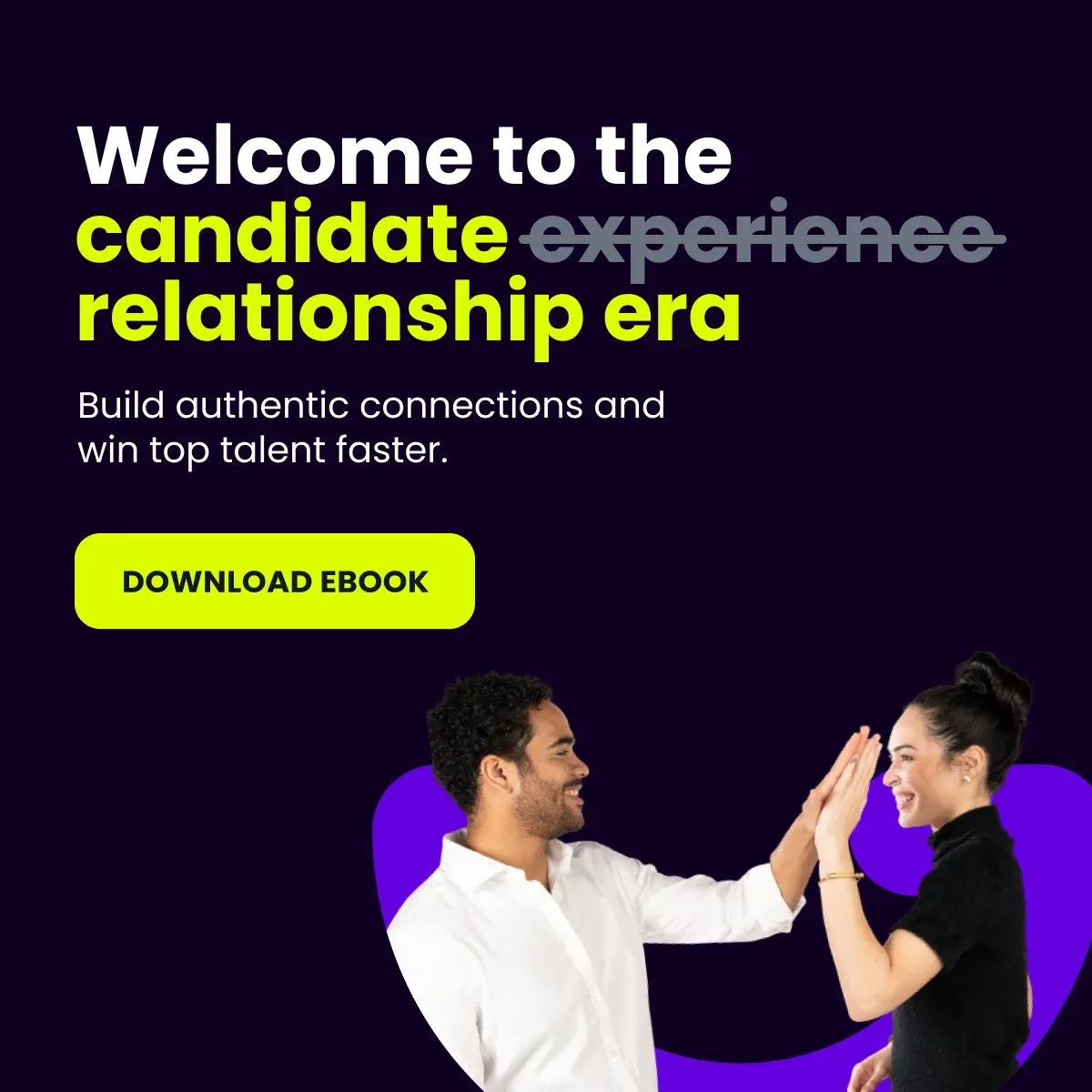
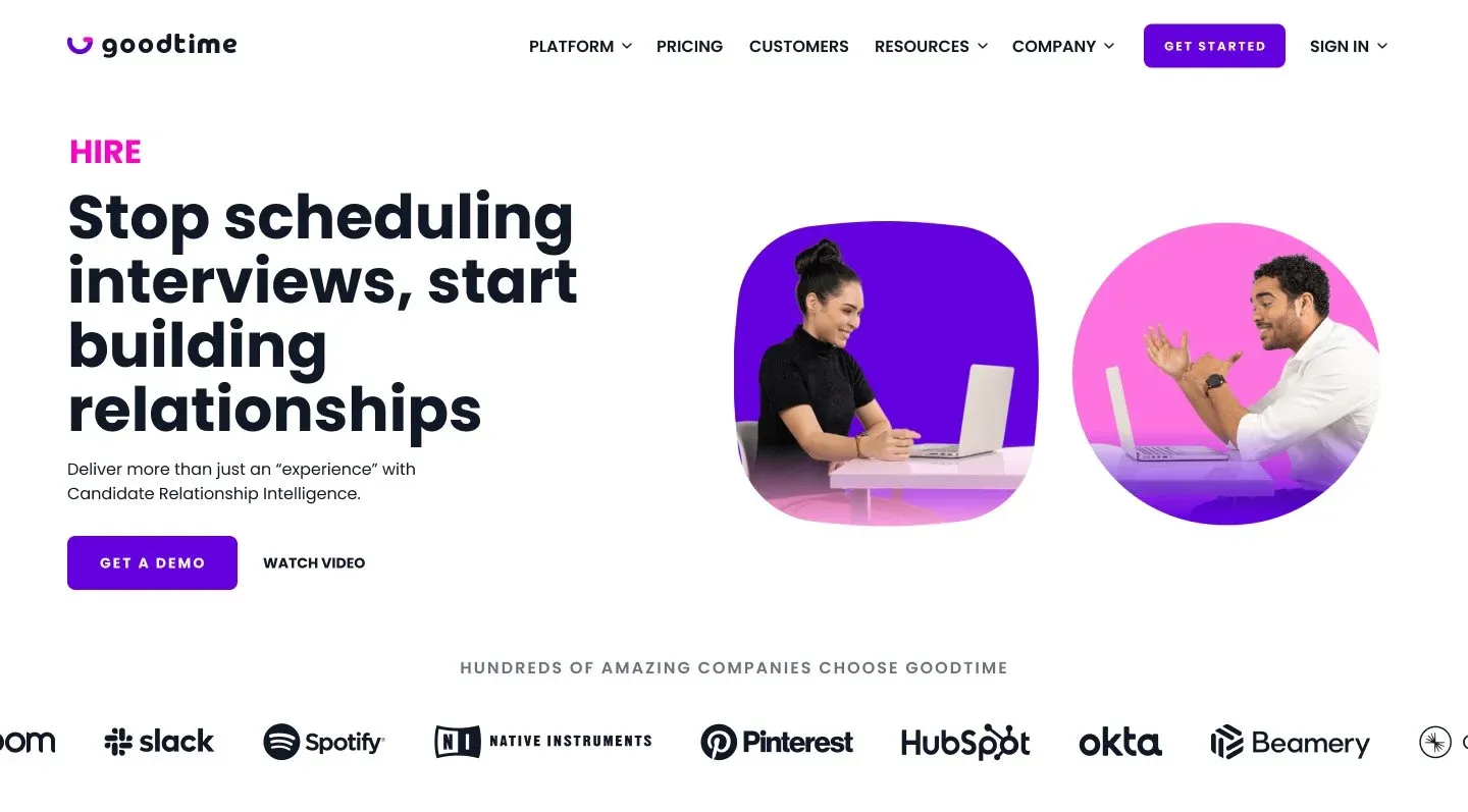
Early exploration
As a fast-moving startup, we had a tight turnaround—just 4 weeks—to explore, execute, and deploy a refined visual identity. Our goal was to evolve the brand to feel fresh, modern, and enterprise-ready while staying true to its core attributes: bold, daring, modern, and clean. This wasn’t a full-scale rebrand or overhaul, but a strategic refinement of an already strong foundation.
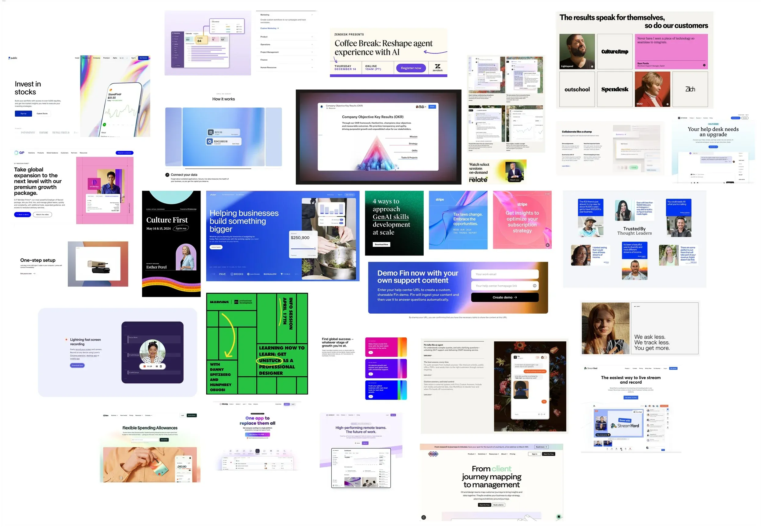
A mood board of wonderful things in the wild we felt aligned with enterprise.
Visual concept approach
Our initial approach was to utilize our existing vibrant color palette using Midjourney, allowing for an open-ended exploration of boldness and variation. This gave us a broad spectrum of visual directions to consider. From there, we experimented with layer blurs and masking effects to generate a range of gradient styles, helping us determine the right balance.











Visual concept application & testing
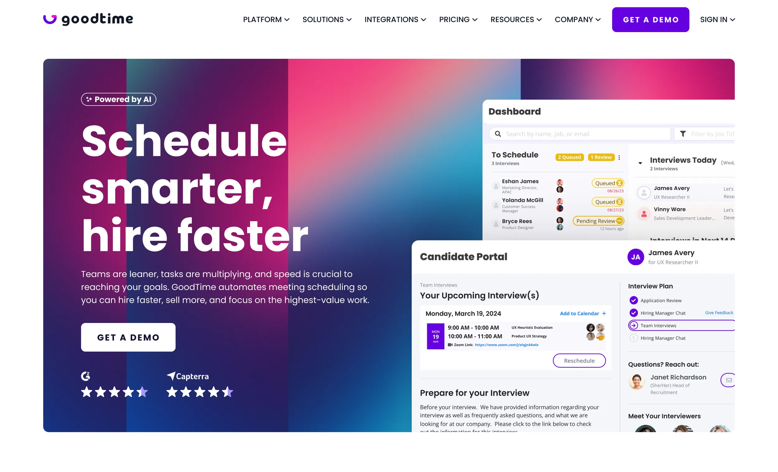
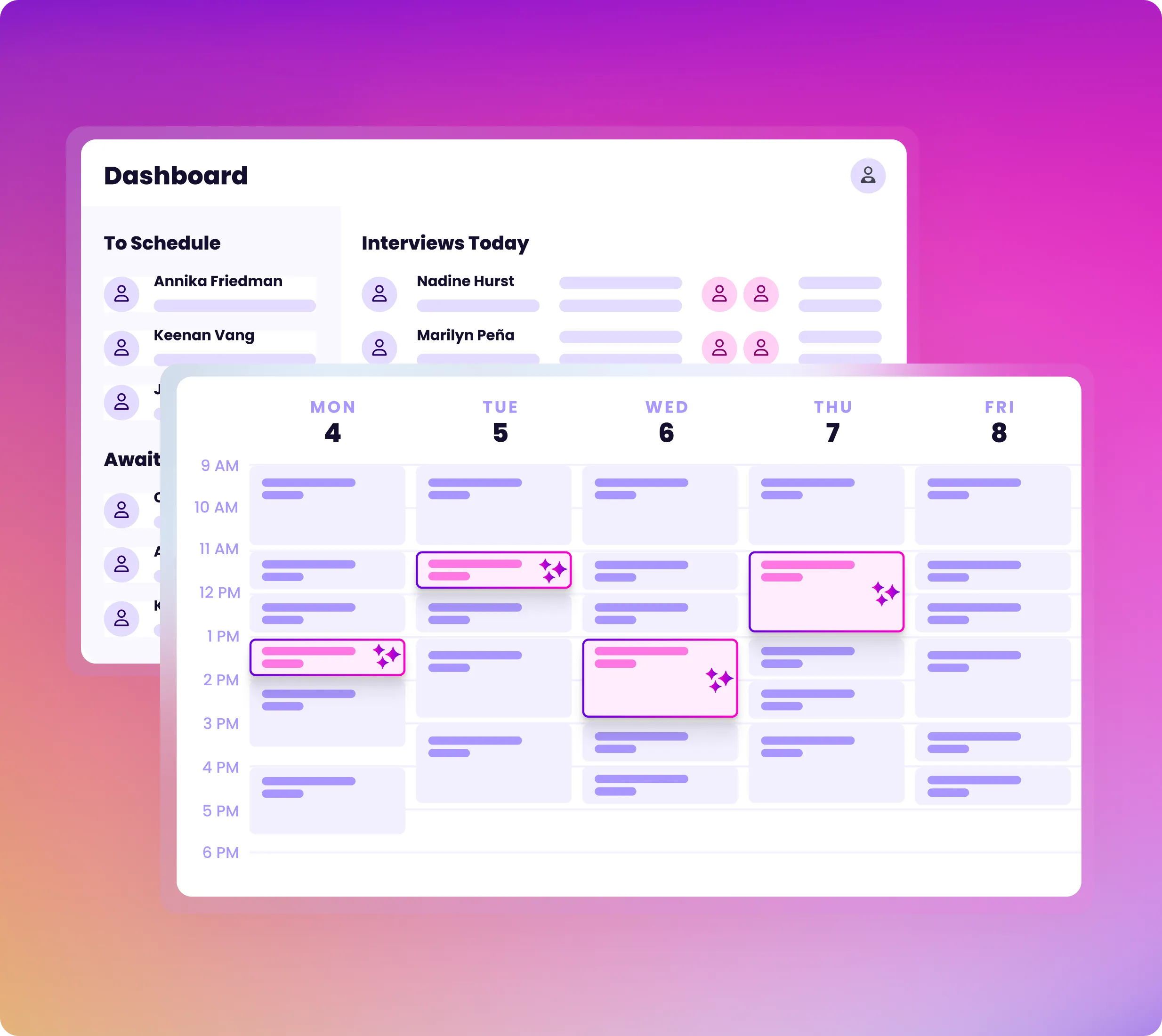
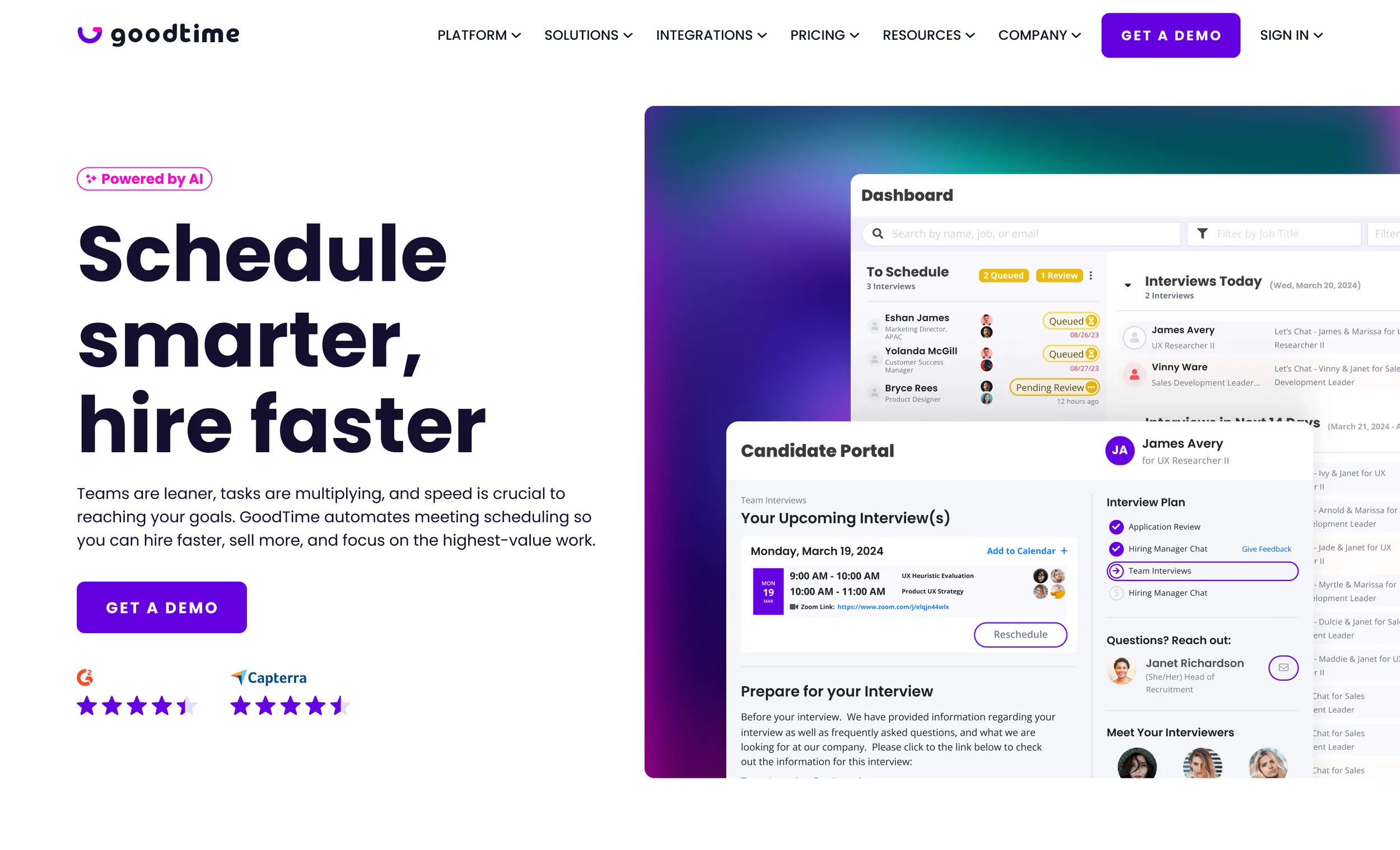
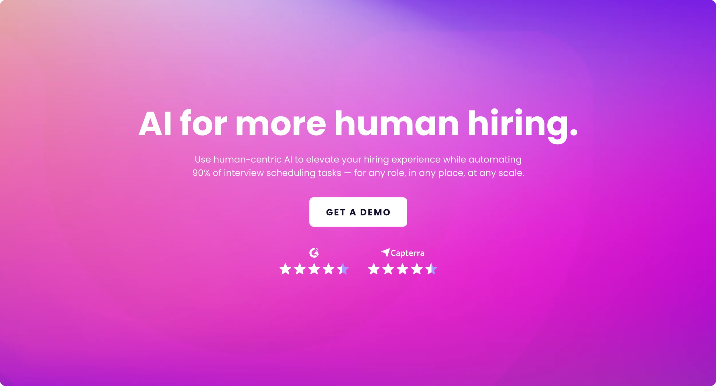
Next, we tested out various different applications with each type of gradient and blur effect to see what a final outcome could look like. From there, we continued to refine ideas and concepts, and discussed how each of these aligned with our goal.
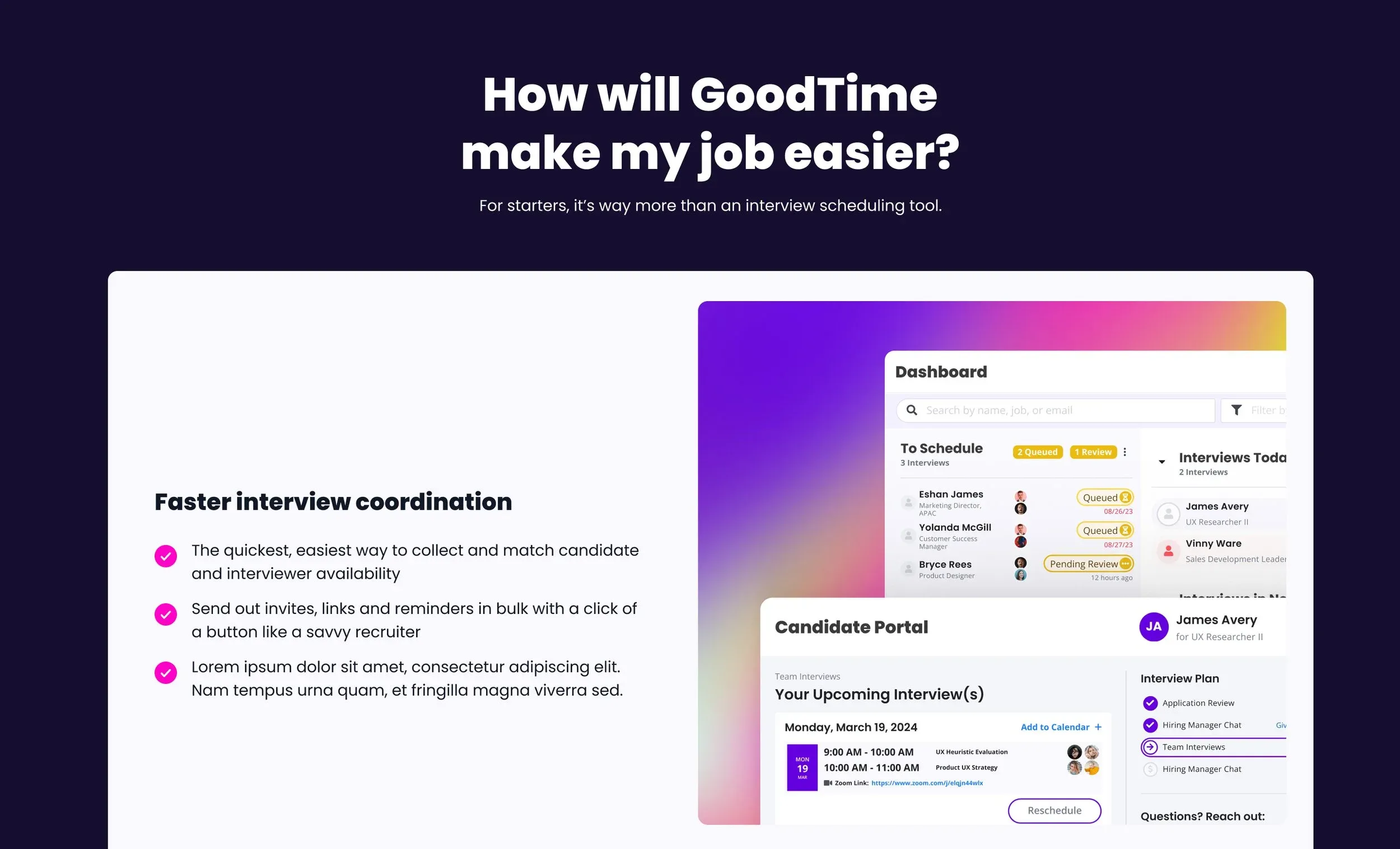
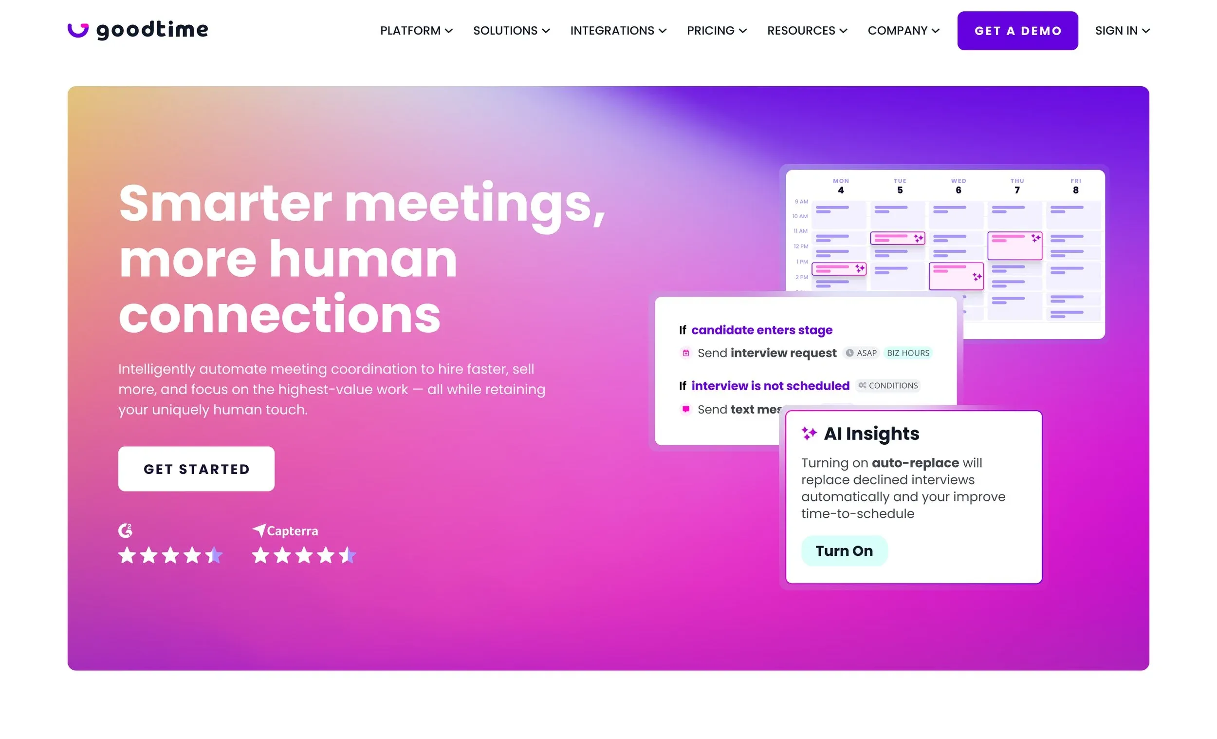
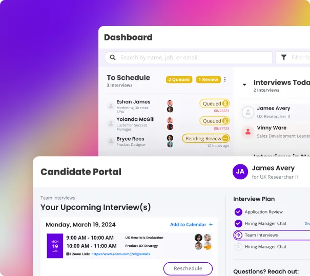

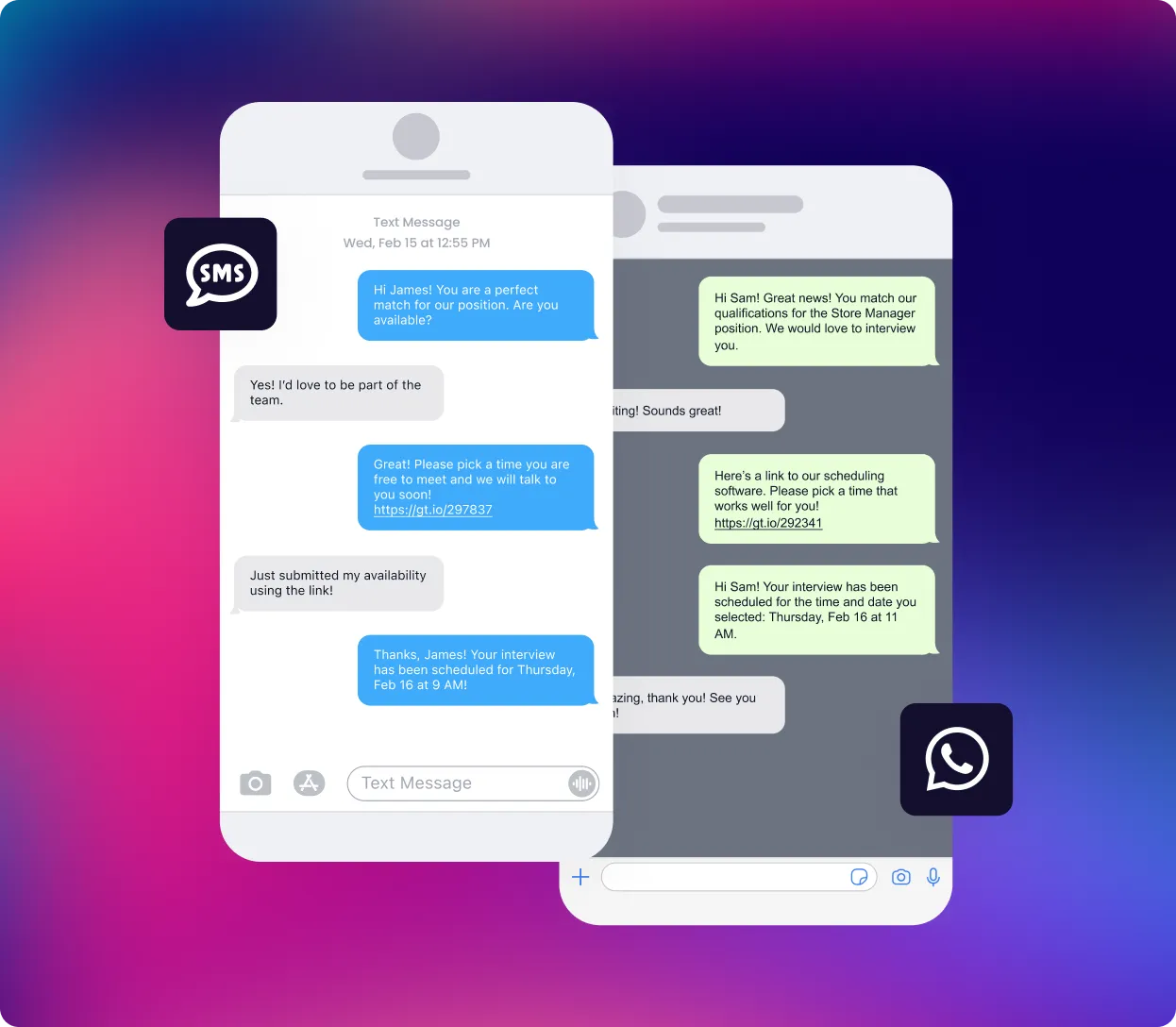
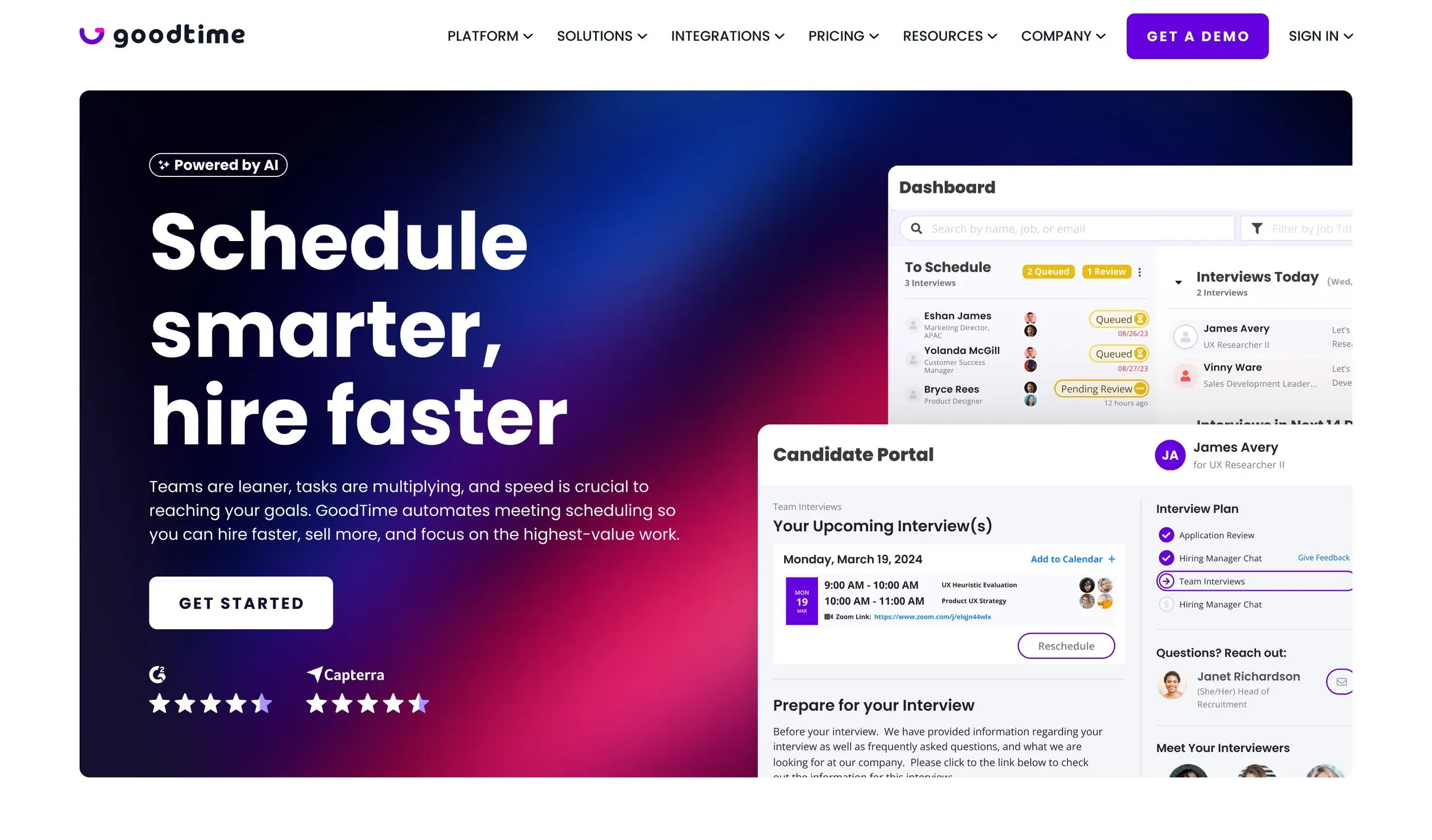

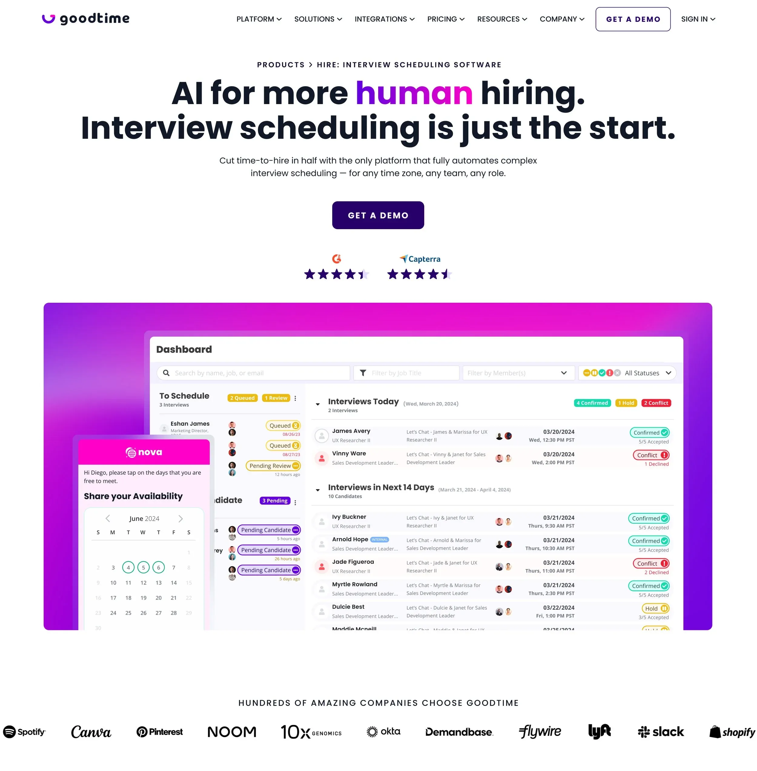
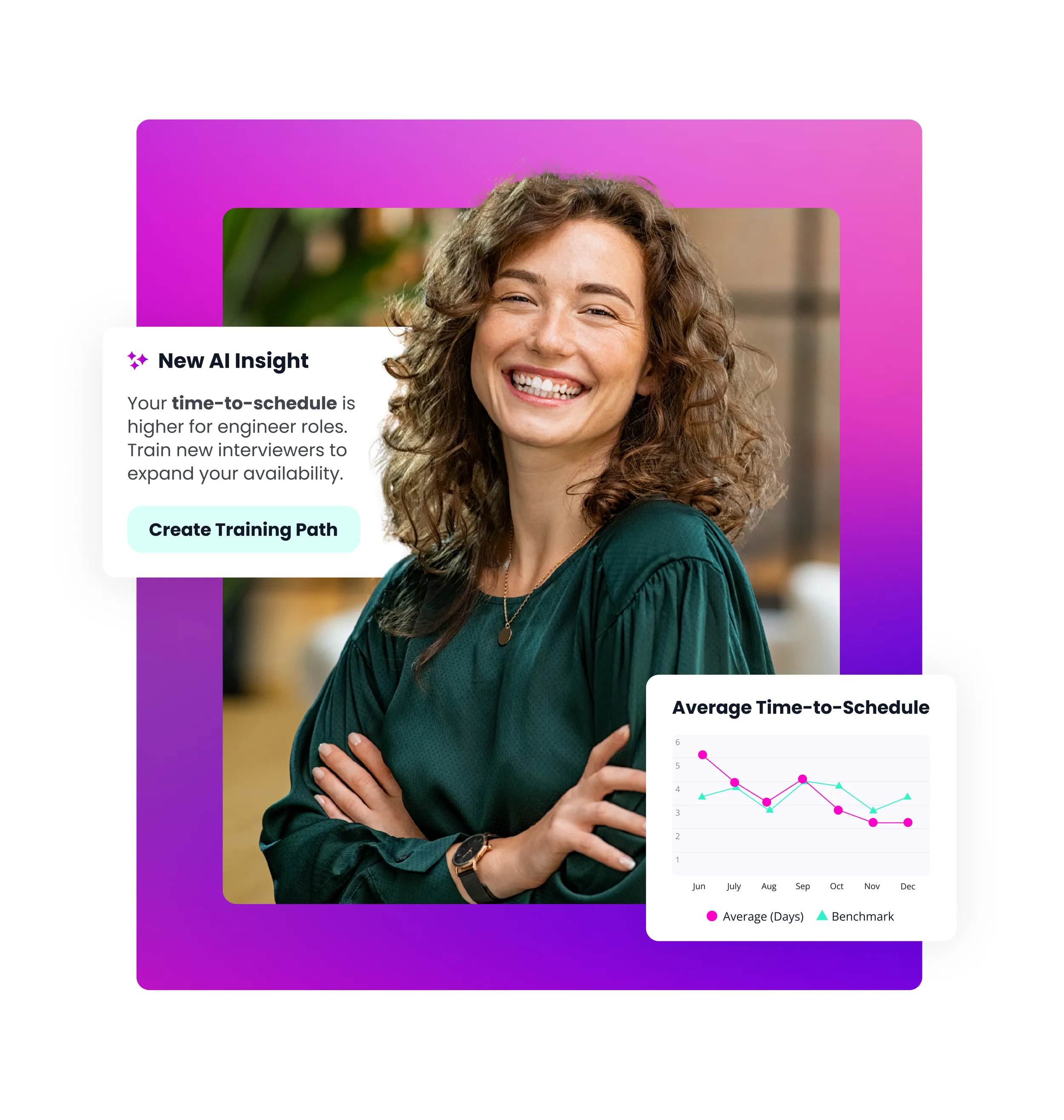
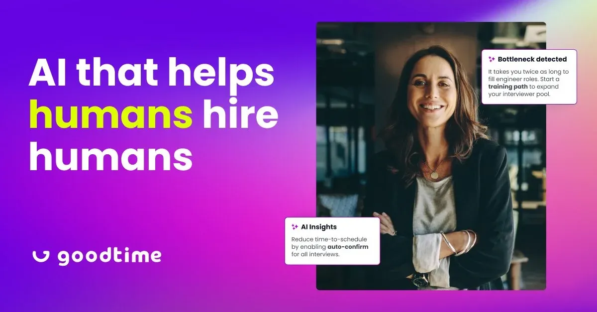
Final visual concepts
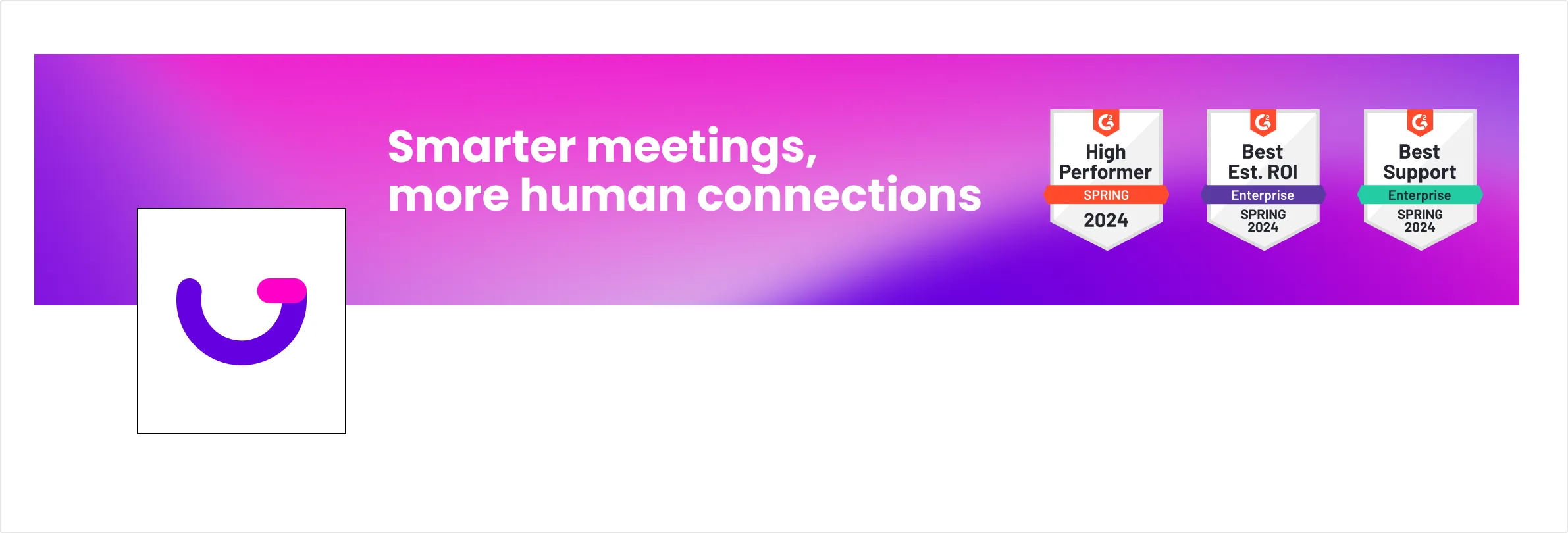
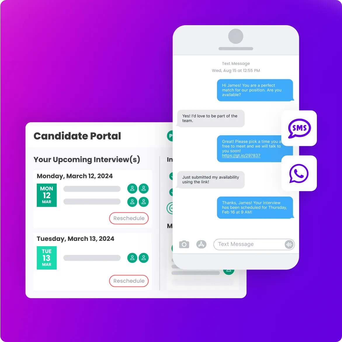
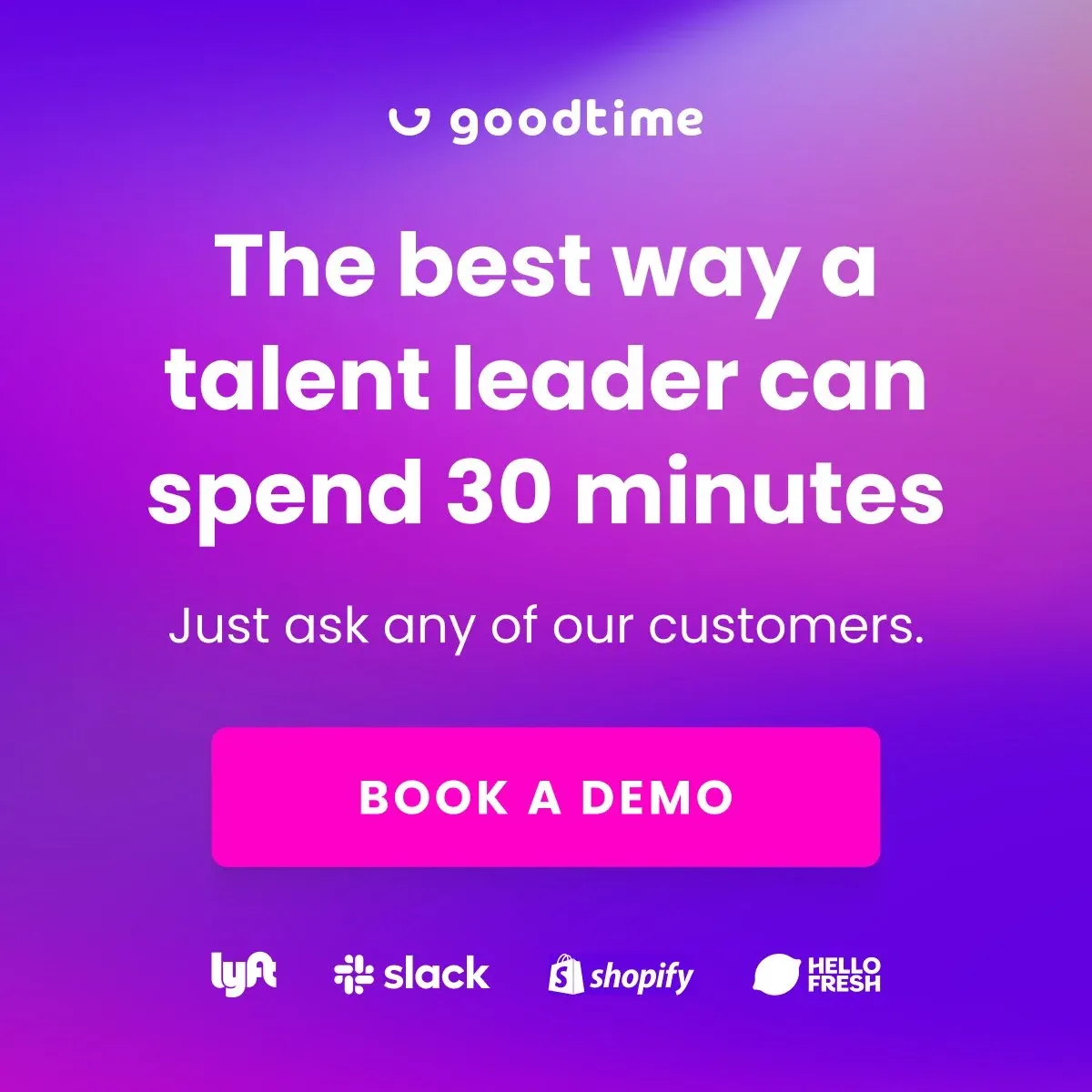
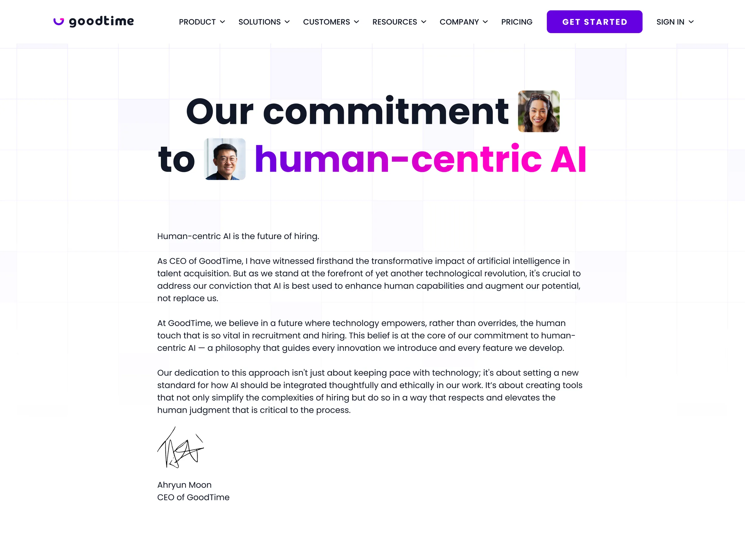
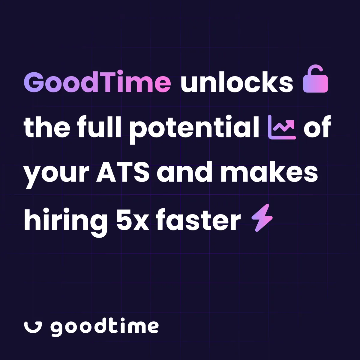
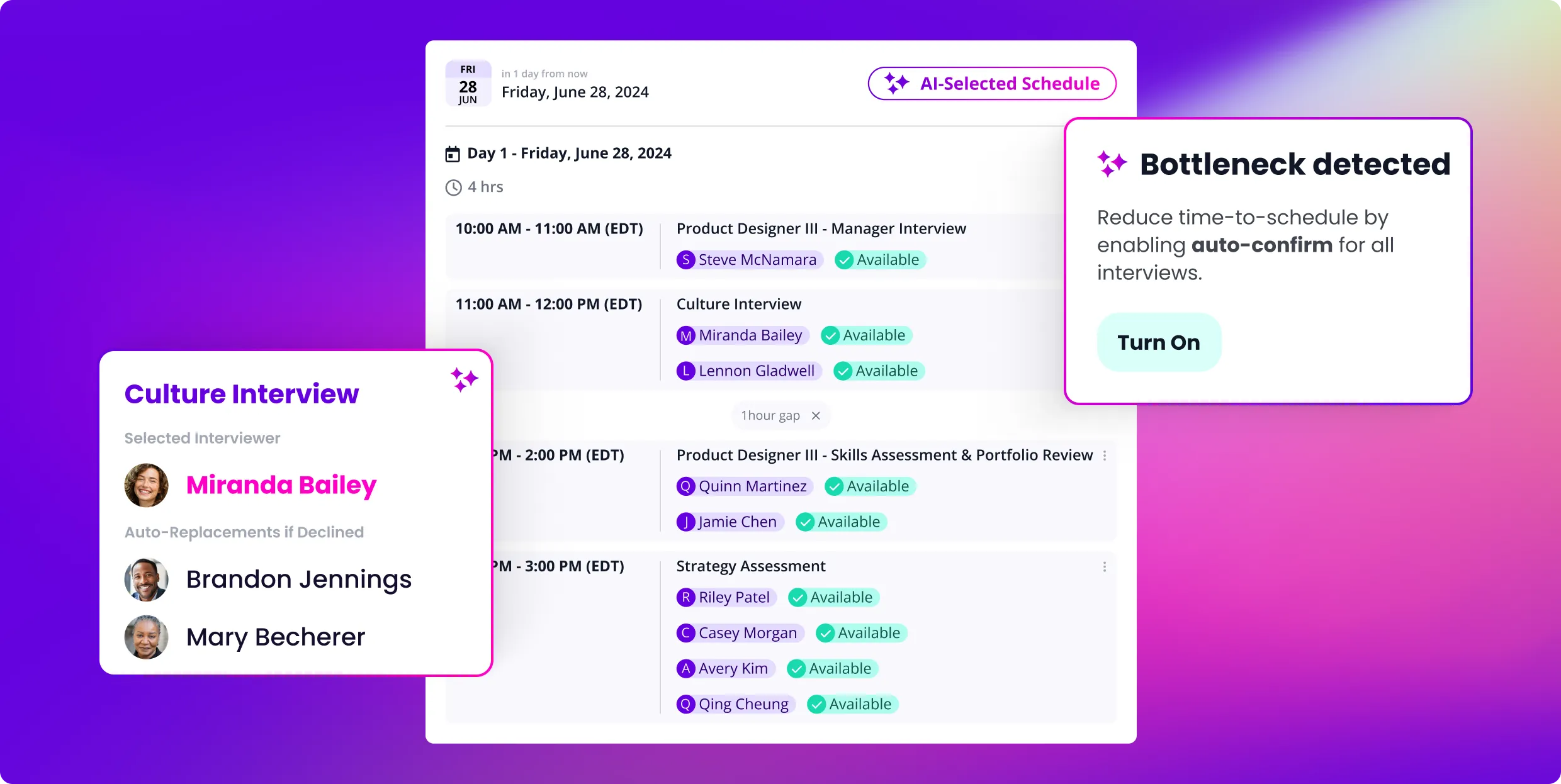
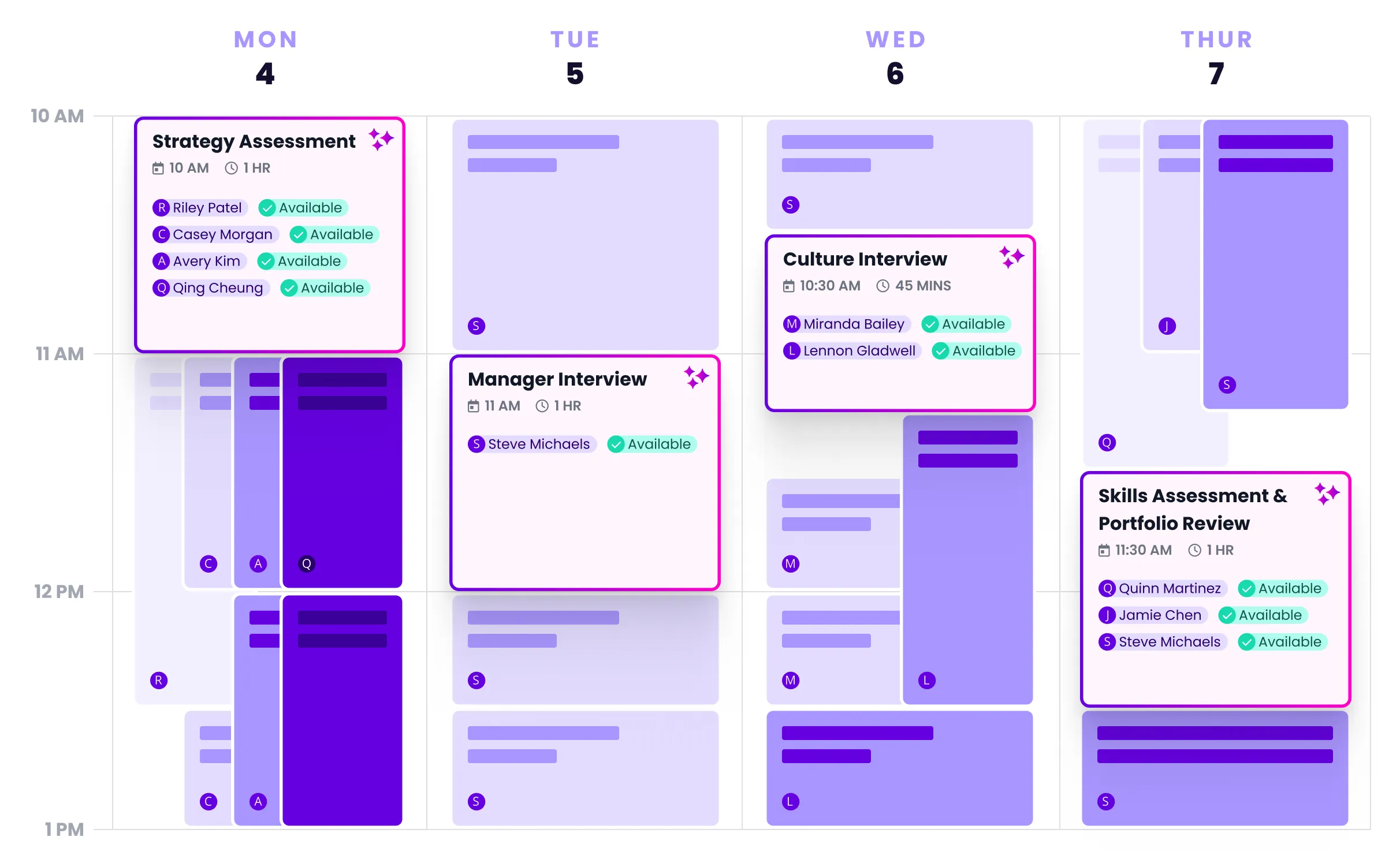
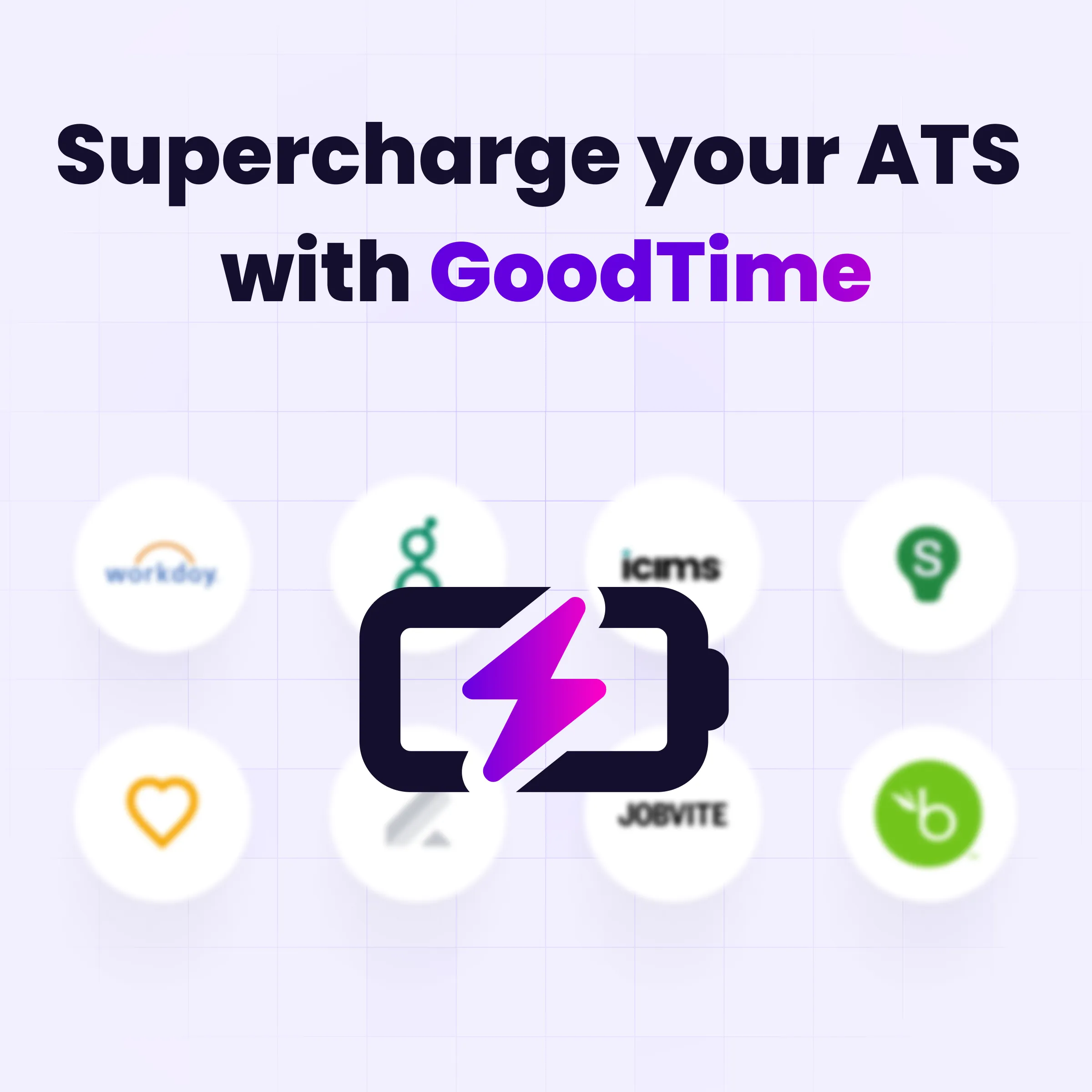
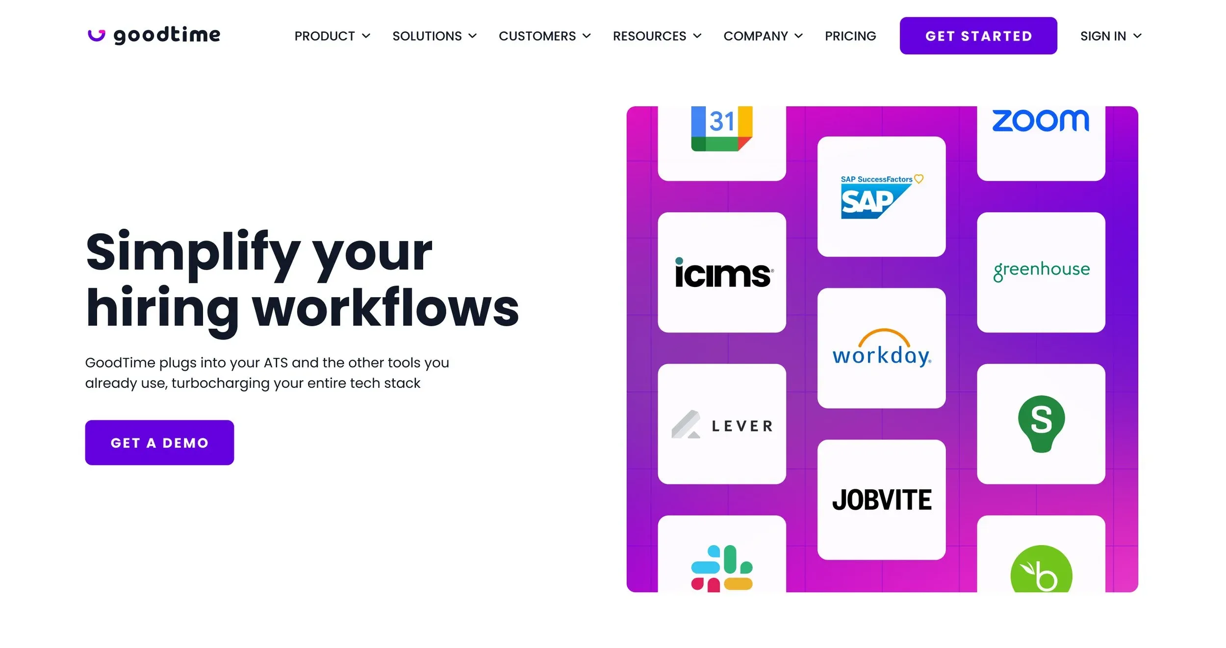
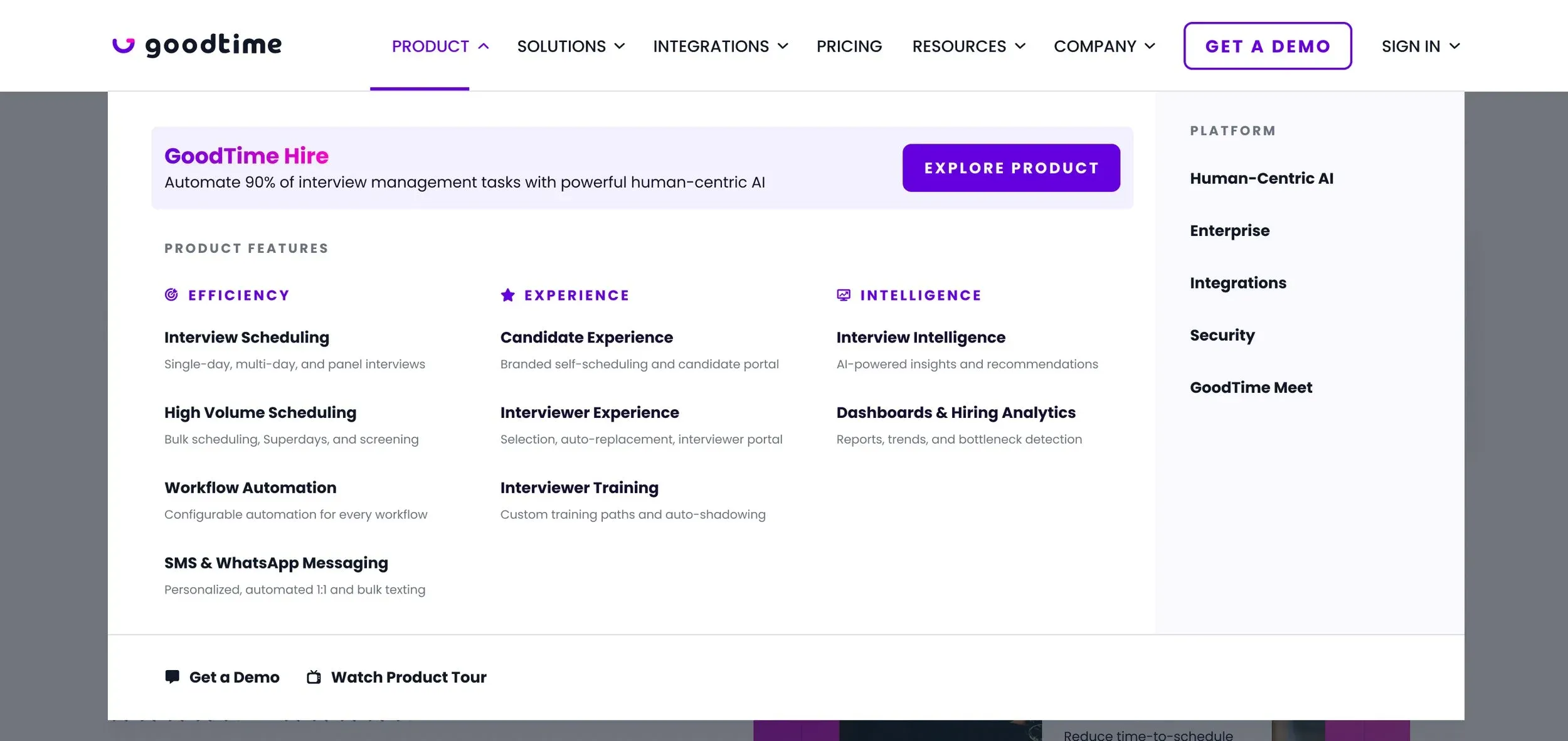
For the final concept, we refined the gradients by using only our core colors—magenta, purple, and green—ensuring the updated style felt fresh while staying clearly on-brand. From there, we experimented with additional visual elements and treatments using grids, checkered patterns, product elements, and photography to further fine-tune the new aesthetic. Our goal was to elevate the existing brand without straying from its core identity.
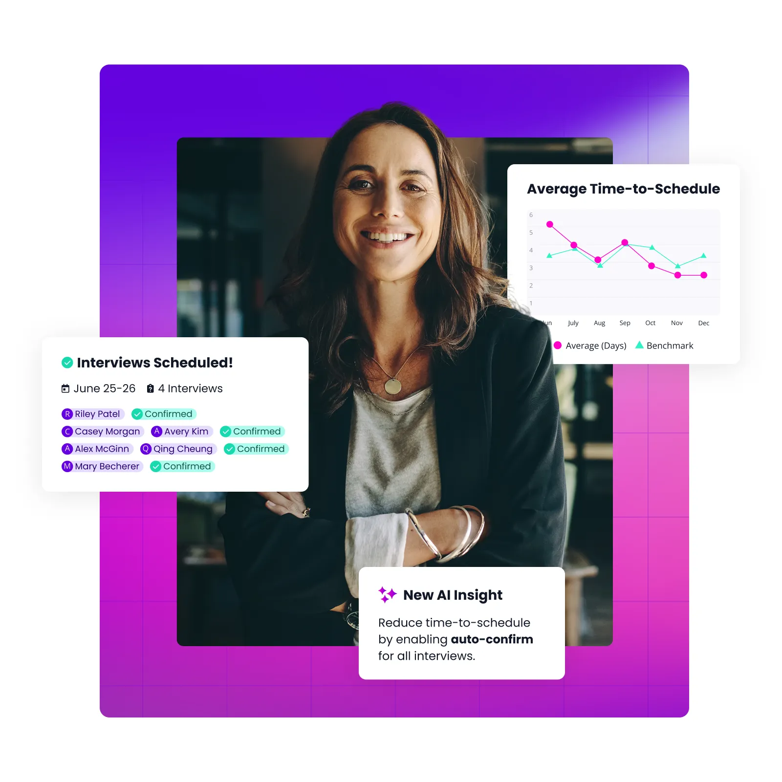
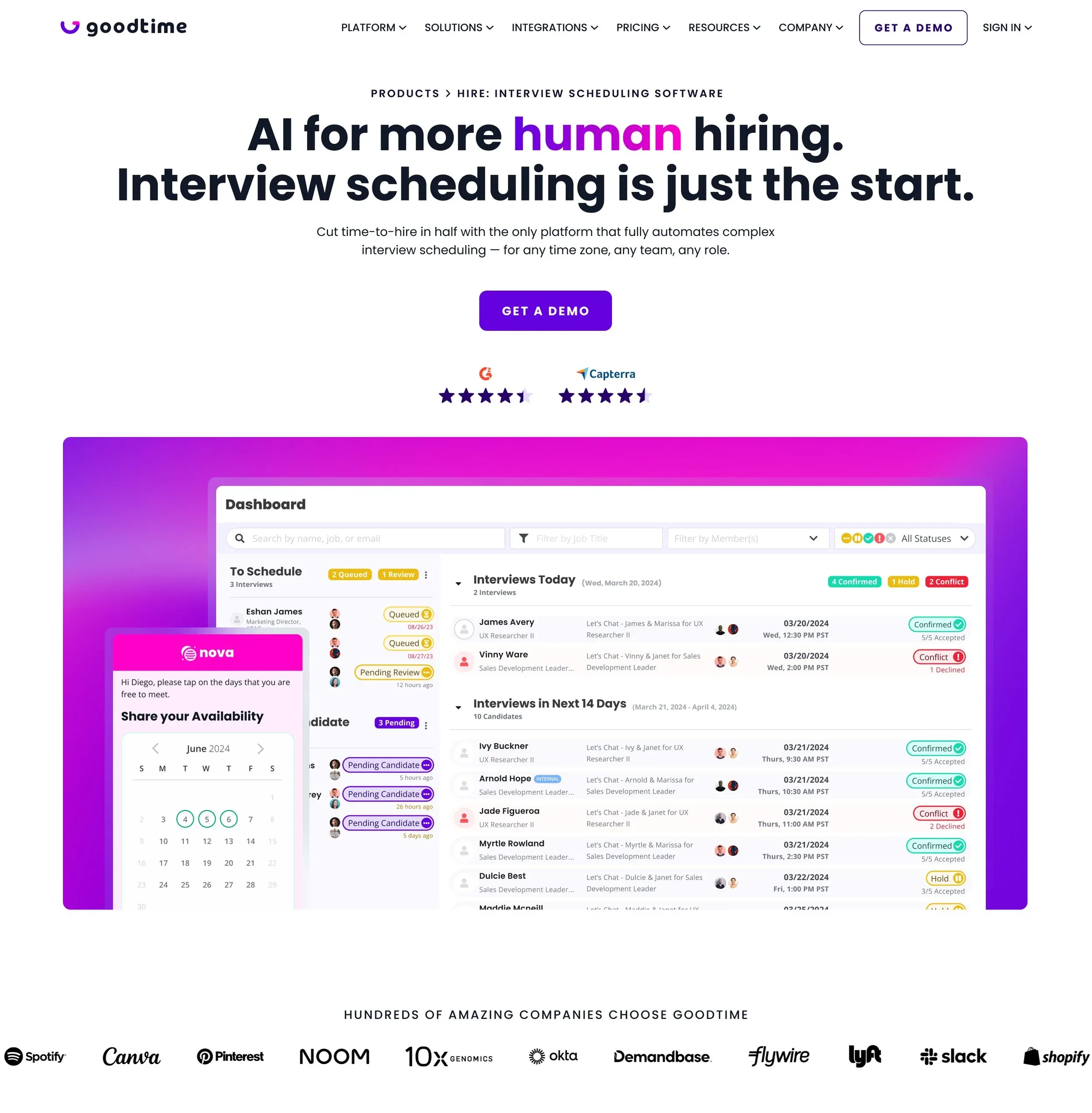
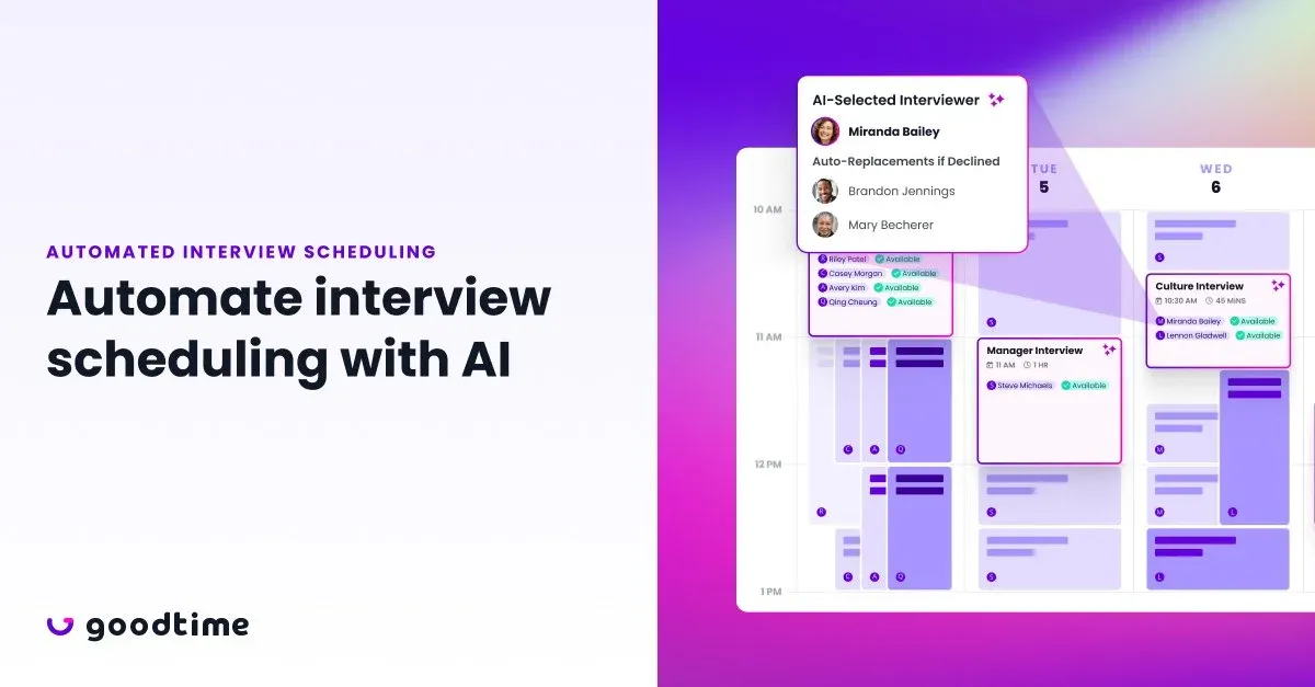
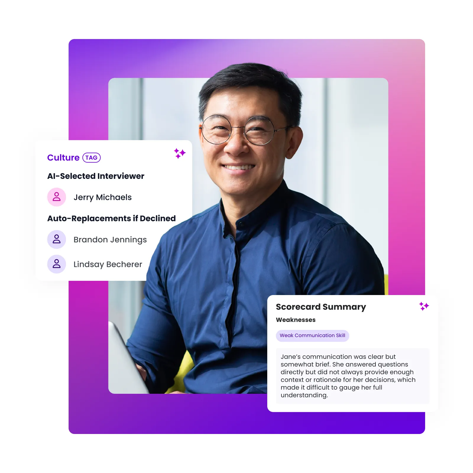
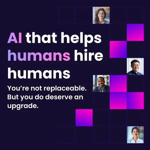
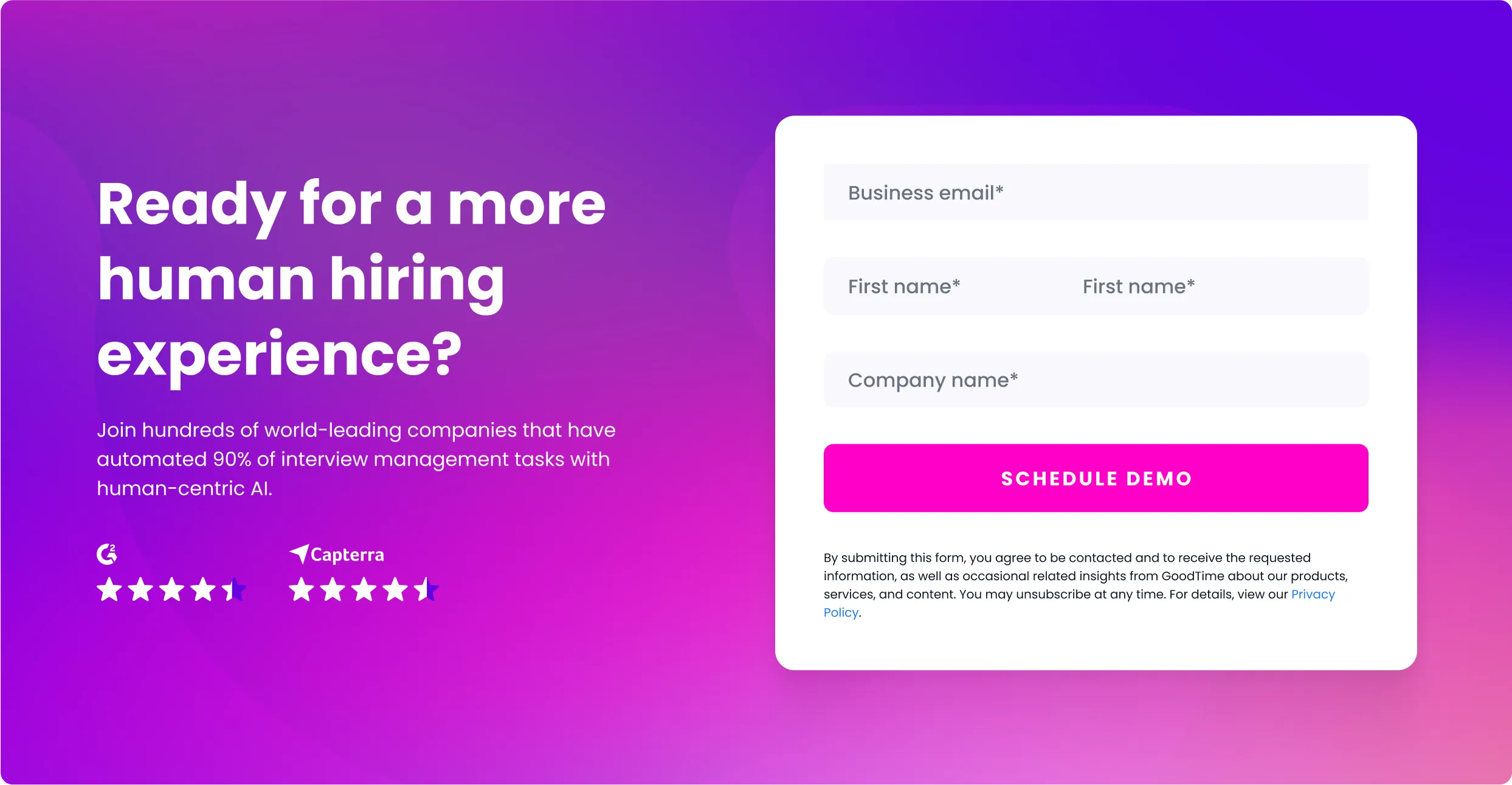

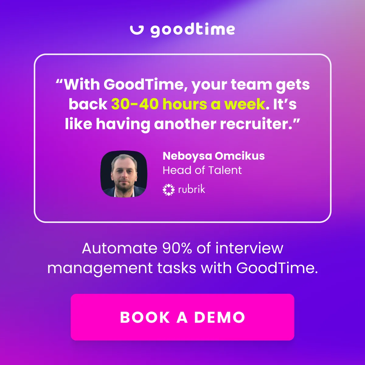
Visual concepts for add-ons
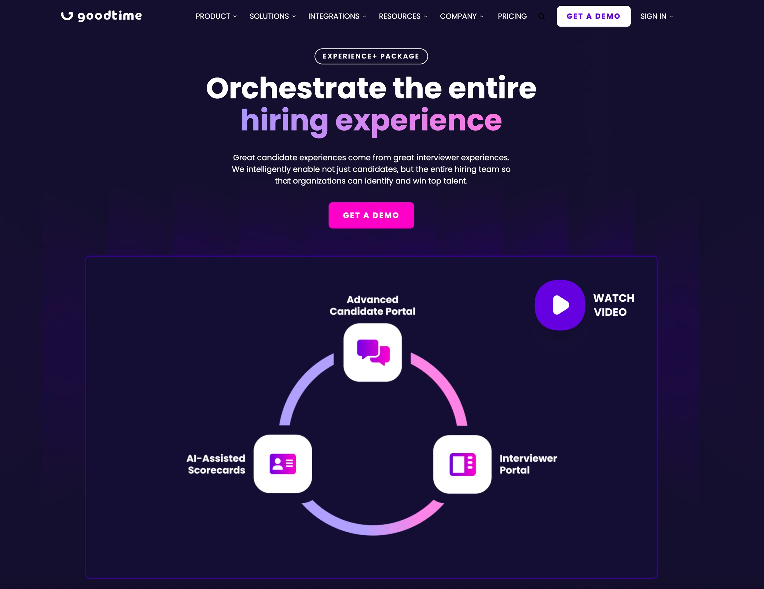
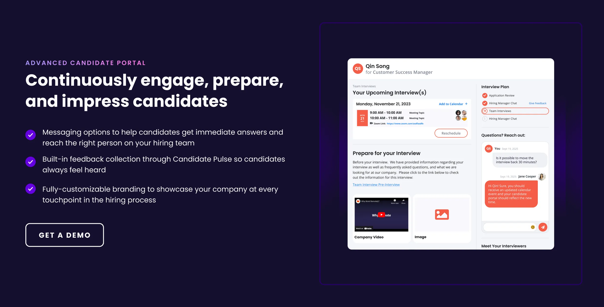
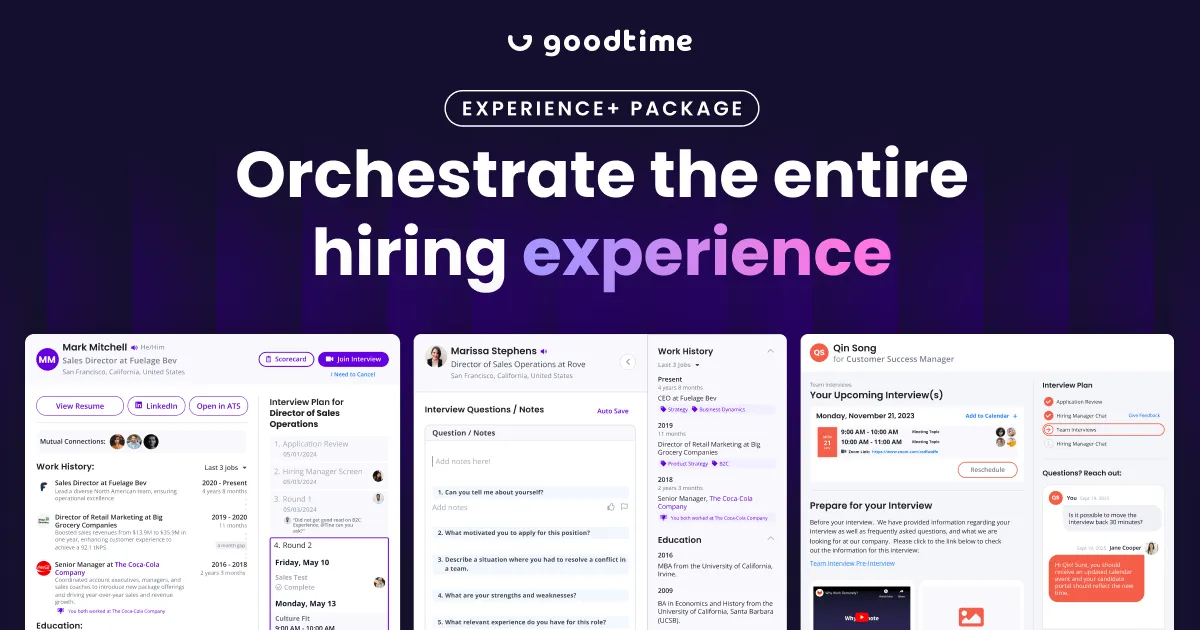
Alongside refining our core brand, GoodTime introduced a new Experience+ add-on package to drive upsells. We aimed for a marketing aesthetic that felt on-brand yet distinct; elevated and premium while maintaining a sense of familiarity, but intentionally set apart from the core brand.
Results
Our primary top-of-funnel metric is the number of MQLs from companies with 250+ employees that use an ATS integrated with our product—such as Greenhouse, Lever, Workday, SuccessFactors, iCIMS, or SmartRecruiters. Below are two charts — focusing solely on our two core channels (paid search and website/inbound) — since the beginning of 2023. The top is the number of MQLs from companies with 250+ employees that use an ATS integrated with our product, and the bottom is the number of MQLs from companies with 500+ employees that use an ATS integrated with our product.
Both charts show a gradual increase in MQL volume, which is aligning with our goal of attracting bigger companies. As a marketing team, we made a big changes in audience targeting and messaging, but it also shows that our visual style aligns with the expectations of enterprise buyers.
An additional chart at the very bottom shows the number of Manager+ MQLs from companies with 250+ employees that use an ATS integrated with our product. As you can see, we’re seeing a steady upward trendline quarter over quarter from the beginning of 2023. These are considered are highest quality leads and close at a much higher rate.
Number of MQLs from companies with 250+ employees that use an ATS integrated with our product - as of March 18, 2025.
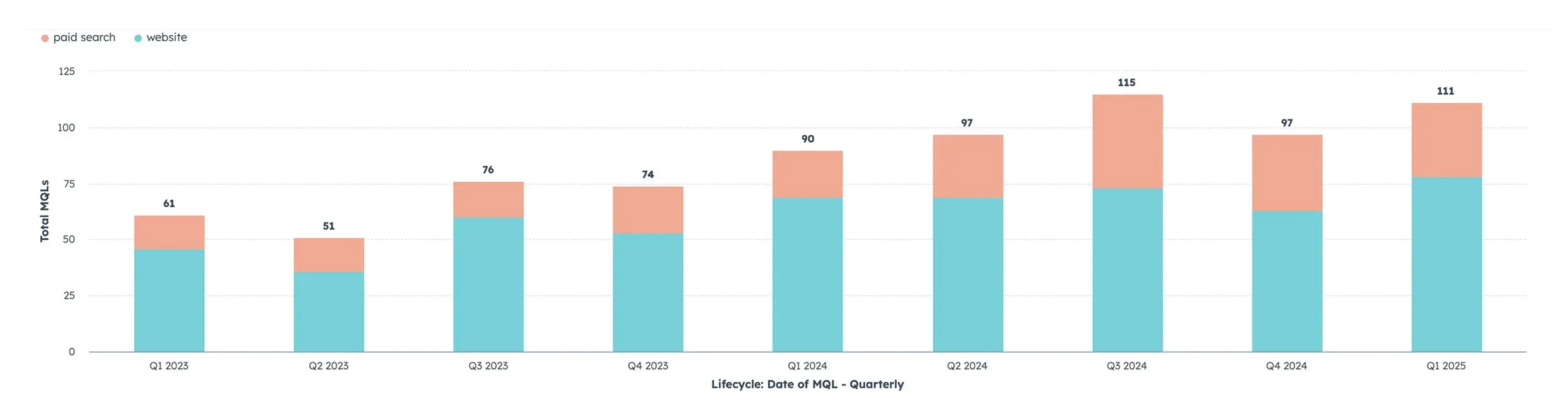
Number of MQLs from companies with 500+ employees that use an ATS integrated with our product - as of March 18, 2025.
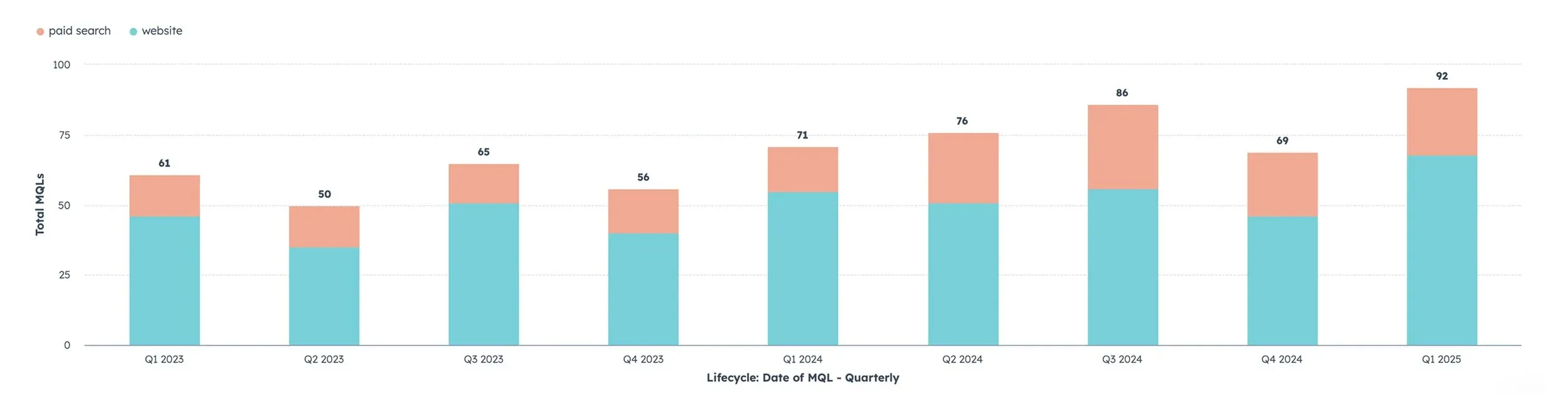
Number of MQLs from companies with 250+ employees that use an ATS integrated with our product, and are a Manager or above - as of March 24, 2025.