Moment 2026
Creative direction and experiential design for GoodTime's first intimate, three-day gathering of 115 talent leaders at Cavallo Point in Sausalito.
- Challenge
- Create GoodTime's first intimate, three-day gathering of talent leaders that felt nothing like a typical B2B conference, without covering a beautiful venue in branding.
- Outcome
- A Net Promoter Score of 89 with zero detractors and 20+ sales handraisers. 23 speakers and 15 sessions, framed by one system that ran from stage to name badge.
- Talent leaders
- 115
- Days at Cavallo Point
- 3
- Speakers
- 23
- Sessions
- 15
- Curated experiences
- 5
The brief
Make it feel like its own thing.
Moment 2026 was GoodTime’s first event of its kind: an invite-only gathering designed to bring more than 100 talent leaders together for three days of conversation about AI, hiring, and the future of talent acquisition.
From the beginning, the creative brief was deceptively simple: don’t make it feel like a typical B2B conference.
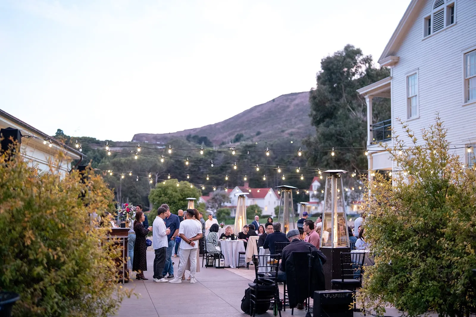
The experience needed to feel intimate rather than programmed, elevated without becoming precious, and unmistakably GoodTime without covering a beautiful venue in branding.
I set the tone as bold, modern, and edgy but credible; intimate, unrushed, welcoming, and intentional. Four principles guided every decision: prioritize connection over content, frictionless by design, every moment should be intentional, and the venue is part of the experience.
The creative approach
Brand the experience, not the venue.
The answer wasn’t to invent a louder event brand. It was to create a system that could live naturally inside the environment.
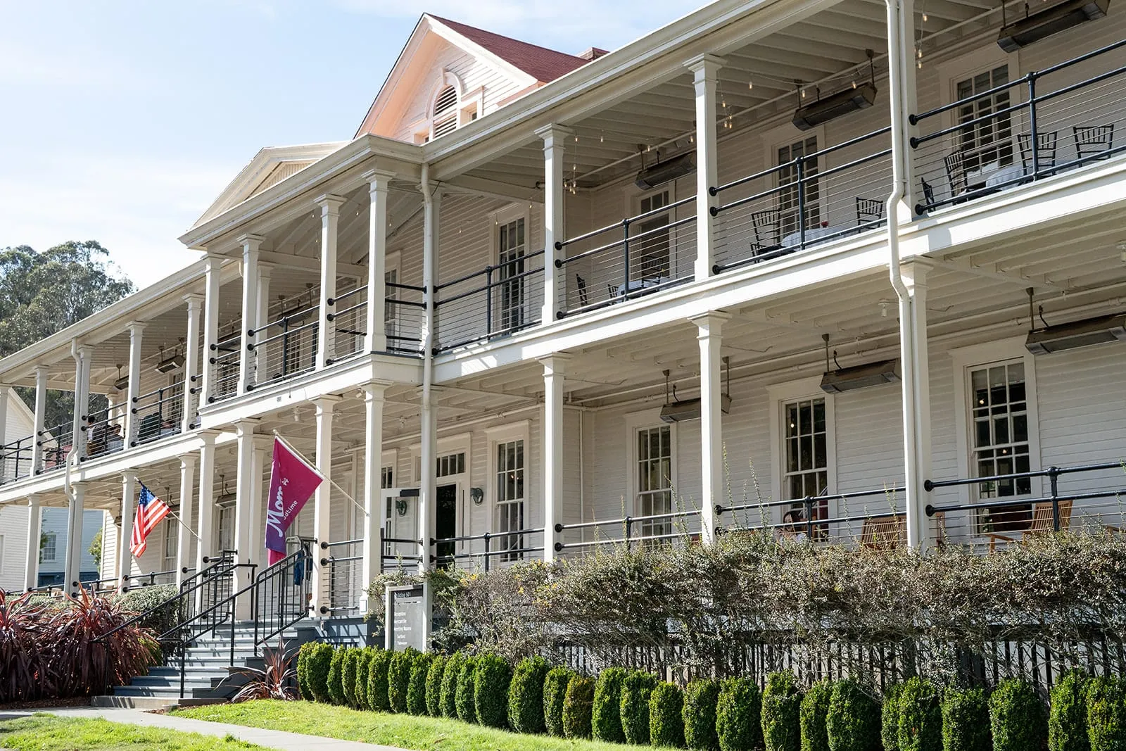
Rather than competing with Cavallo Point, I treated the GoodTime brand as a layer within it: present when it added energy, clarity, or utility, and intentionally absent when the setting could do the work on its own.
That restraint became one of the most important creative decisions of the project.
The atmosphere should speak for itself.
Building the visual world
Finding the direction
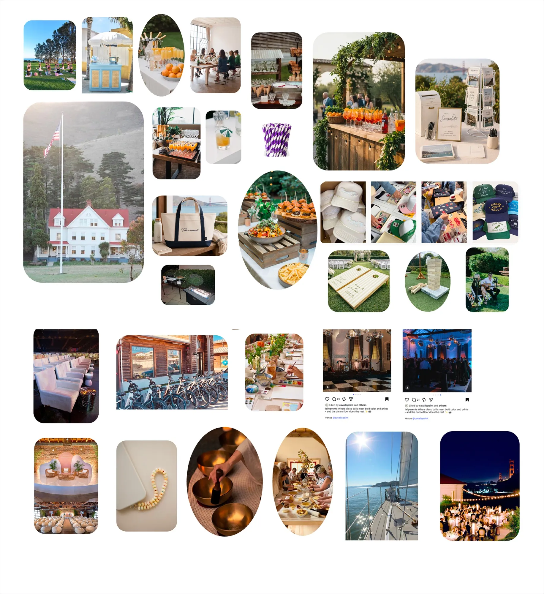
It started with a moodboard built from the venue itself: Cavallo Point’s historic buildings, the bridge, the bay at golden hour, and the small hospitality details that make a place feel cared for. Alongside it, a set of type-led references pointed toward something with a vintage, hand-lettered warmth rather than a typical tech-event look.
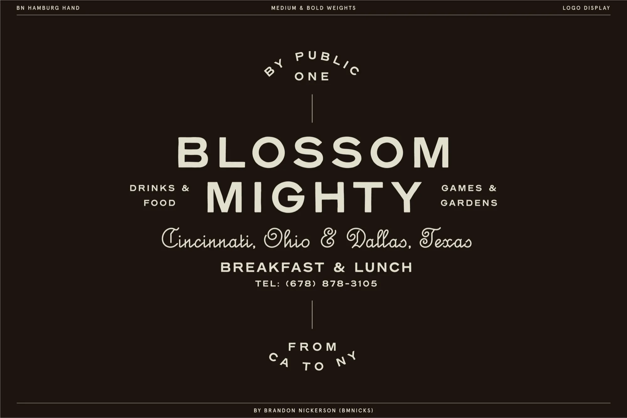
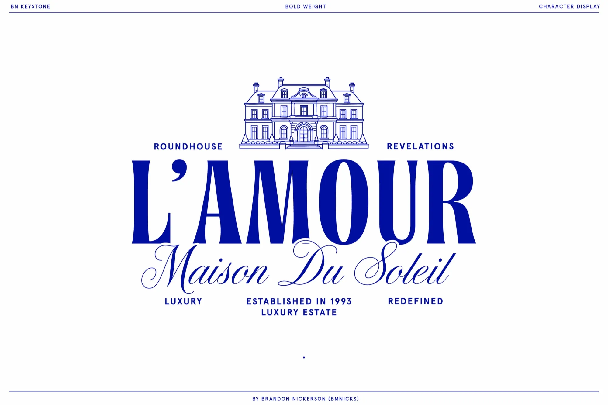
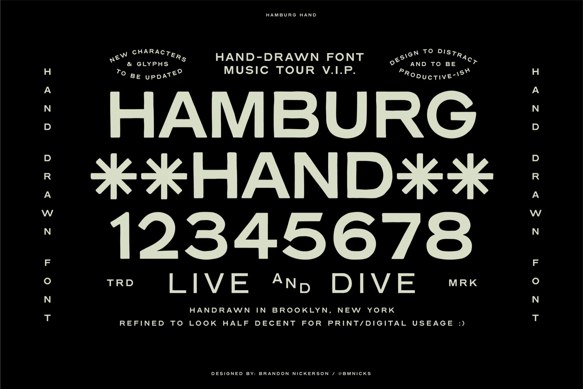
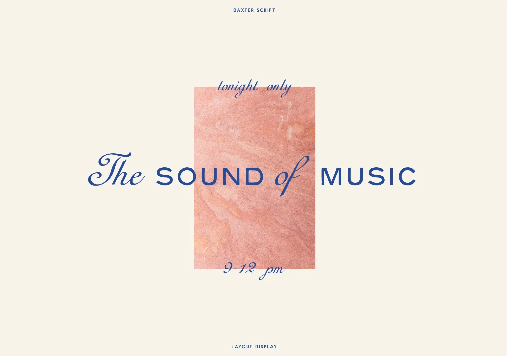
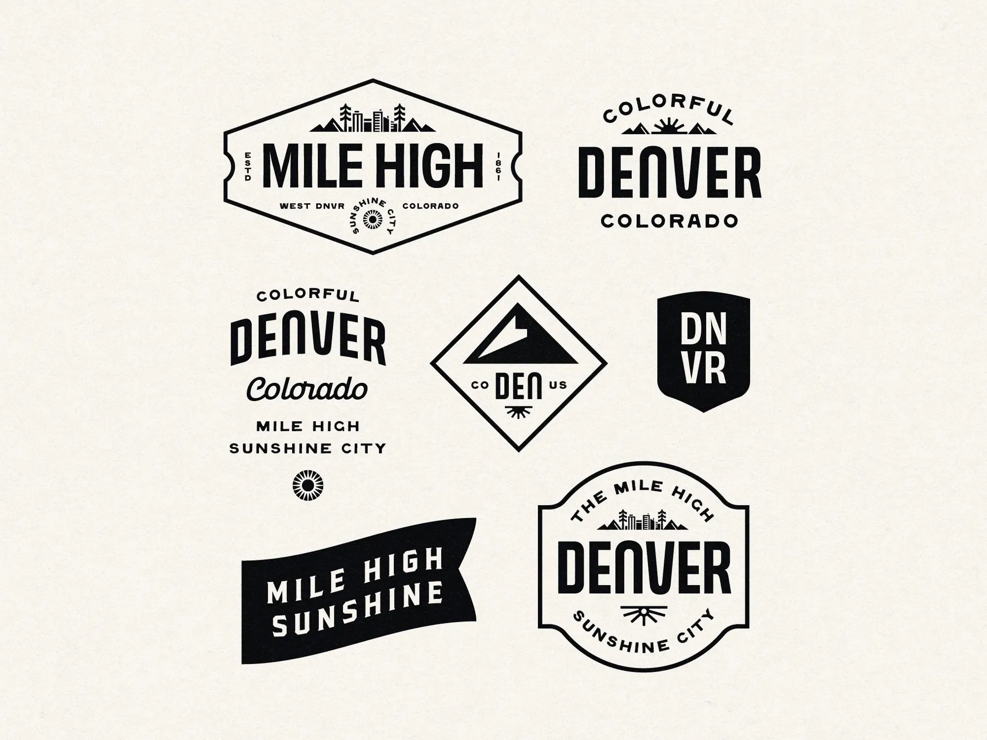
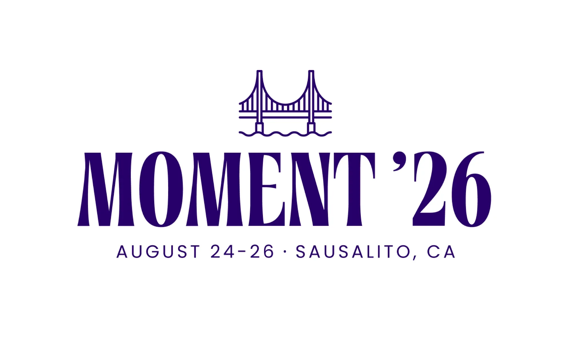
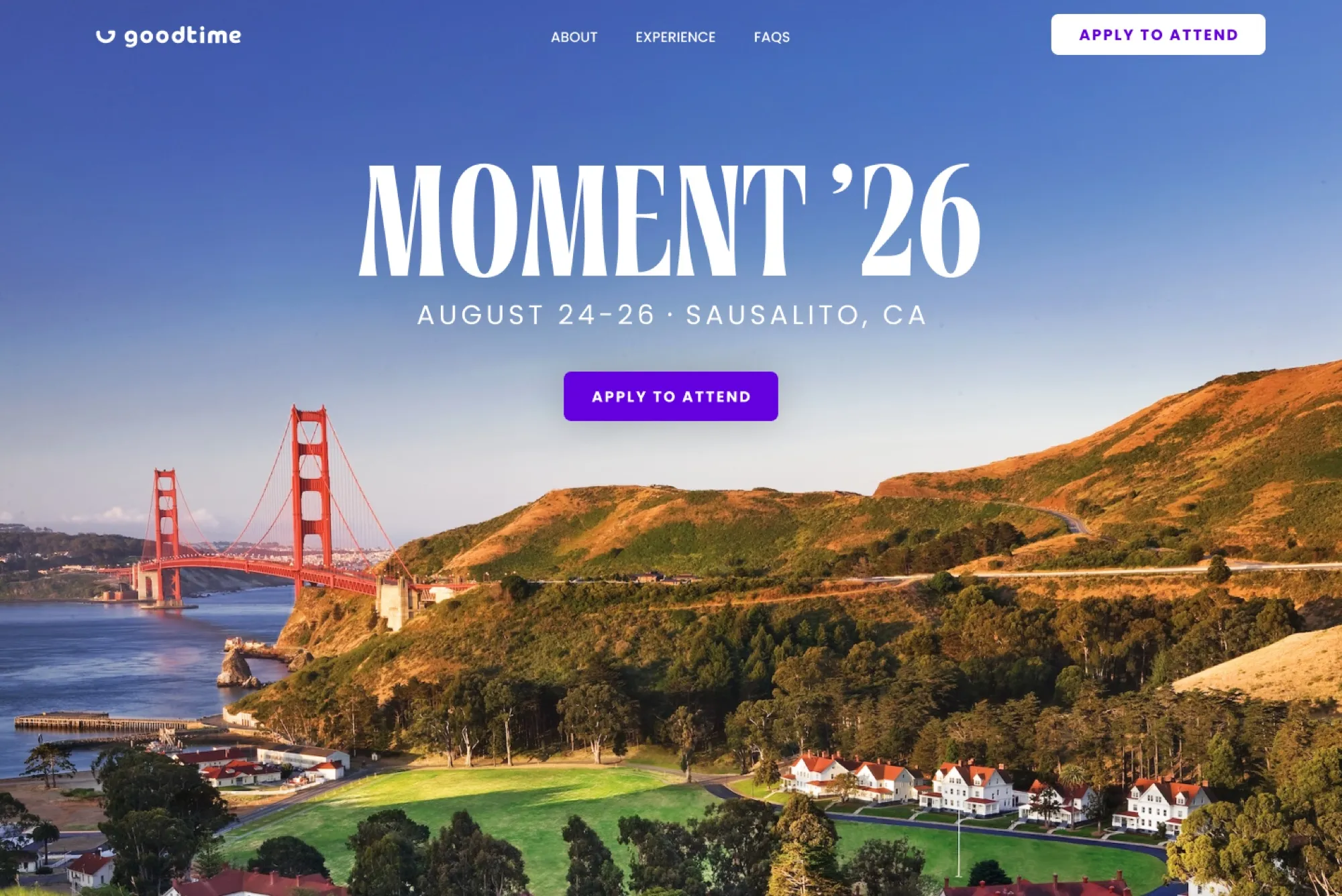
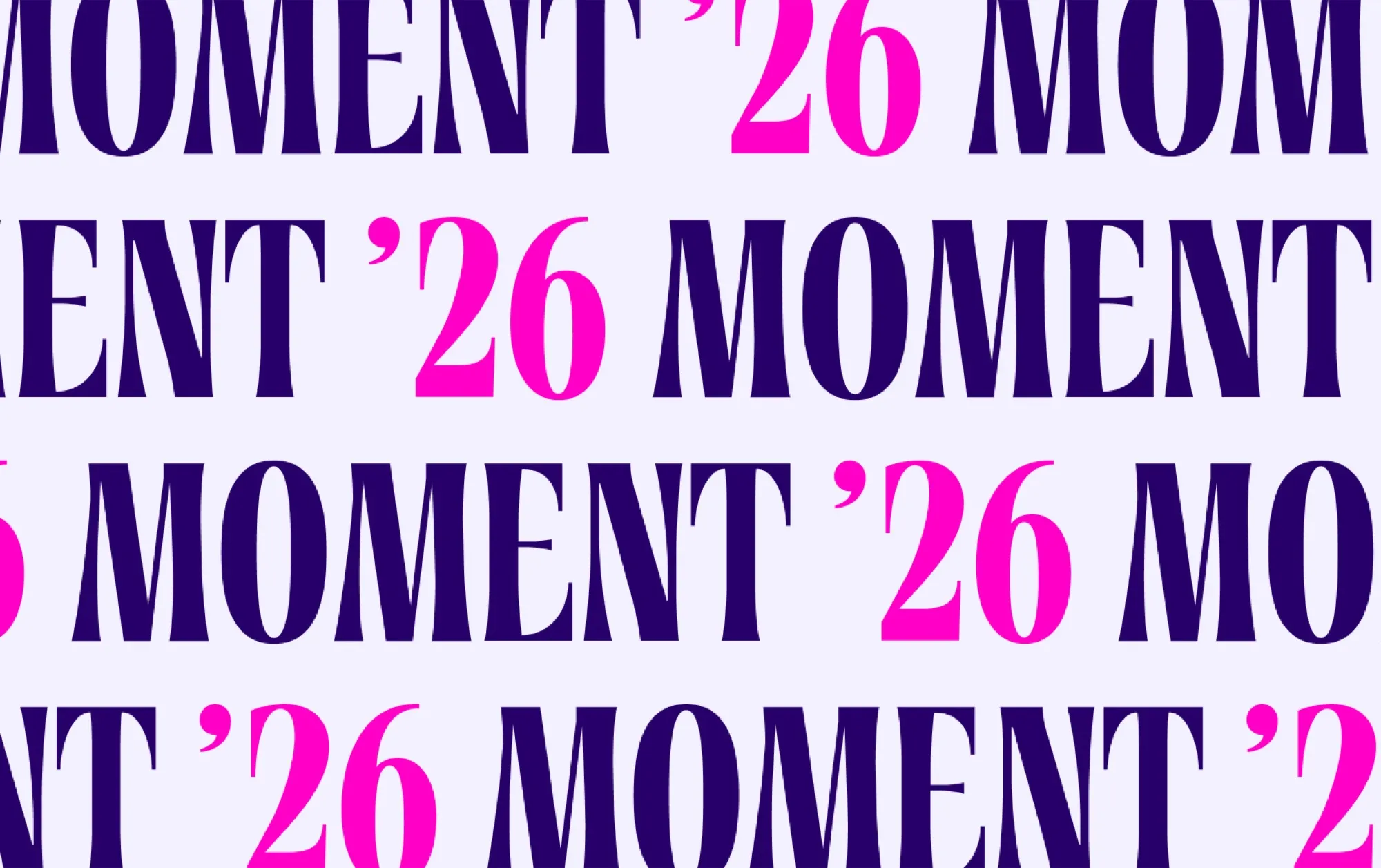
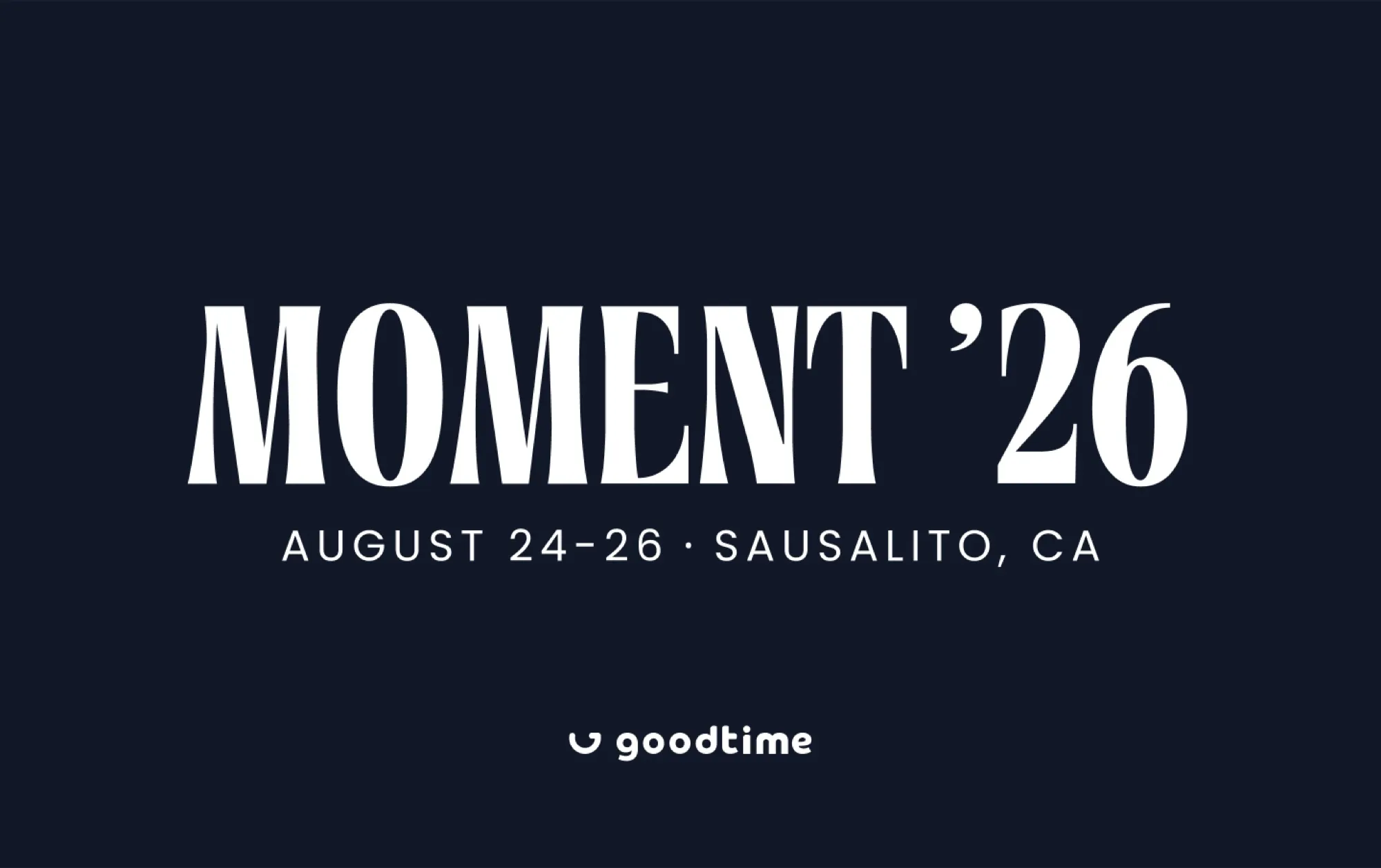
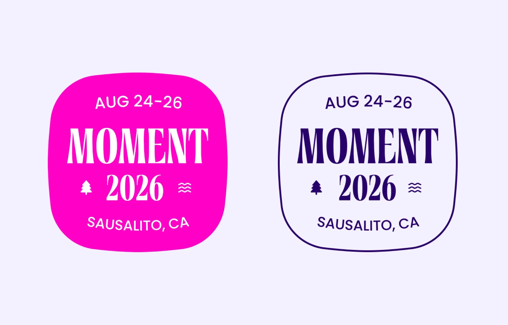
From there, I explored two directions. The first leaned editorial, with a tall condensed serif that felt confident and premium, tested across solid color, photography, a repeating pattern, and badge lockups.
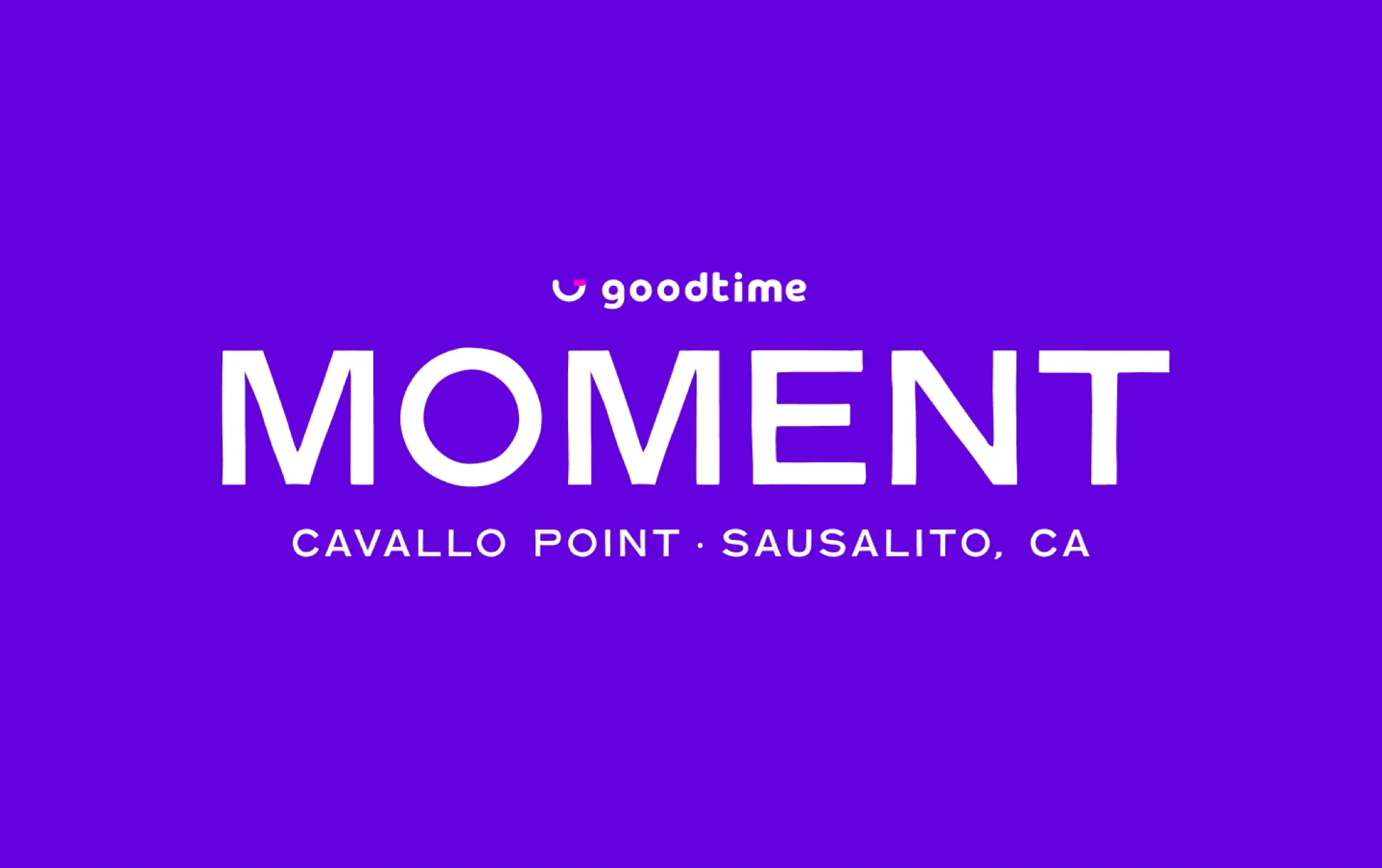
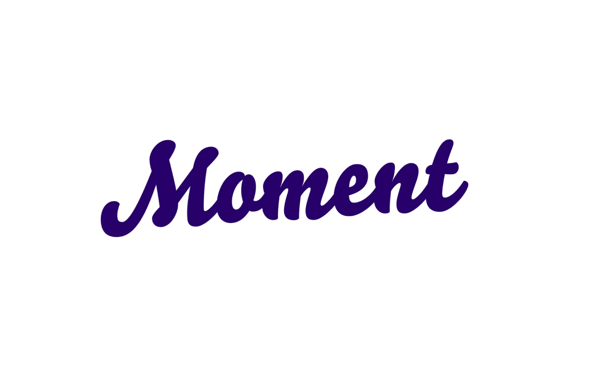
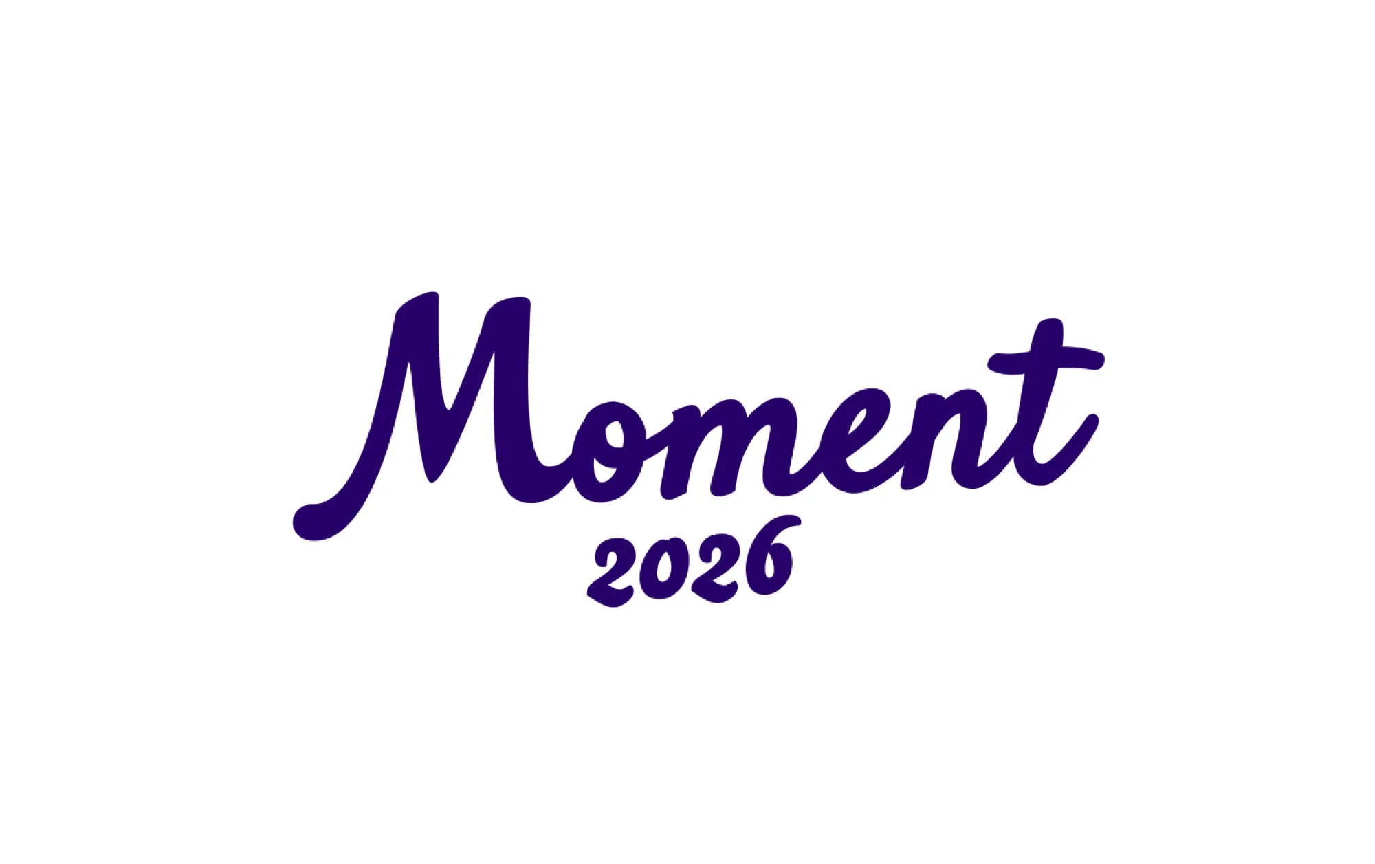
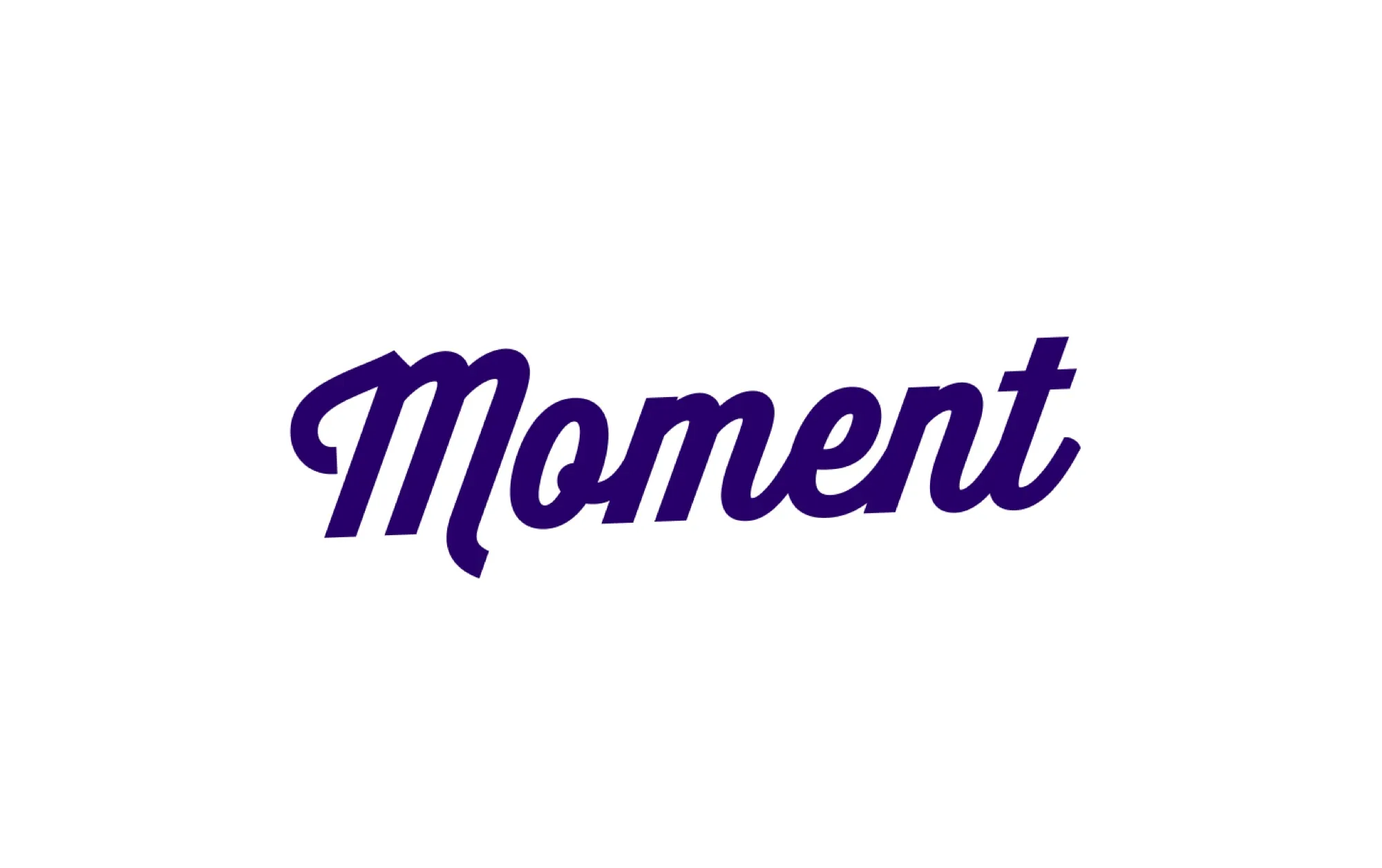
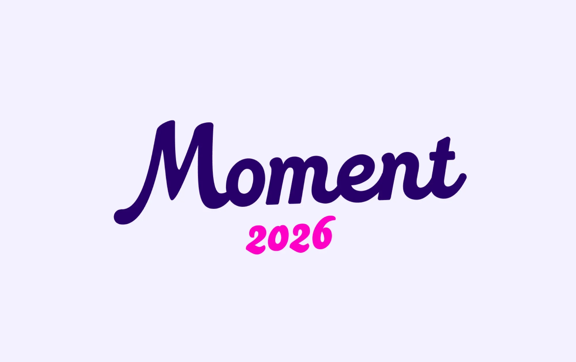
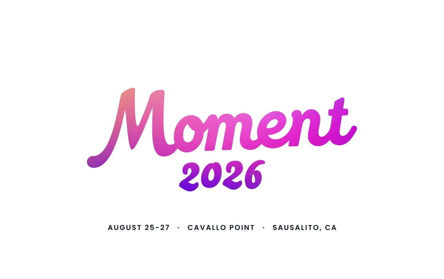
The second went warmer and more relaxed, built around a bold retro script. It felt closer to the coastal setting and to the idea of a moment worth remembering, so it became the foundation for the final identity.
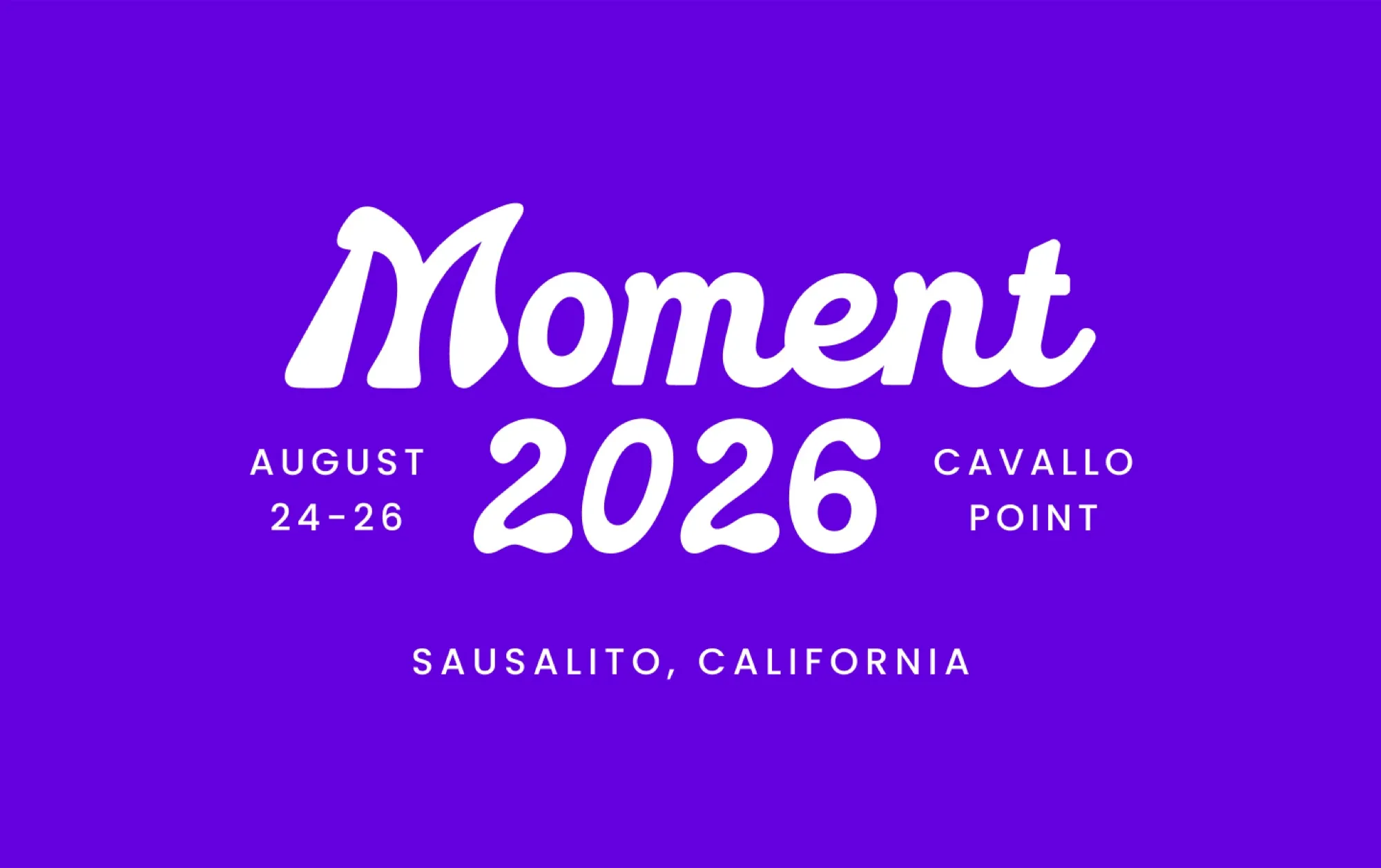
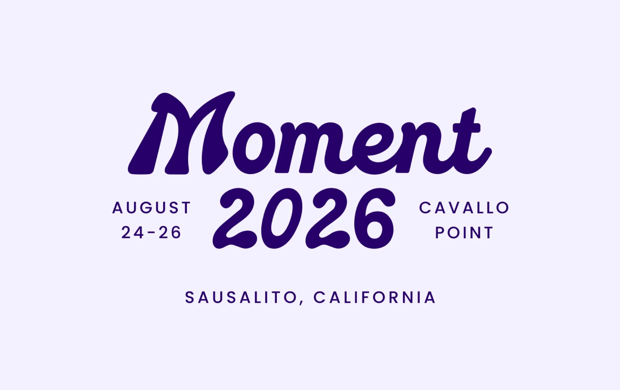
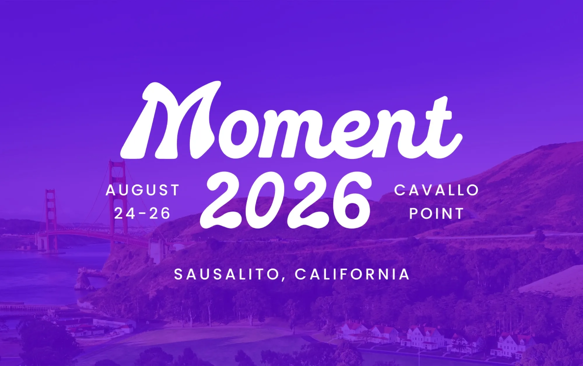
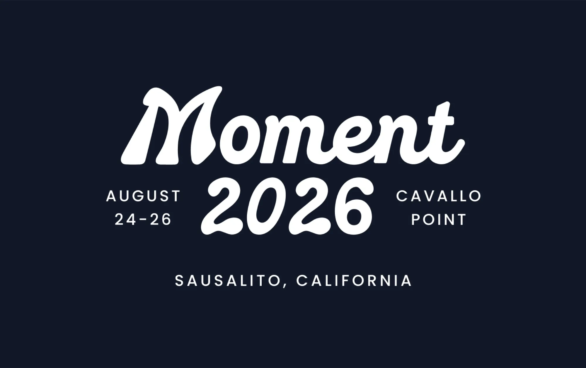
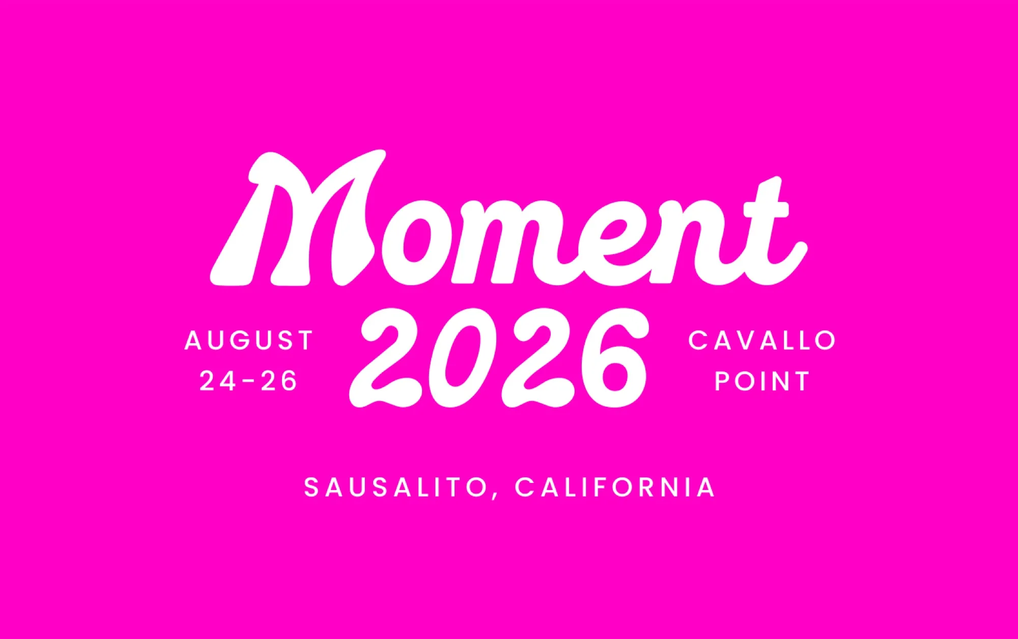
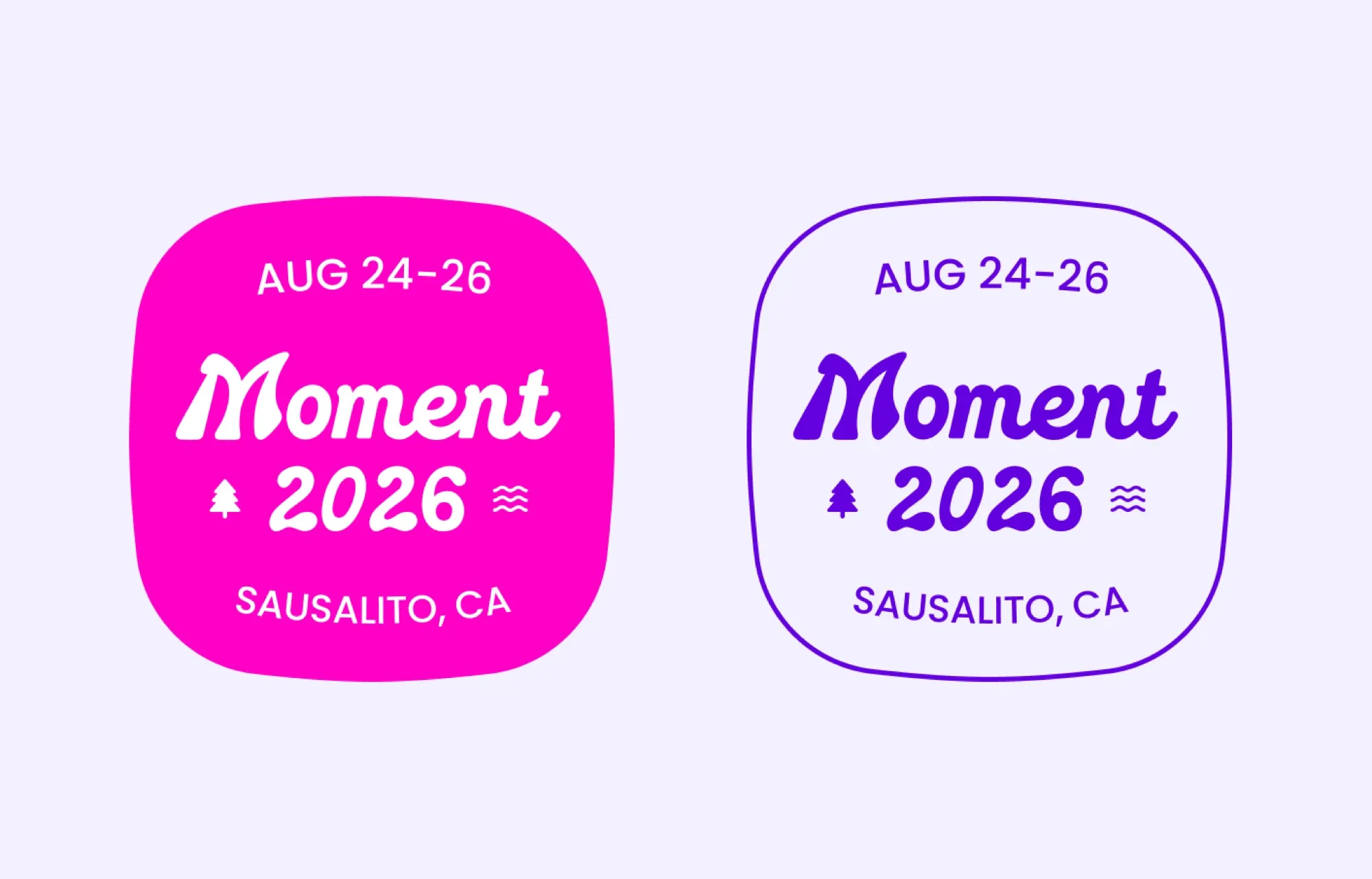
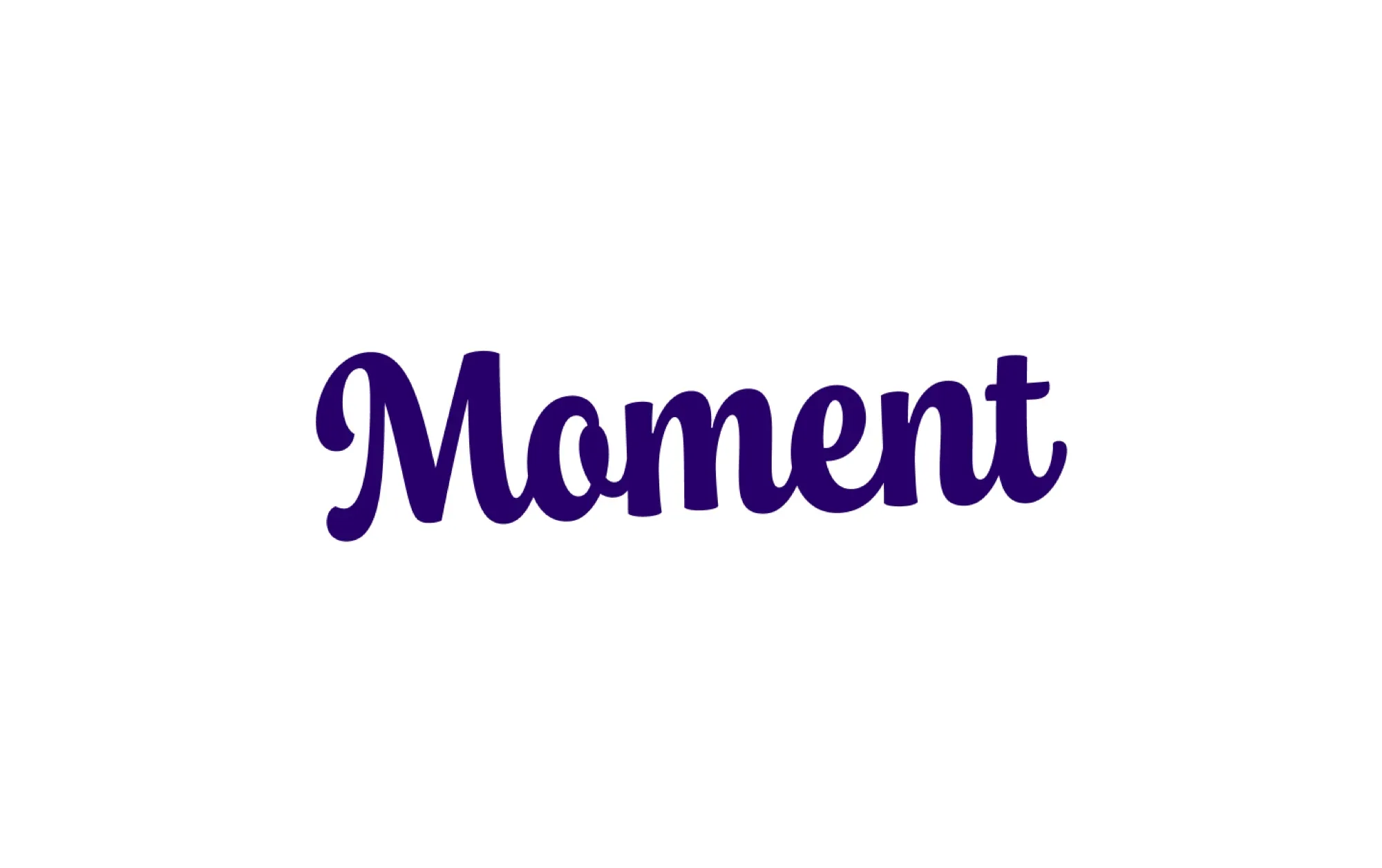
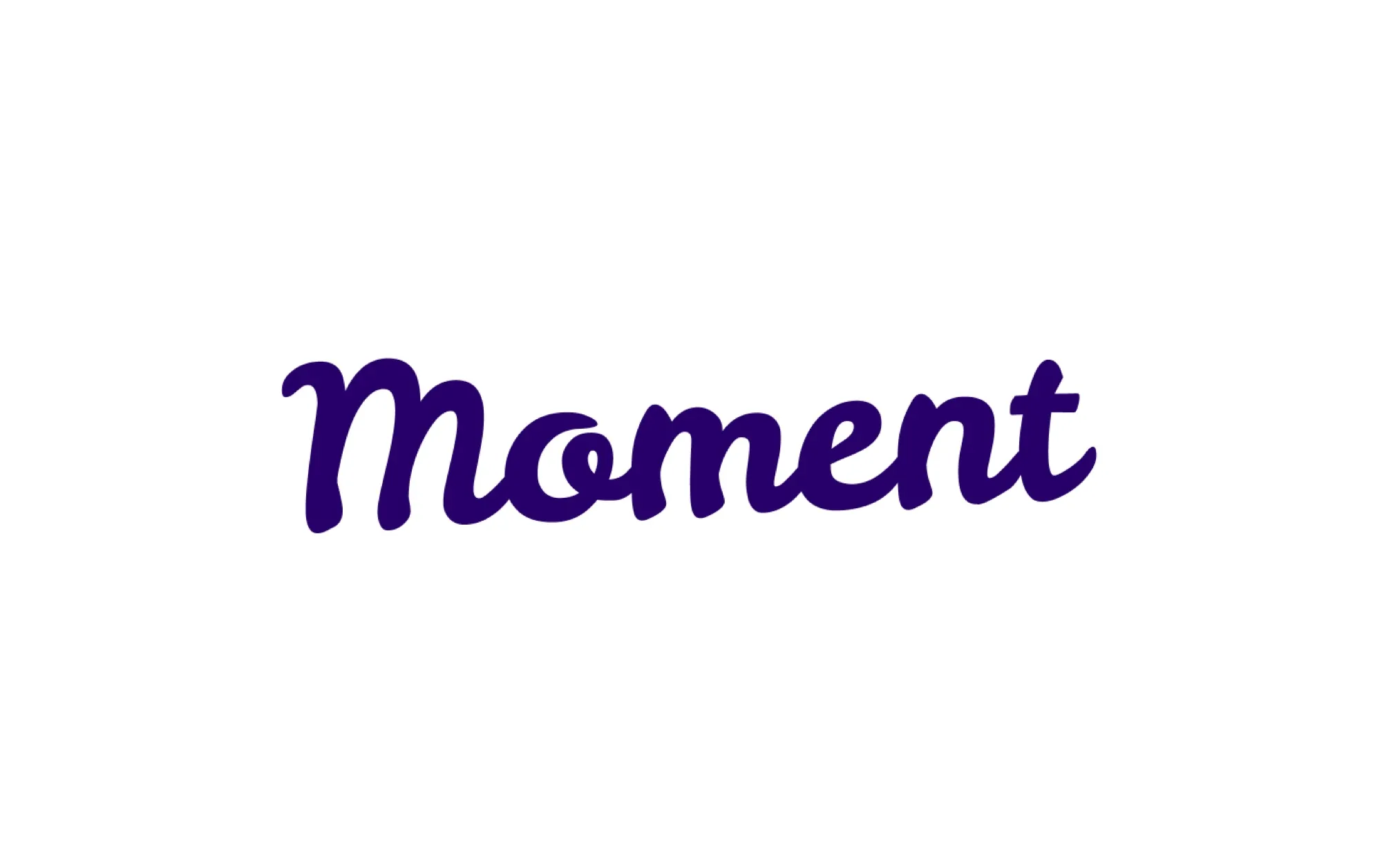
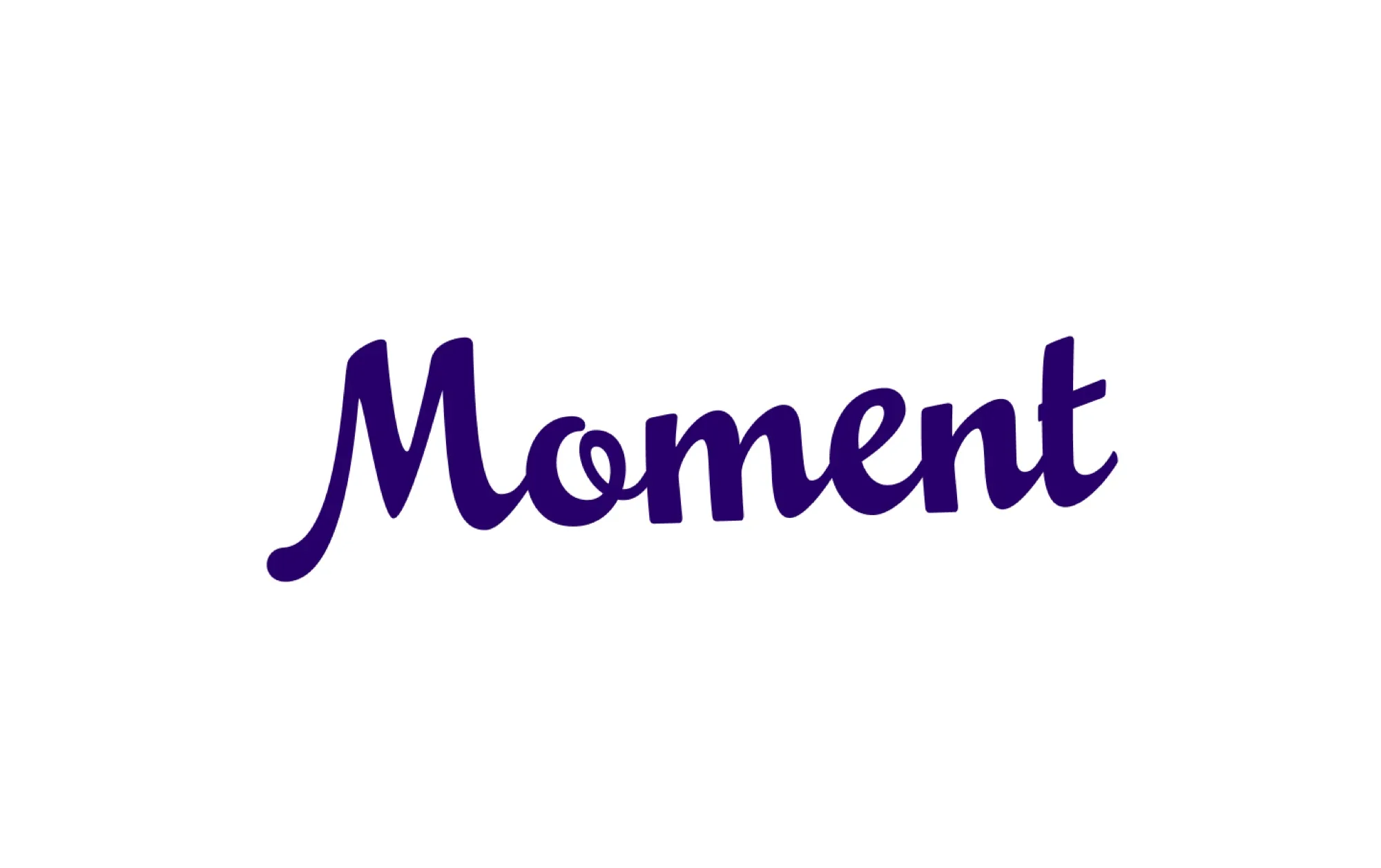
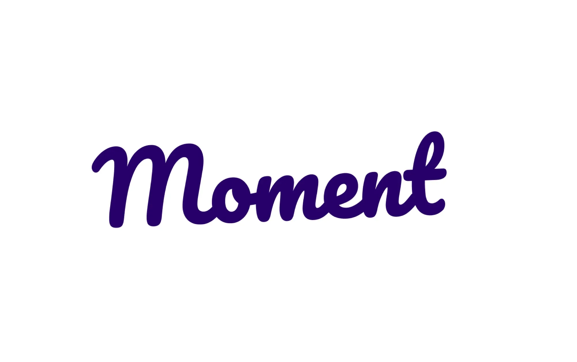
Finding the right script took its own round of exploration, comparing weight, slant, and personality until the wordmark felt friendly without losing polish.
Coastal Glow
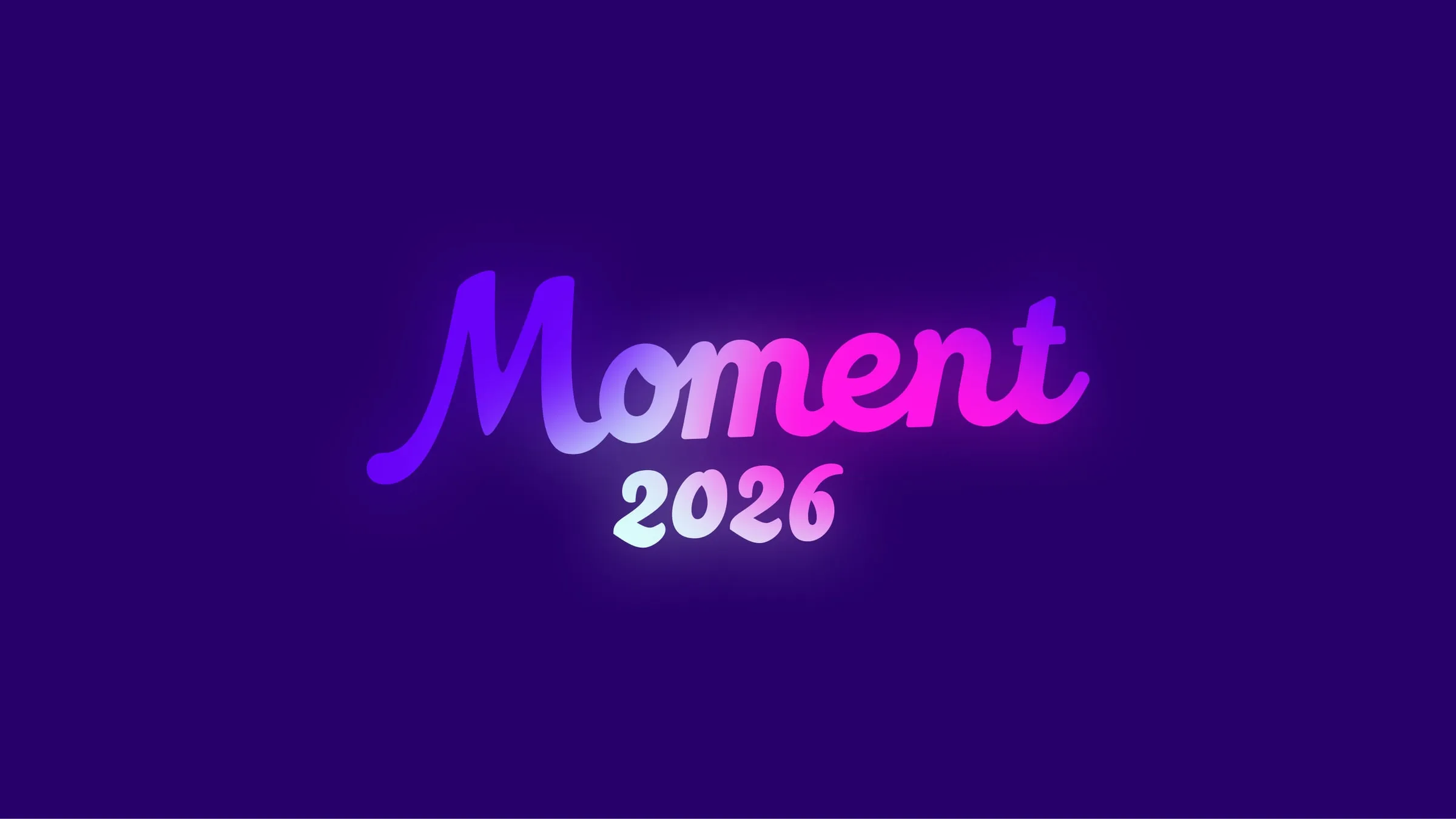
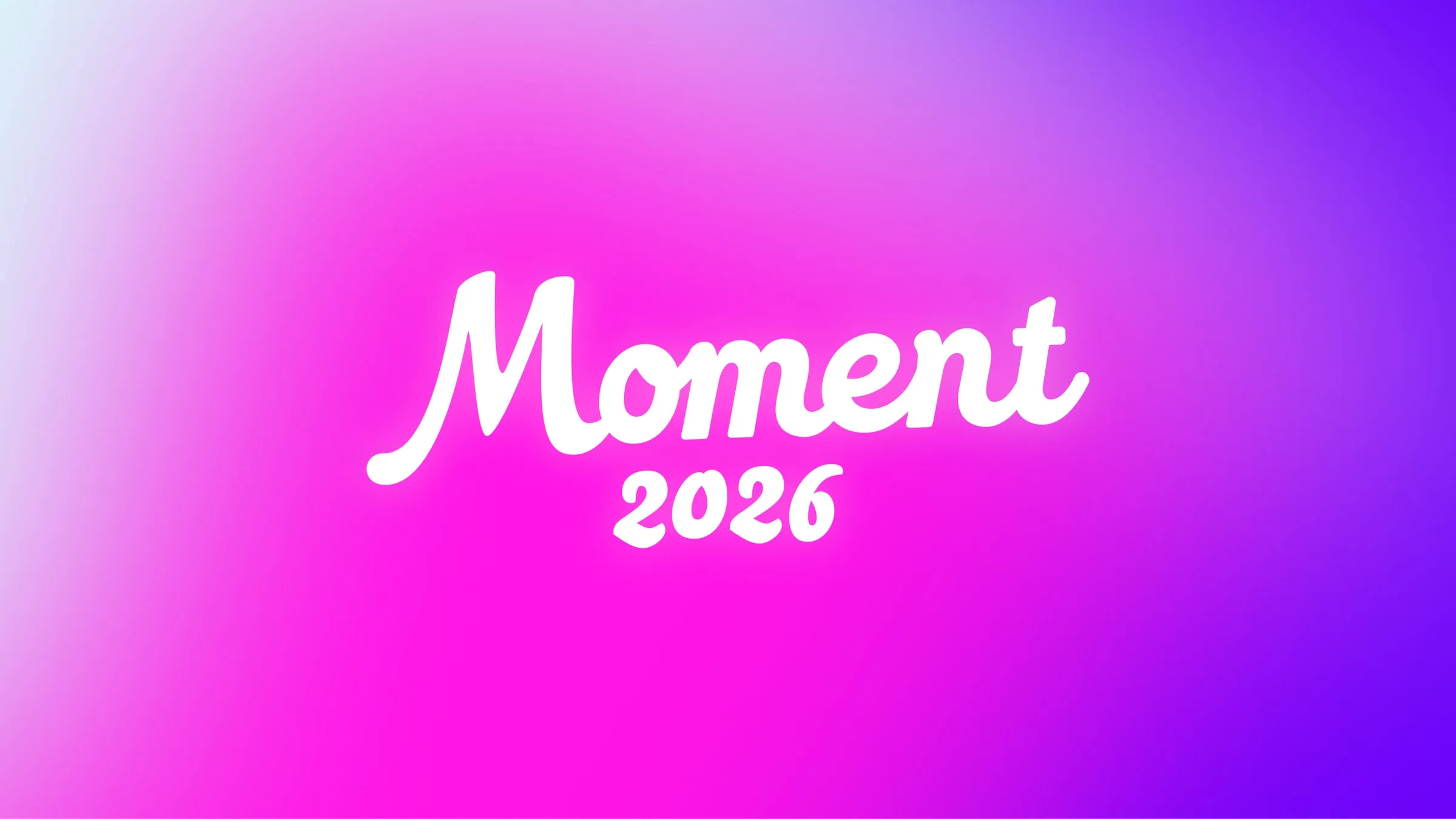
I developed Coastal Glow, a visual direction that brought GoodTime’s existing identity into the setting instead of competing with it.
Inspired by the bay, it paired purple, magenta, teal, and a coastal gradient with bold Poppins to feel bold, relaxed, and refined. A motif from the GoodTime logo could be tiled, stretched, or cropped, and photography leaned cinematic.
I codified it all in a creative guidelines deck so every partner, vendor, and teammate worked from the same playbook.
A souvenir system
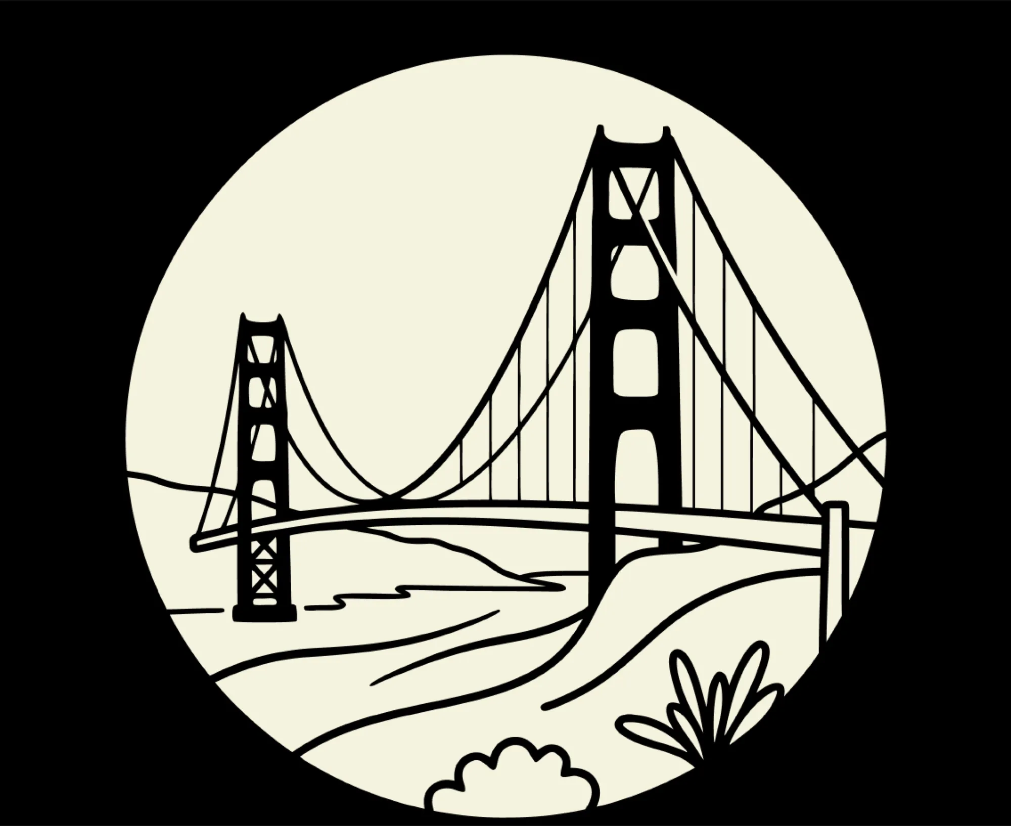
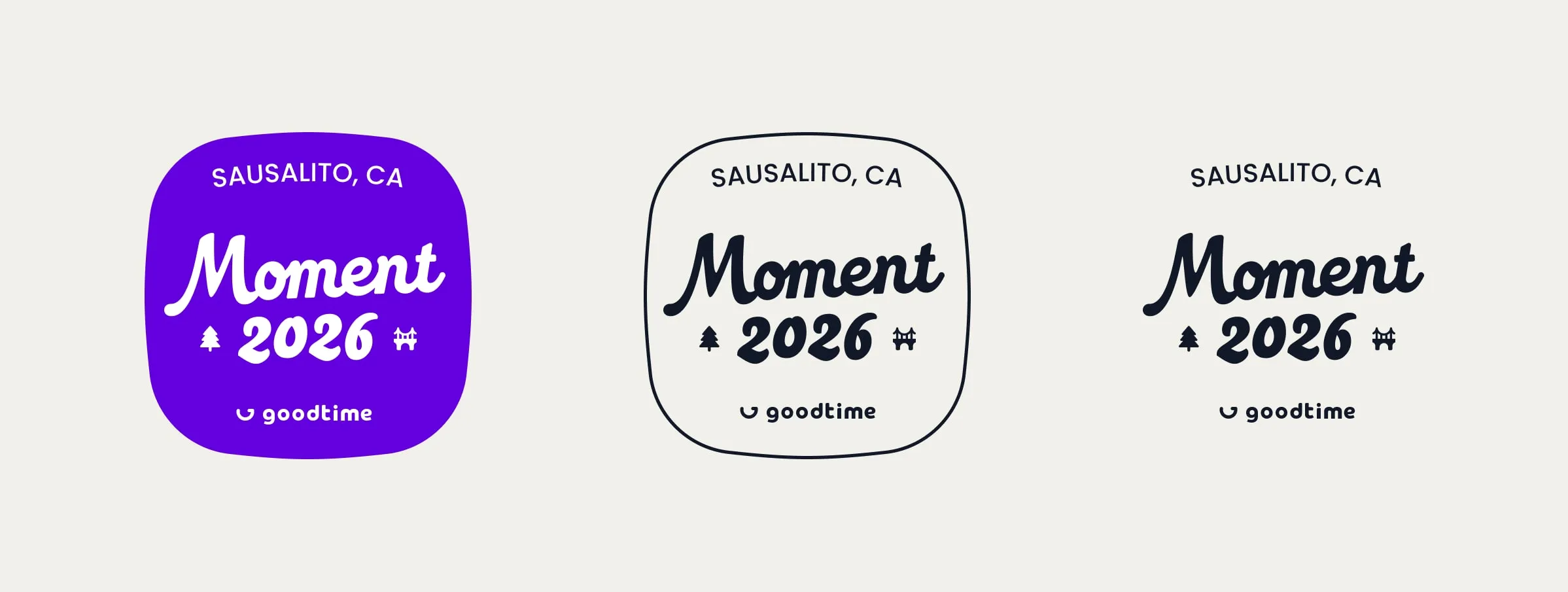
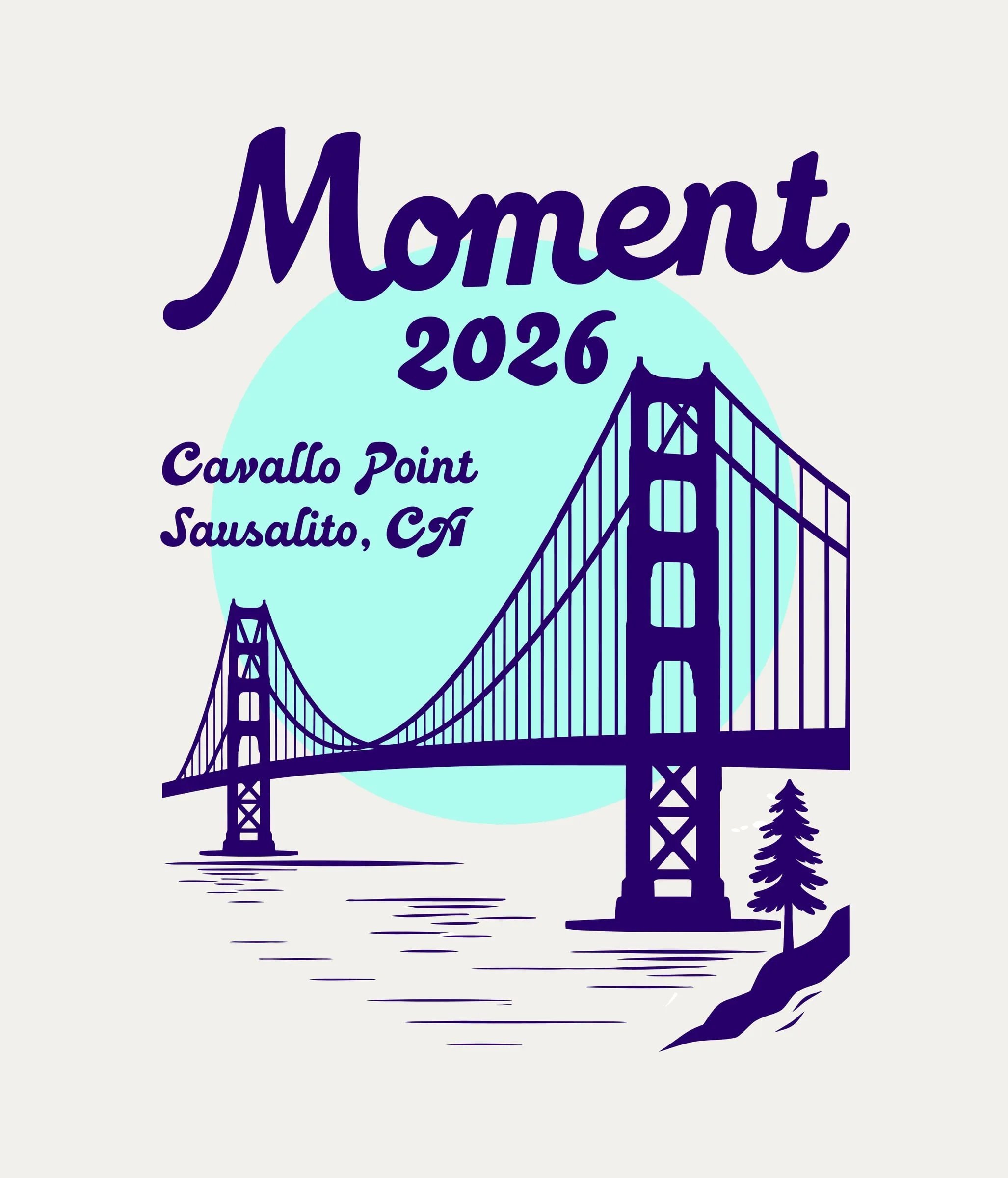
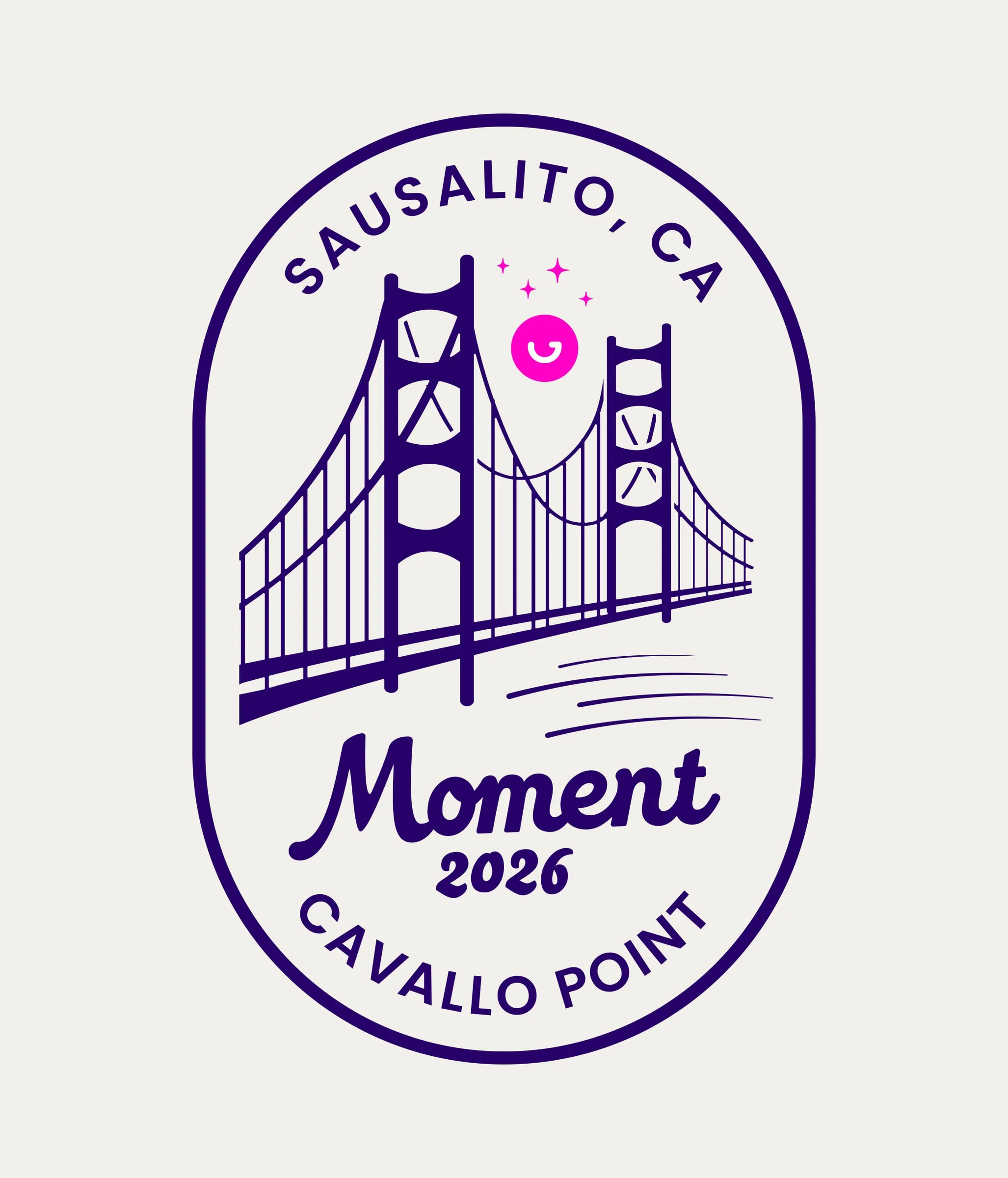
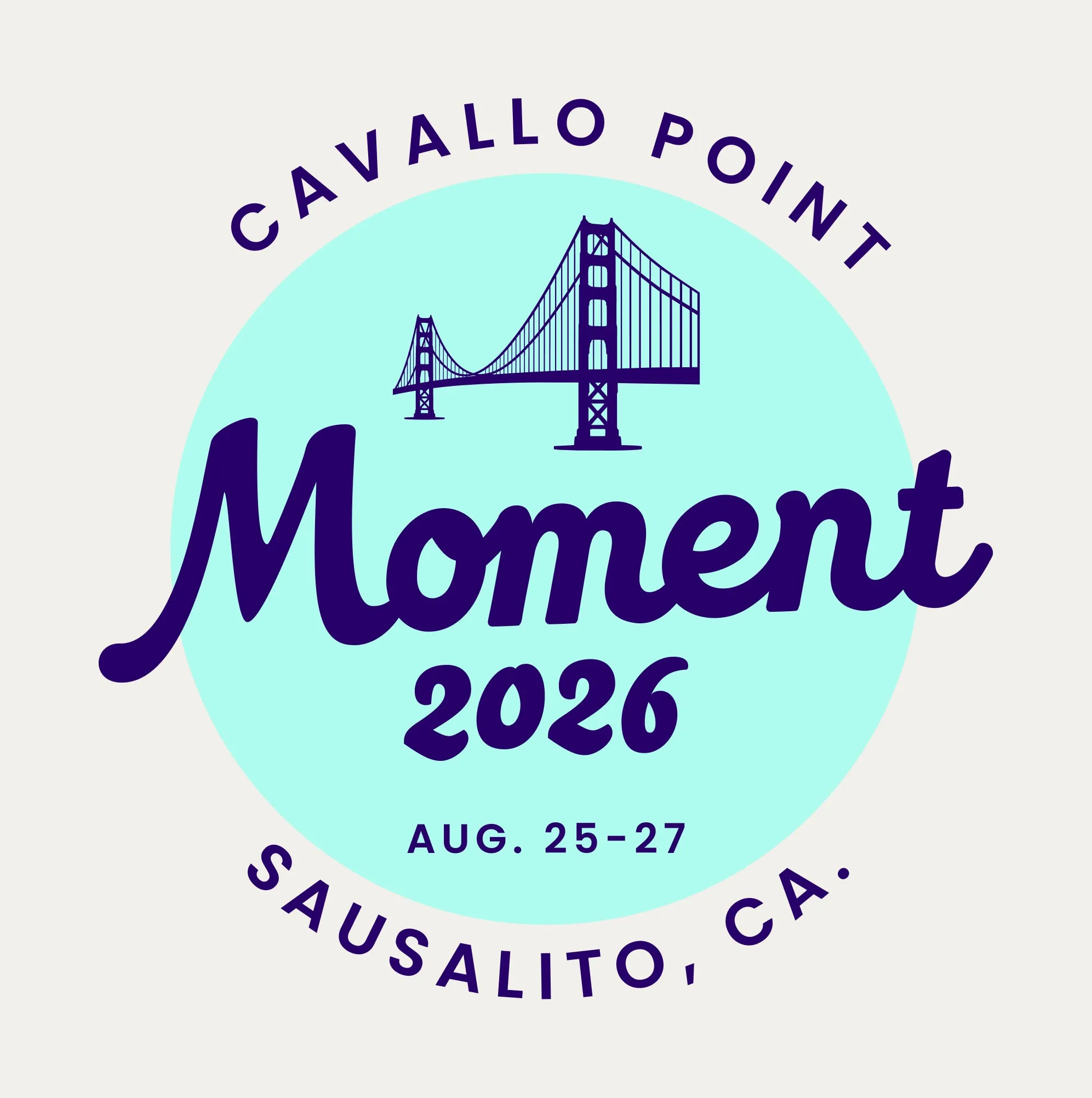
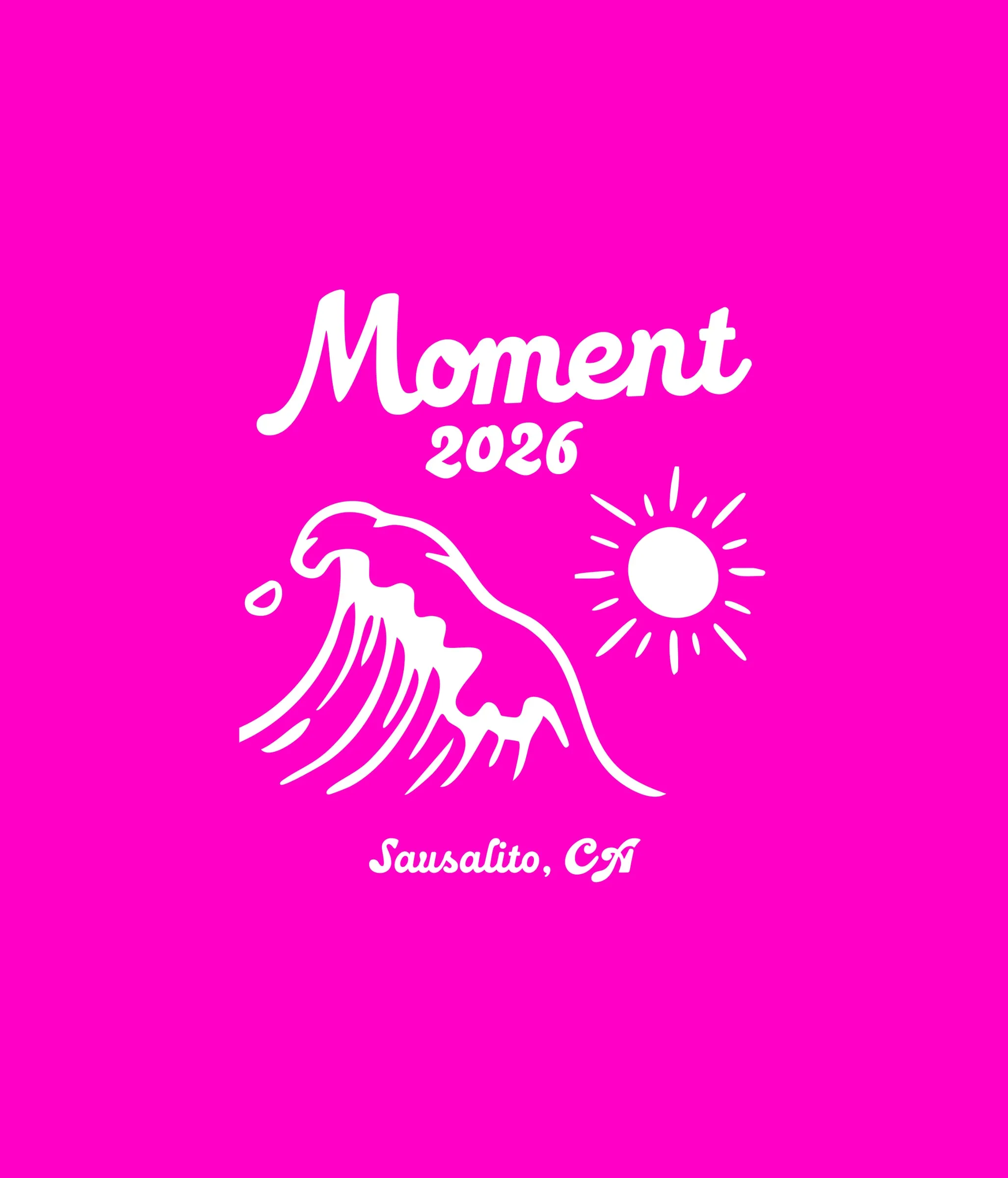
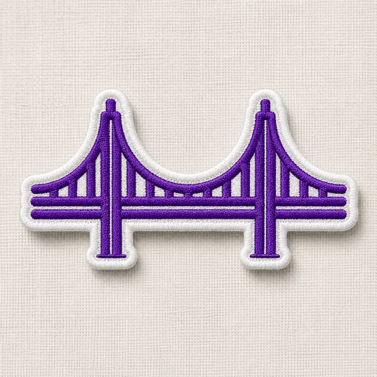
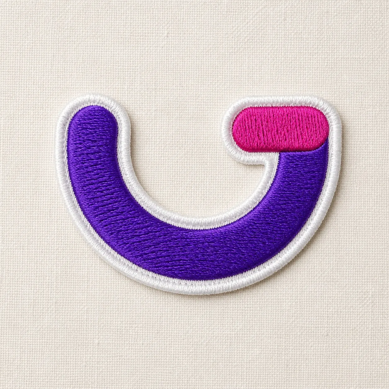
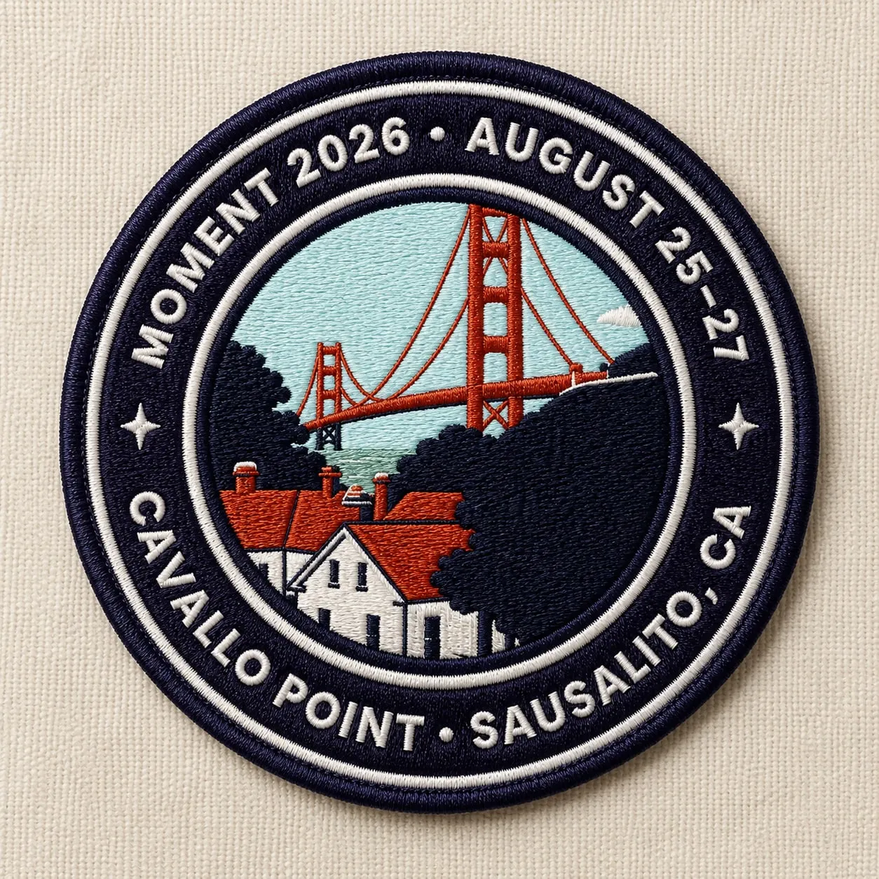
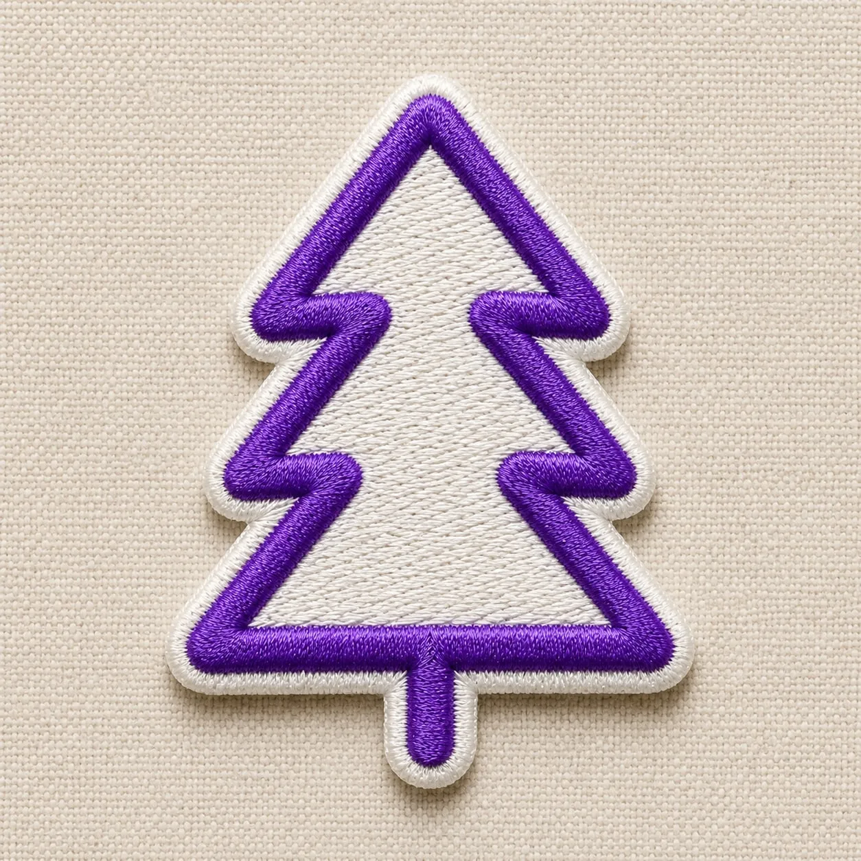
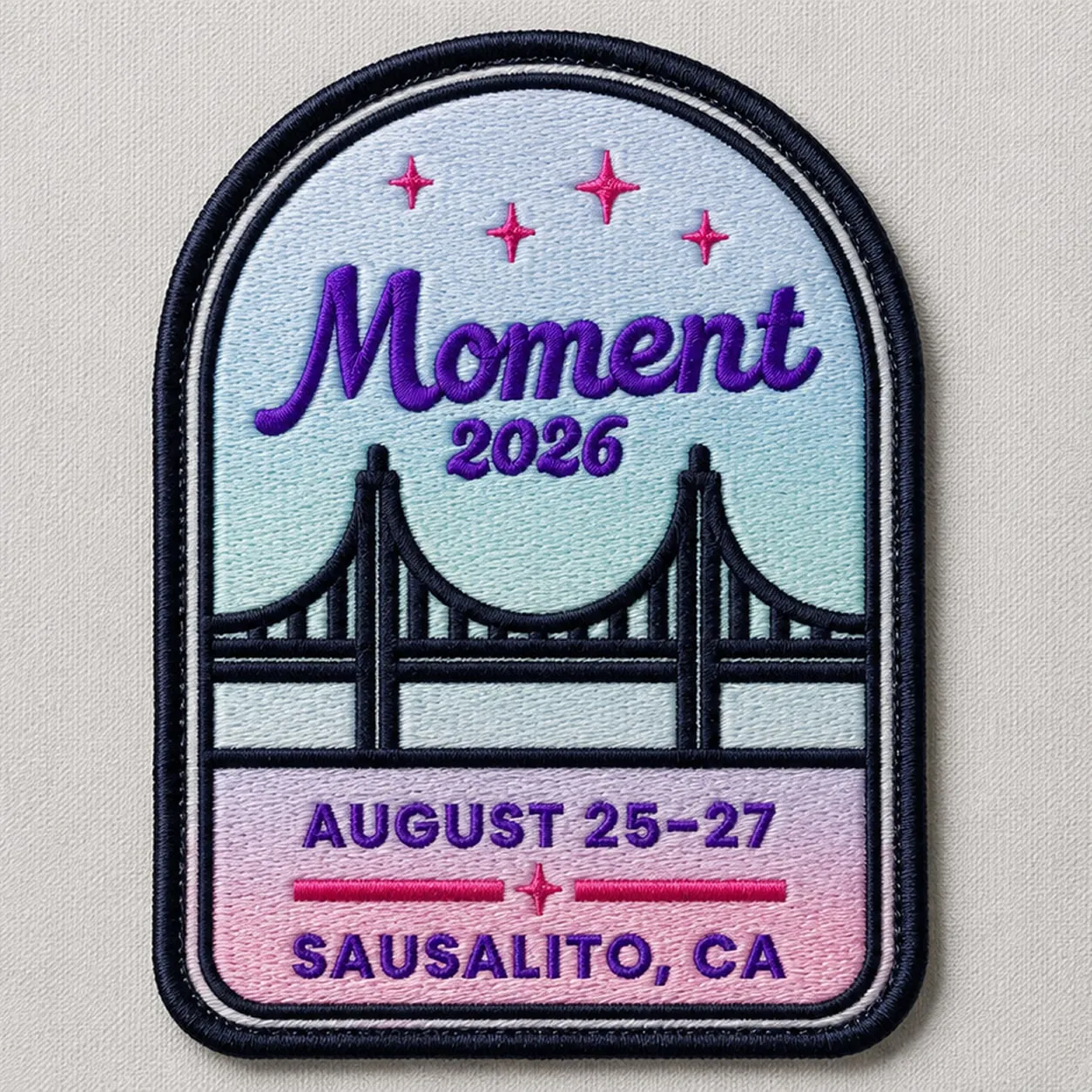
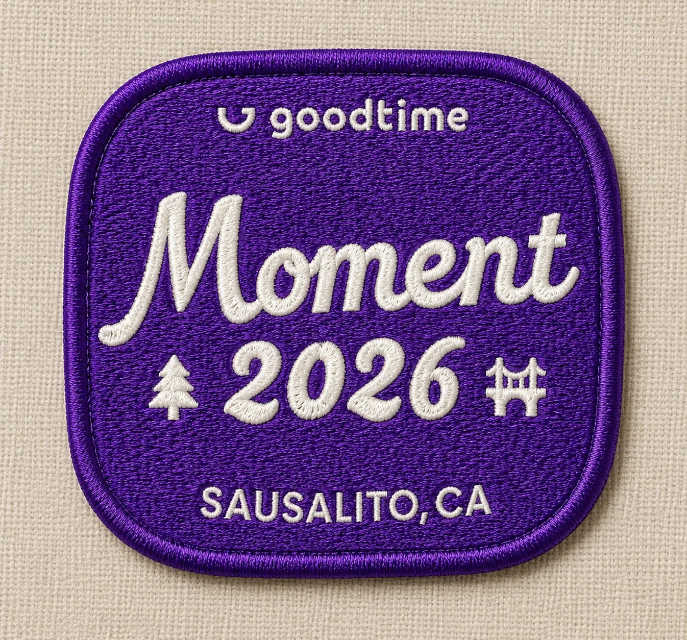
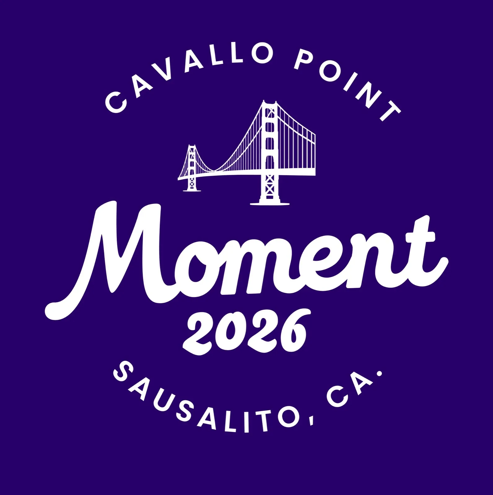
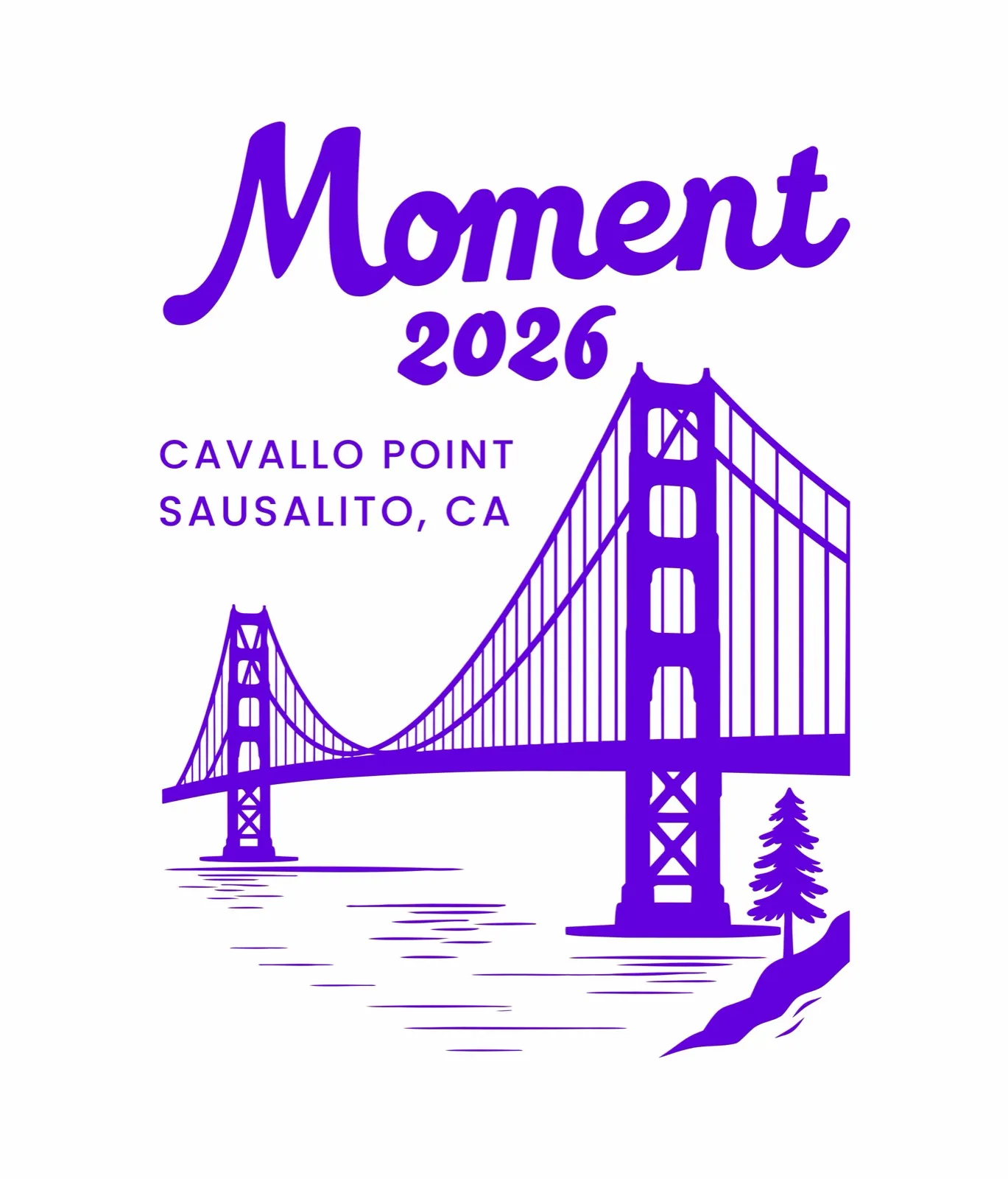
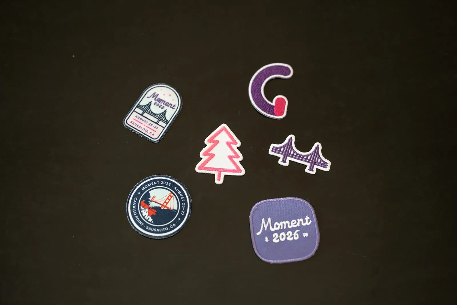
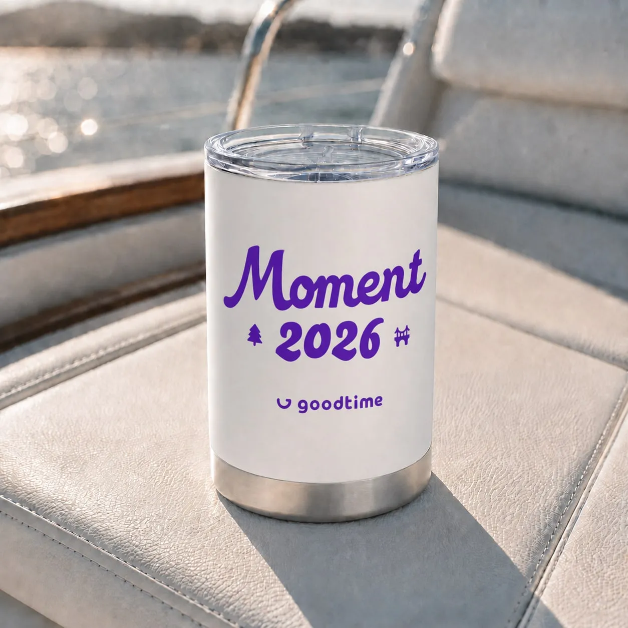
Alongside the core identity, I built a set of illustrated marks from the Golden Gate, Cavallo Point, and the bay. They gave Moment a relaxed, souvenir-like second voice for the things guests would take home: apparel, patches, and gifts. The rule for swag was simple: every piece carries both the Moment logo and the GoodTime mark, with Sausalito, Cavallo Point, or the dates as optional details.
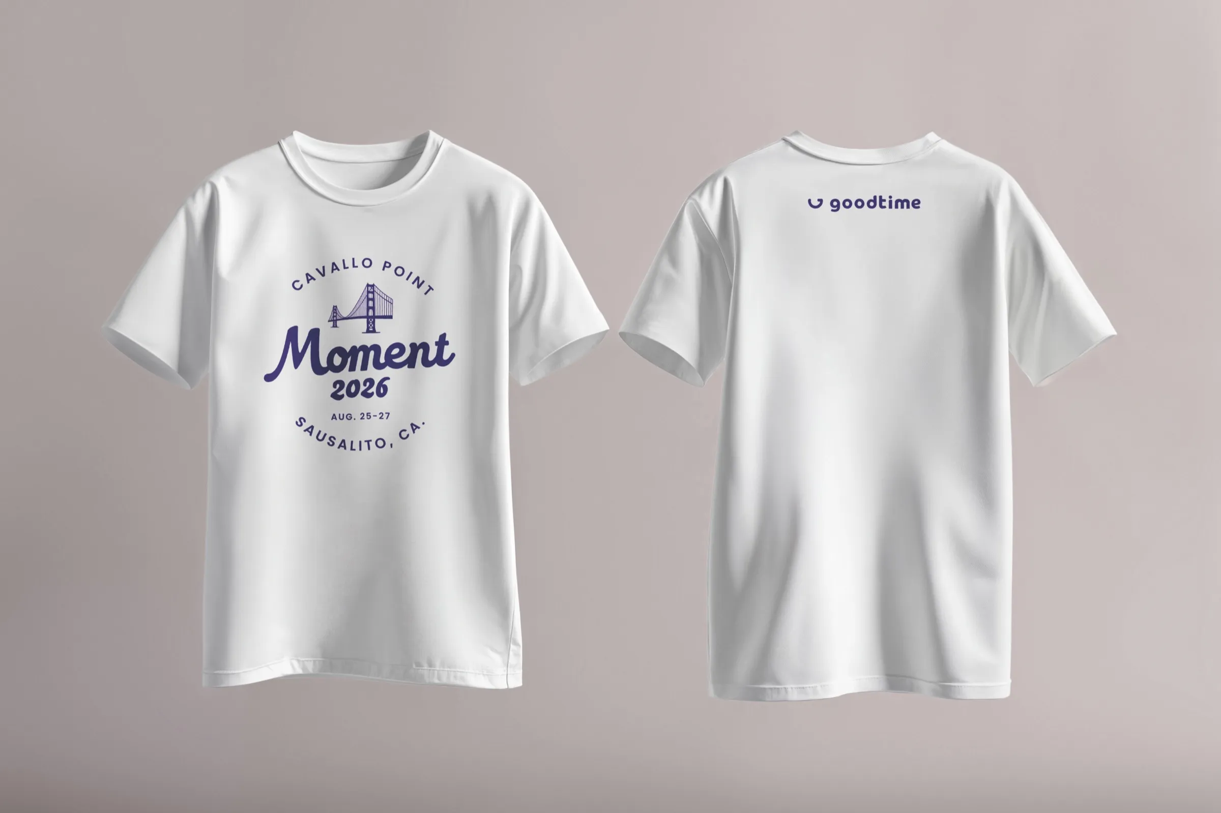
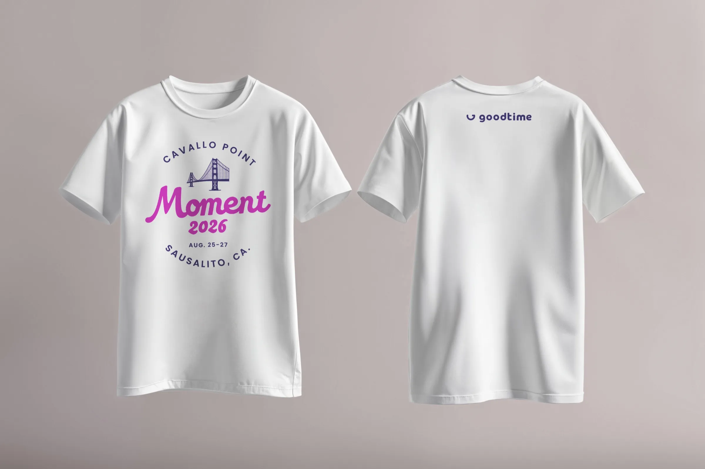
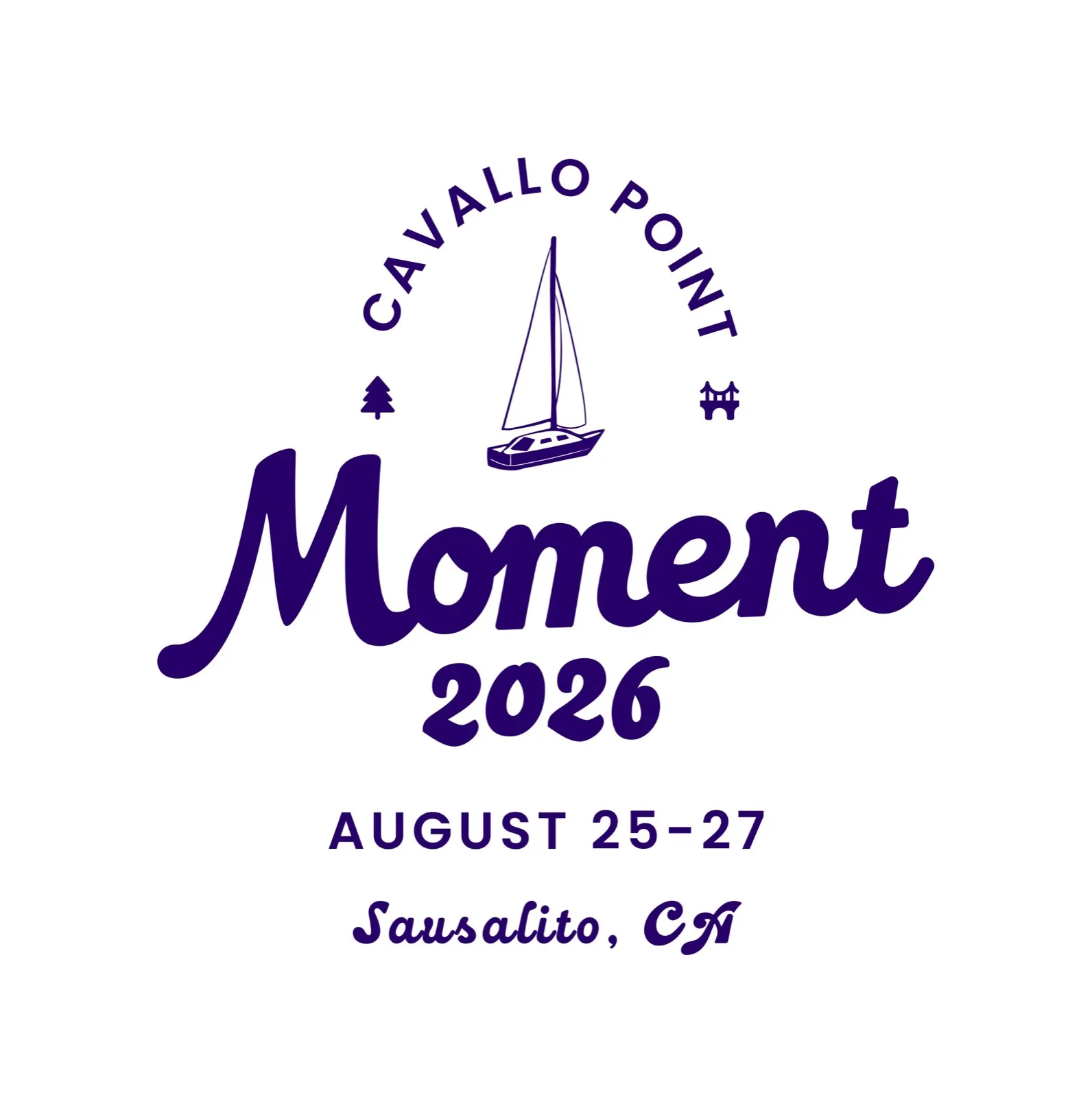
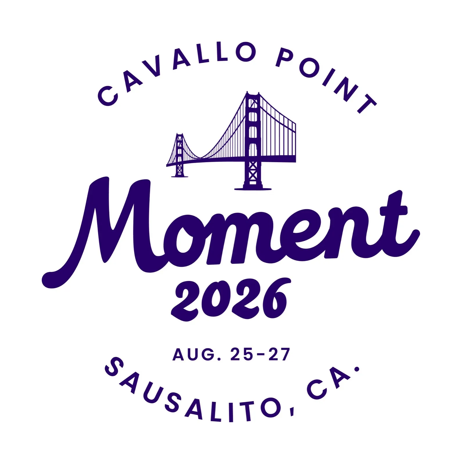
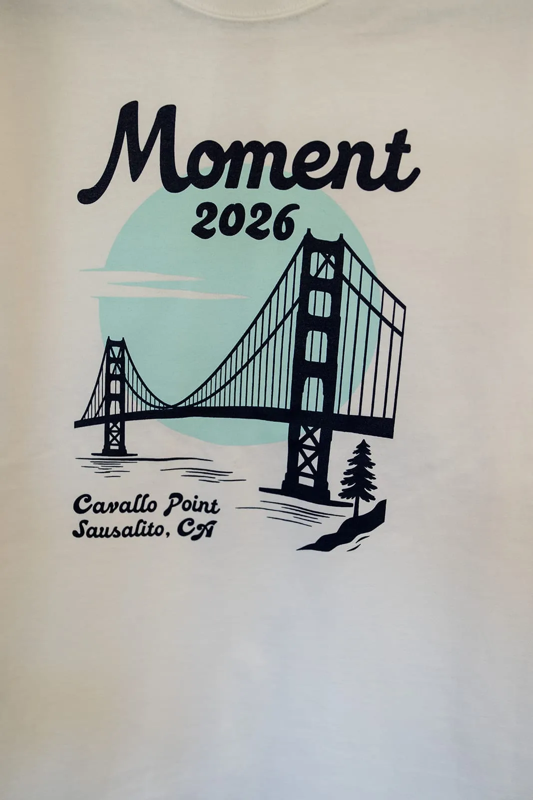
The tee
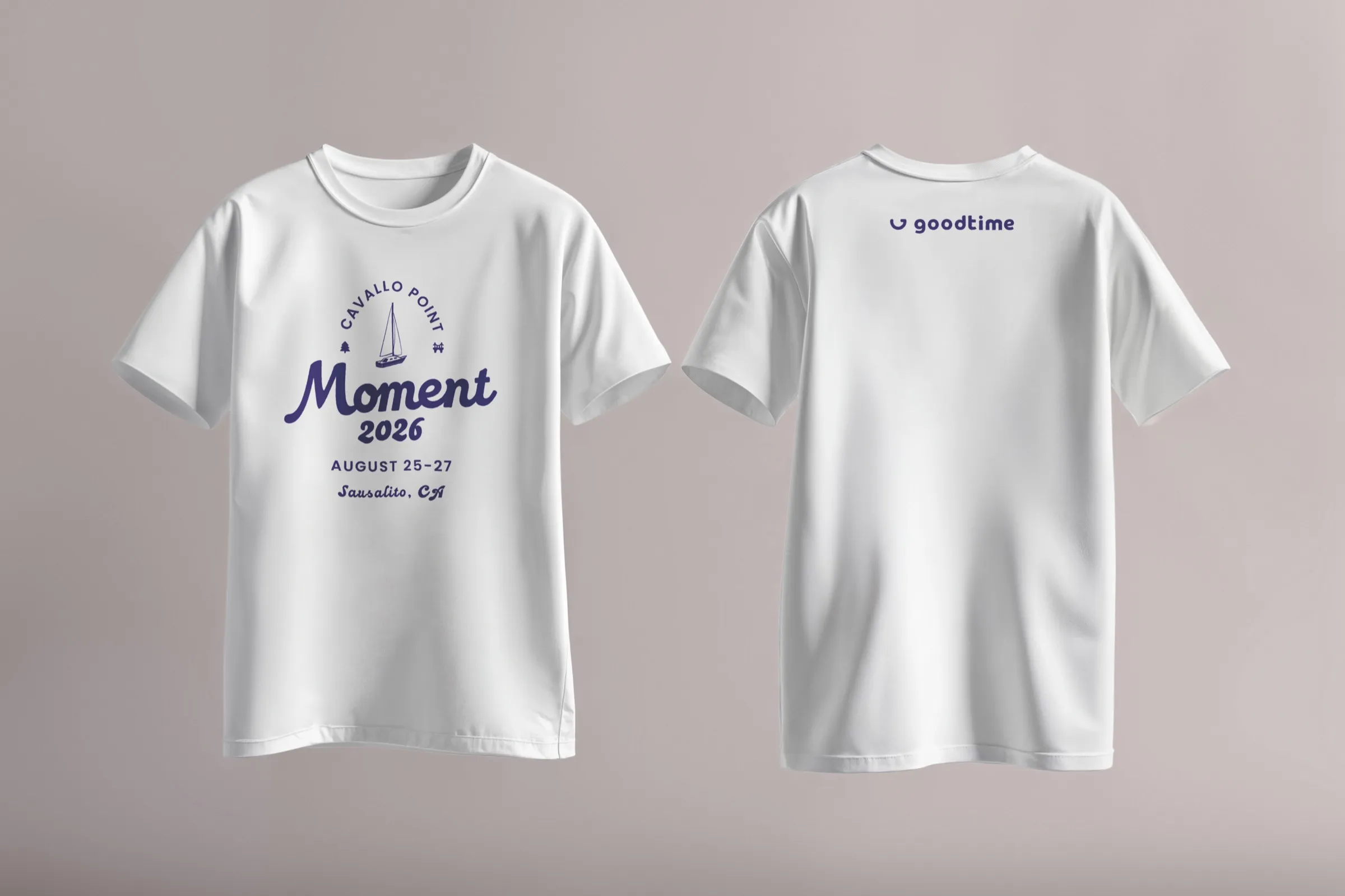
The T-shirt went through several rounds before landing on the final design. Each version tested a different mix of landmarks, lockups, and color, with the GoodTime mark kept small on the back.
One system, an entire experience
Designing every touchpoint
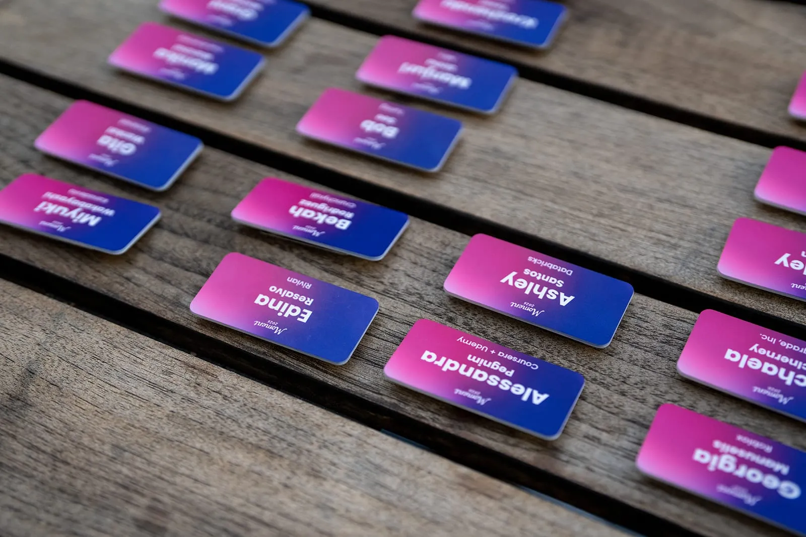
The identity had to work across wildly different scales, from a full keynote environment to a three-inch name badge.
That meant thinking about Moment as one connected experience rather than a collection of deliverables. Stage design, wayfinding, maps, menus, presentation design, gifts, apparel, printed materials, and digital touchpoints all needed to feel related without becoming repetitive.
Before arrival
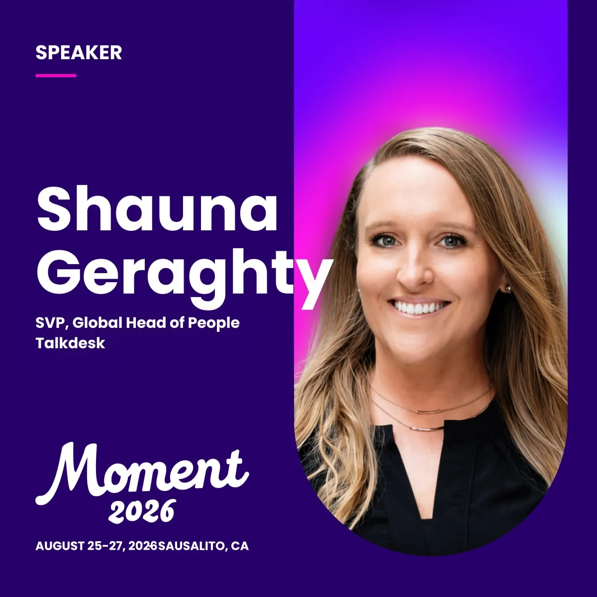
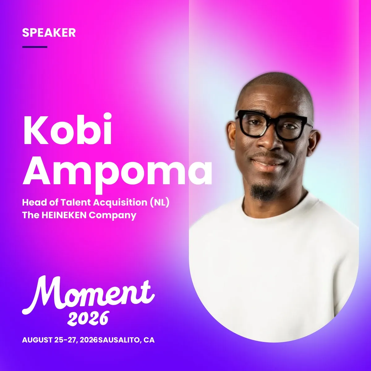
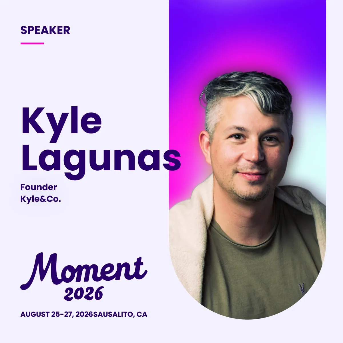
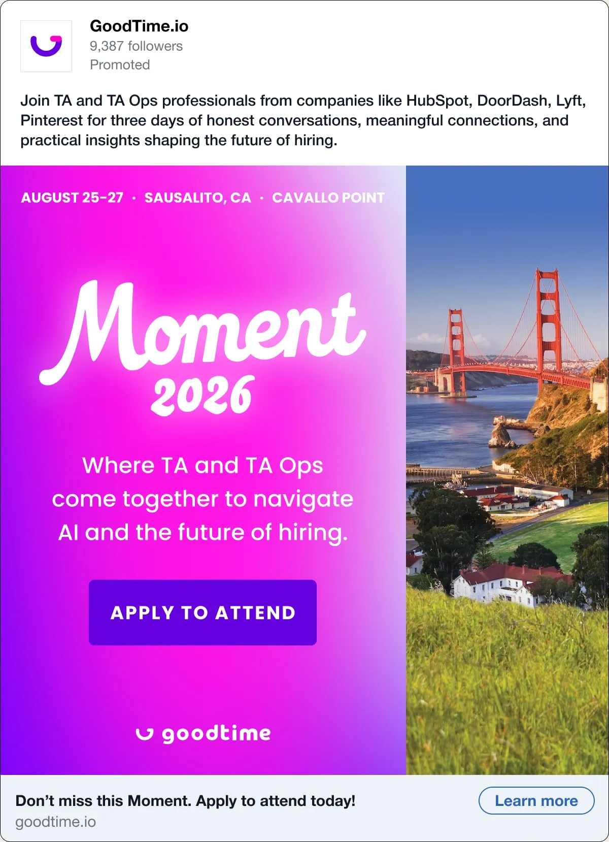
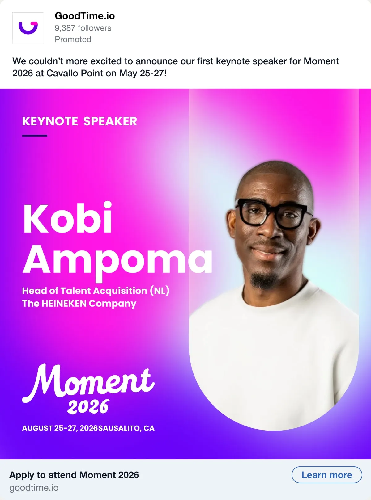
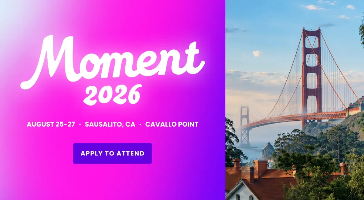
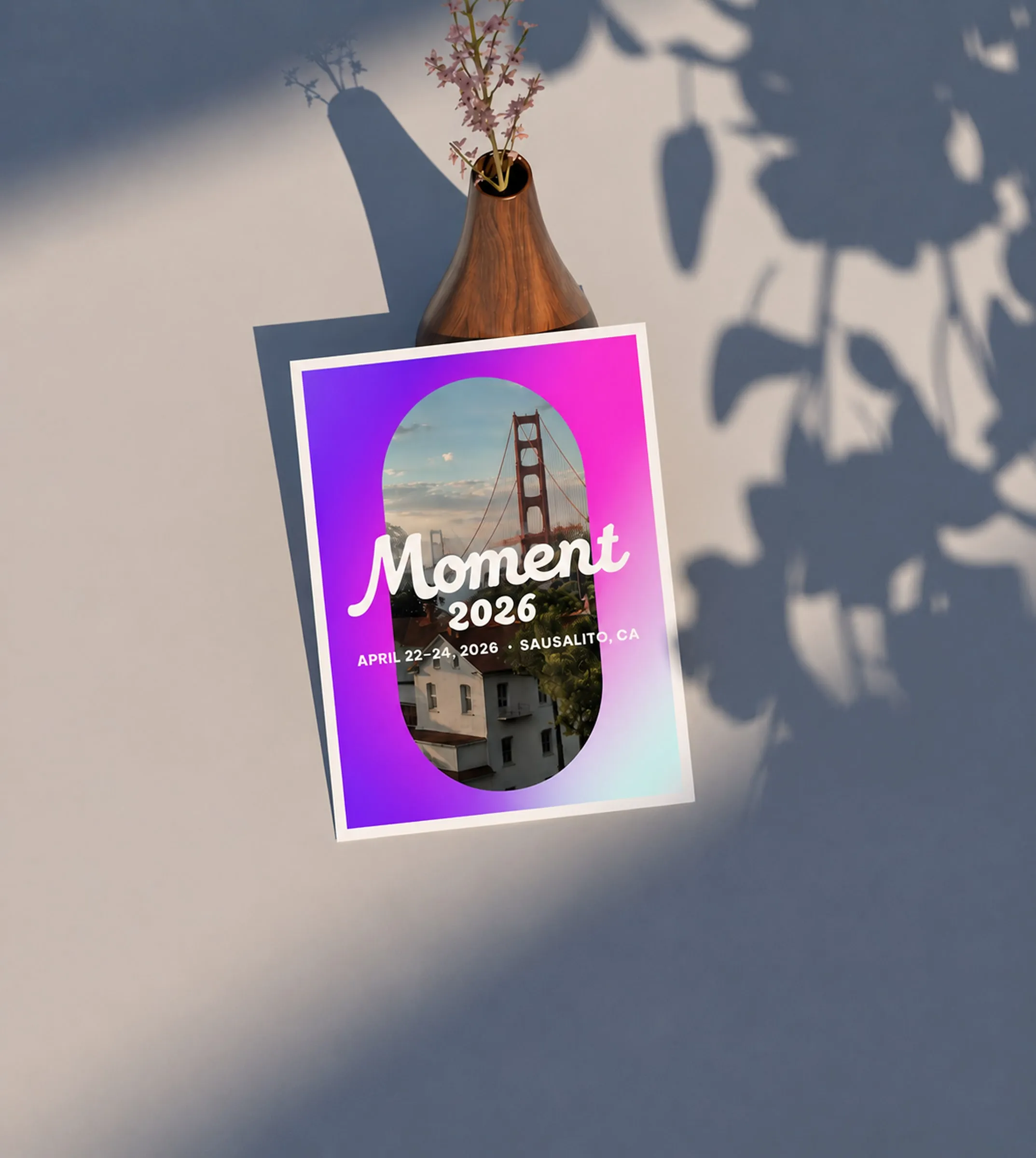
Moment was invite-only, so the first job of the system was recruiting the right room. Speaker announcements, paid social, and email carried Coastal Glow to talent leaders, and the event page set the tone for the experience well before anyone arrived.


Arrival
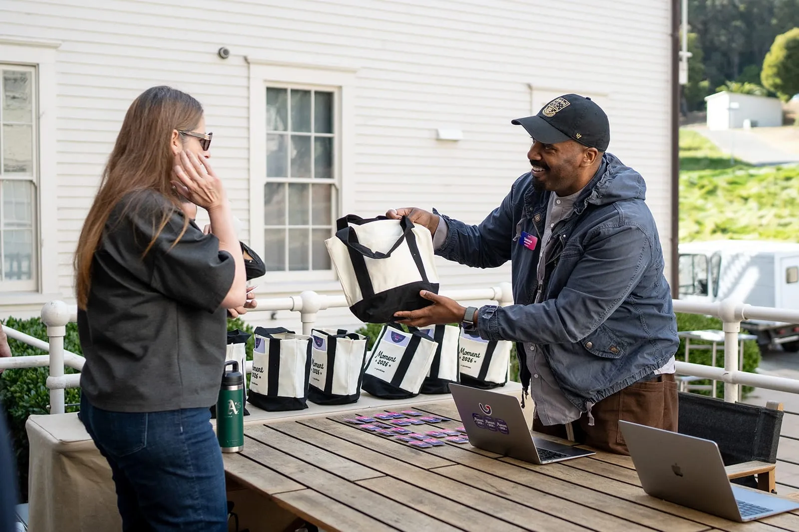
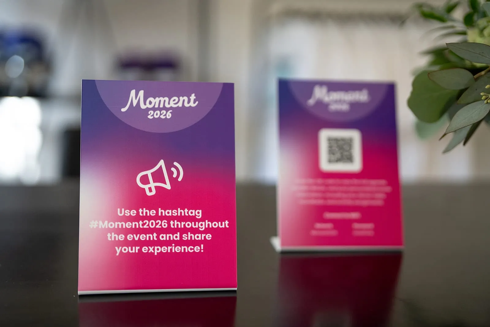
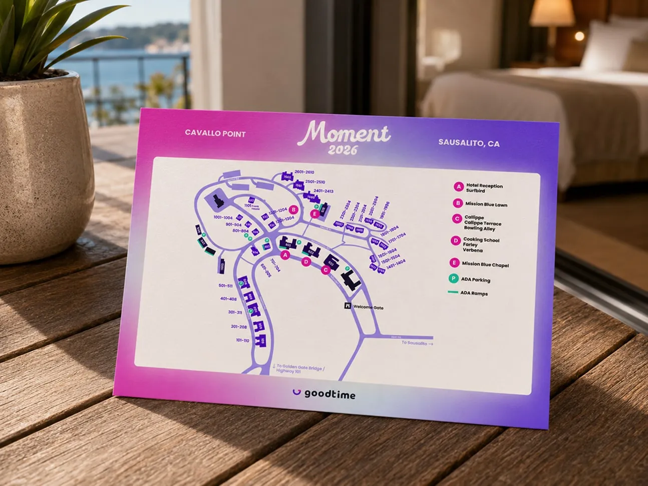
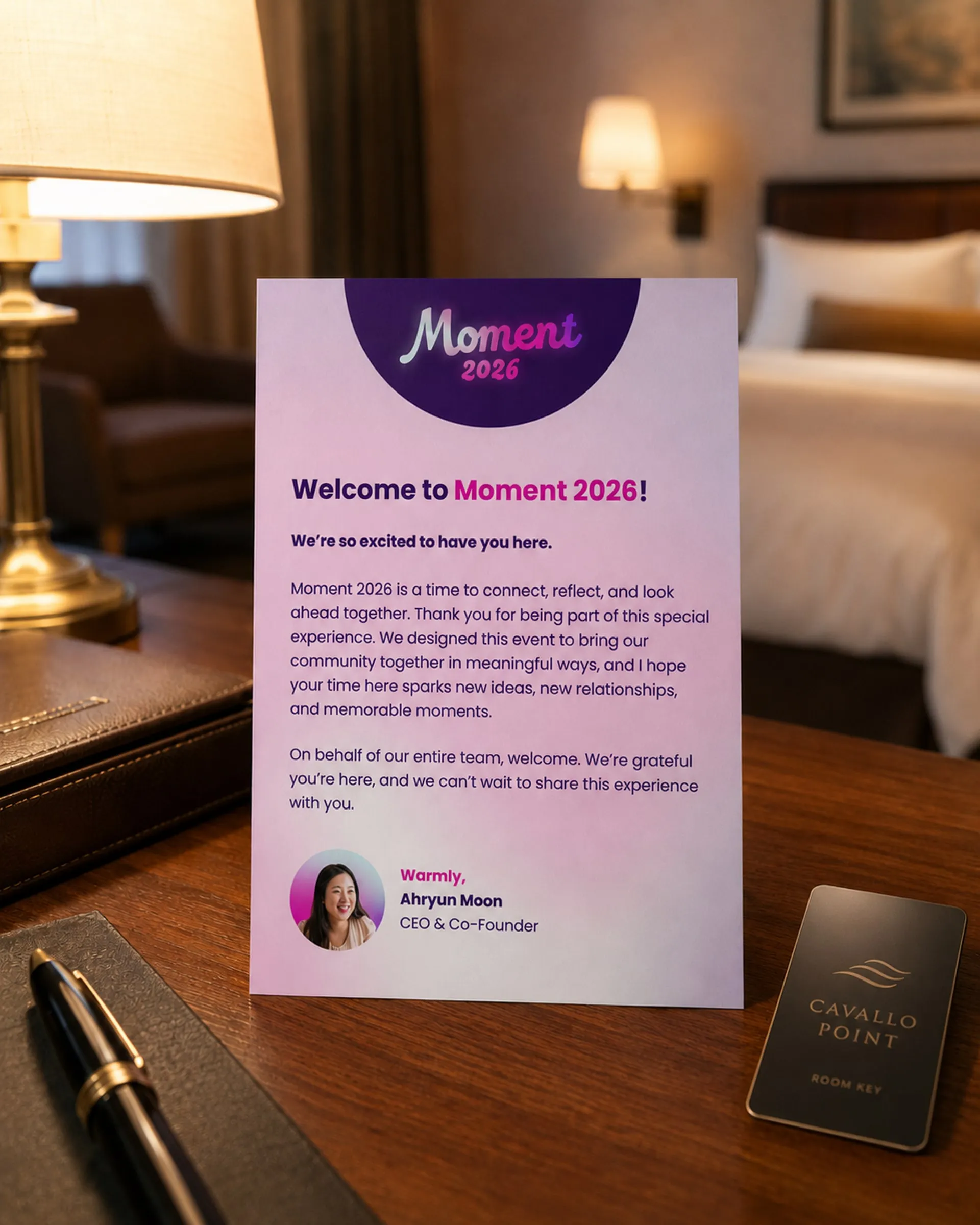
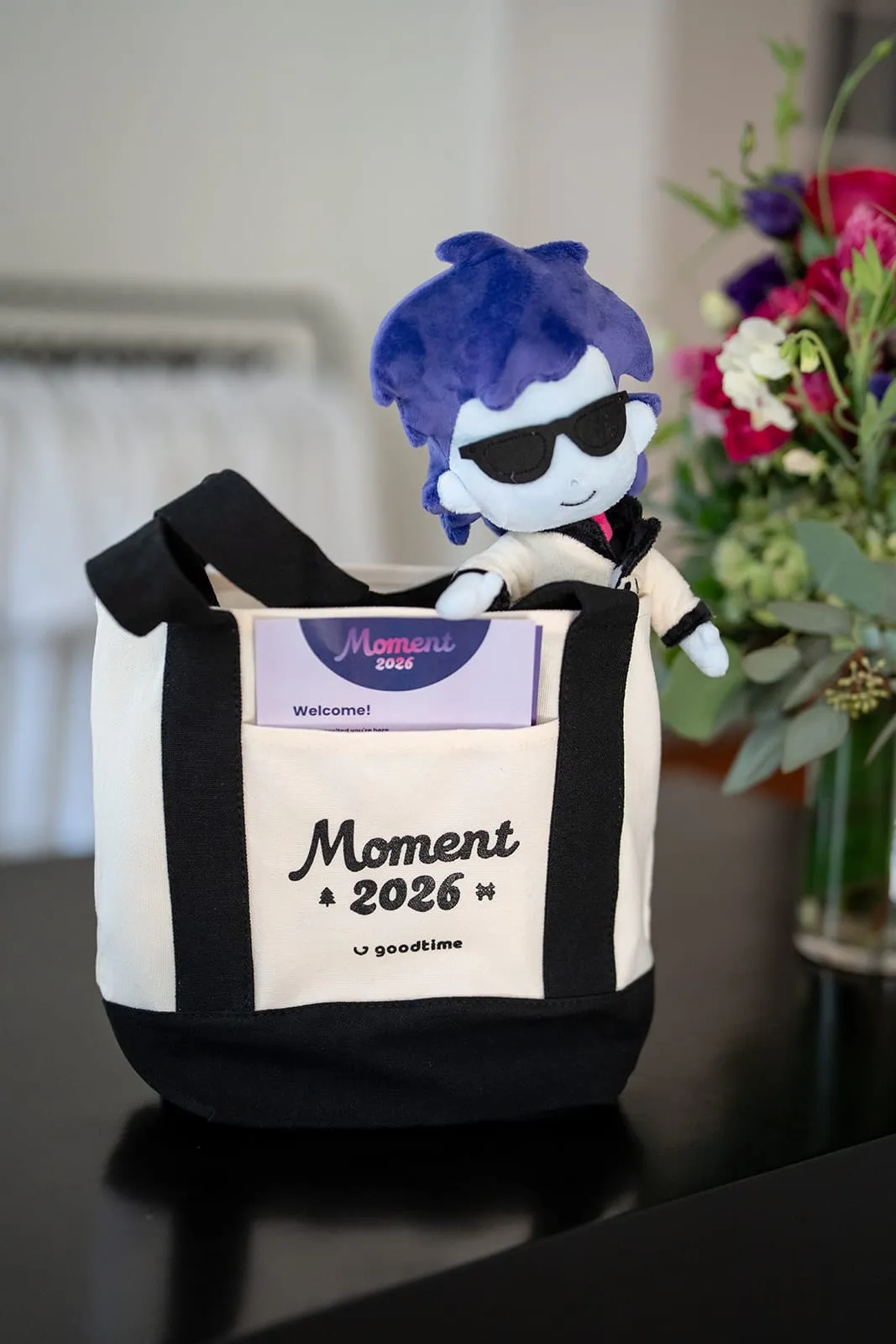
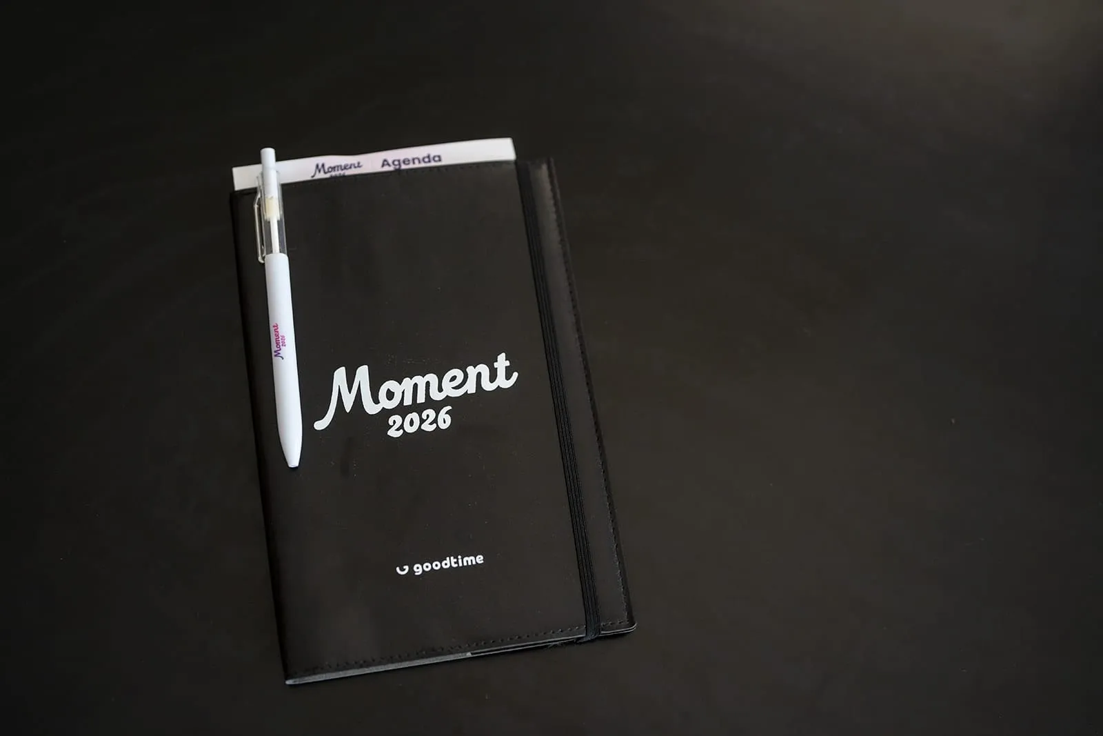
Every guest was welcomed with a tote holding the printed guide, a venue map, their badge, a welcome note, and a Brick and Cori doll. From there, a welcome flag, wayfinding, agenda cards, and a Moment digital guide carried them through every step of the three days. Signage followed a simple rule: the Moment logo as the primary anchor, the GoodTime logo as a supporting host mark, and no extra copy unless it was functional.
In your pocket
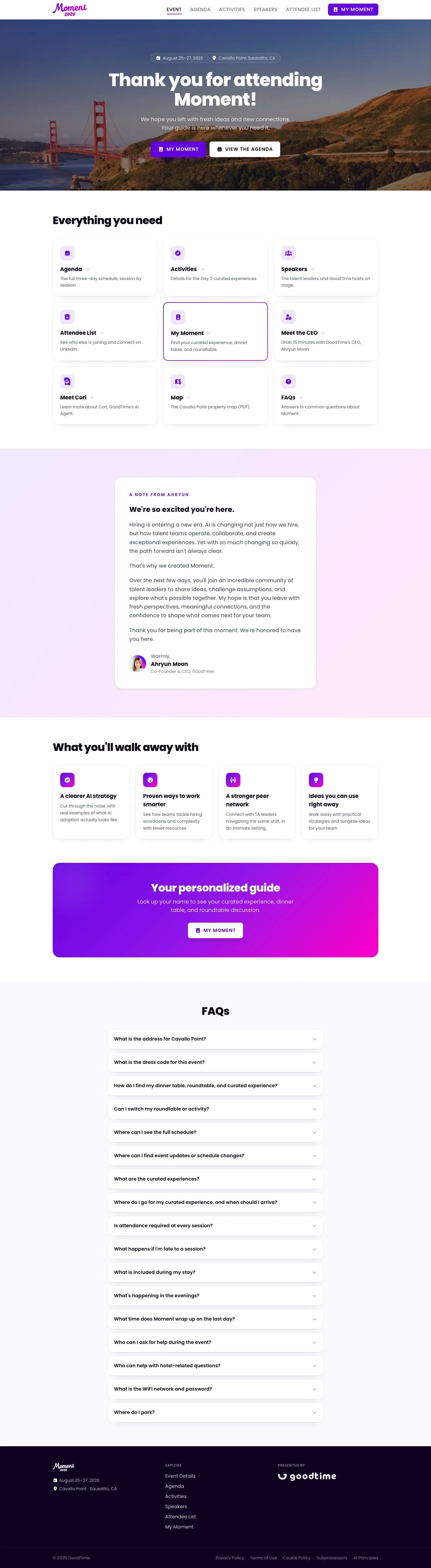
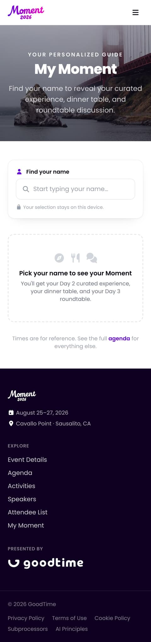
Frictionless by design meant nobody should have to hunt for information. I designed and built the Moment digital guide, an attendee web app that carried guests through all three days. The agenda opened to the current day automatically, and My Moment let each guest look up their own curated experience, dinner table, and roundtable in seconds. Activities, speakers, the attendee list, the property map, and FAQs lived in one place, alongside ways to book time with GoodTime’s CEO and meet Cori.
On stage
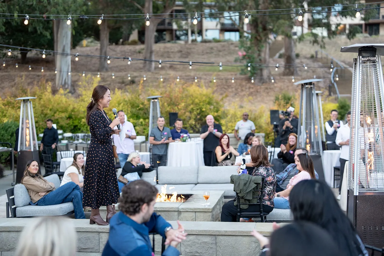
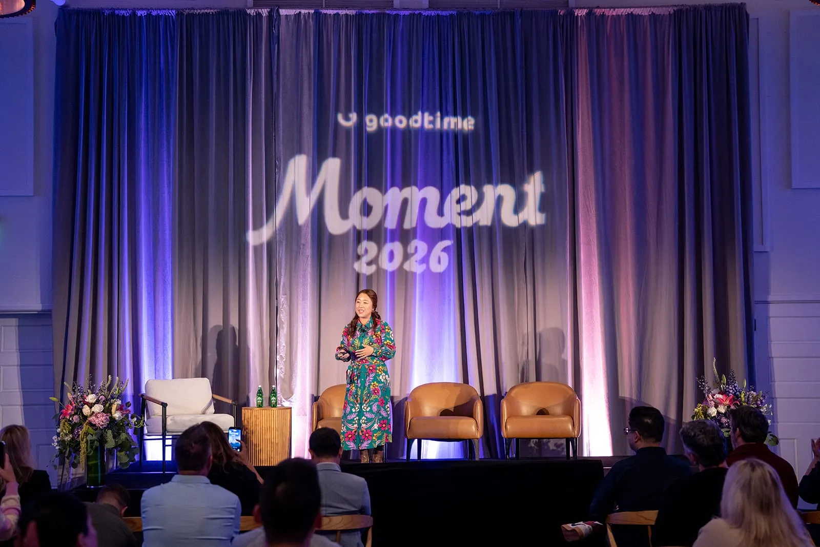
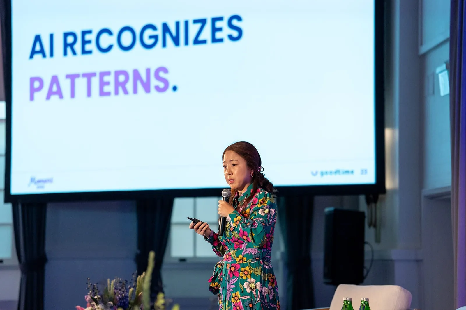
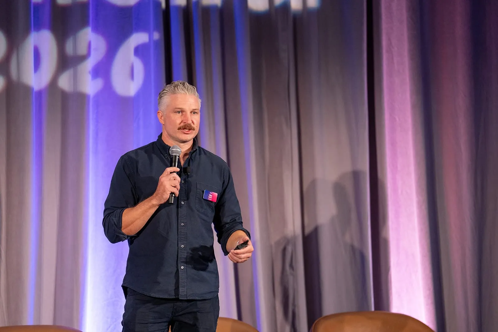
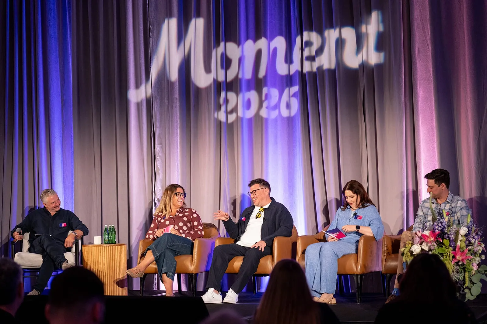
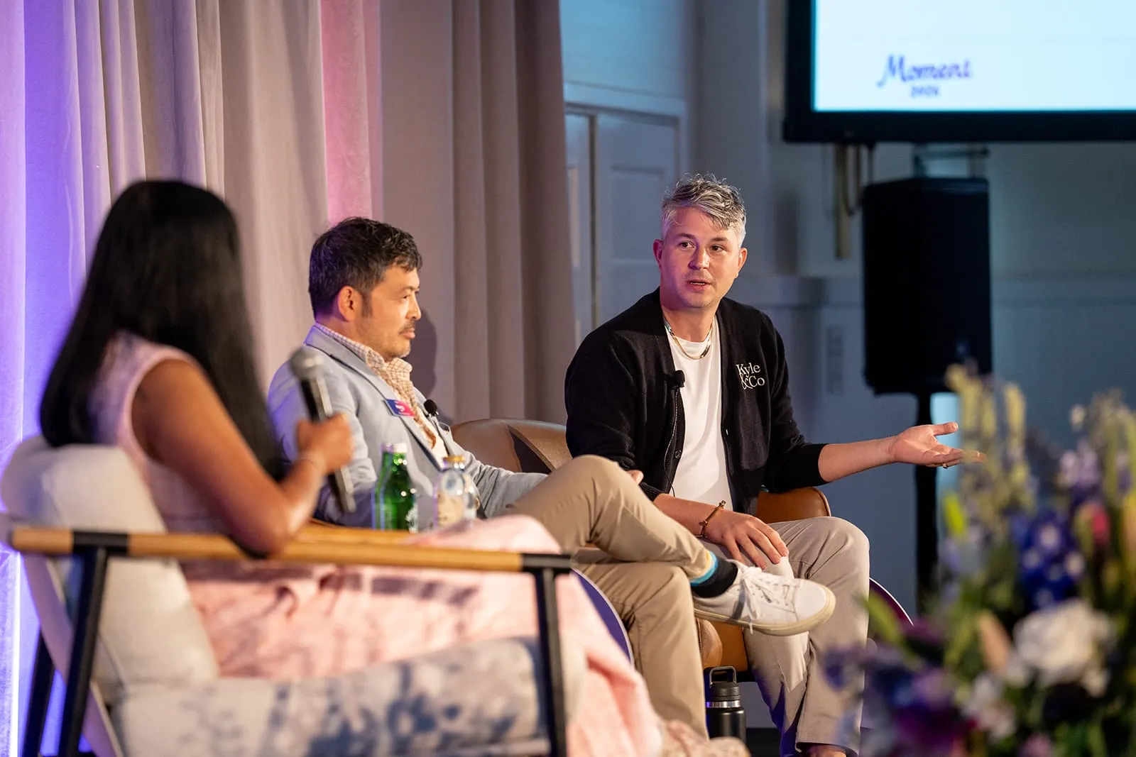
Fifteen AI-focused sessions (keynotes, panels, fireside chats, and roundtables) with 23 speakers from companies including Replit, Miro, Datadog, Pinterest, HP, and Heineken. The stage environment, purple and magenta lighting, keynote graphics, and motion gave every session the same considered frame.
In your hands
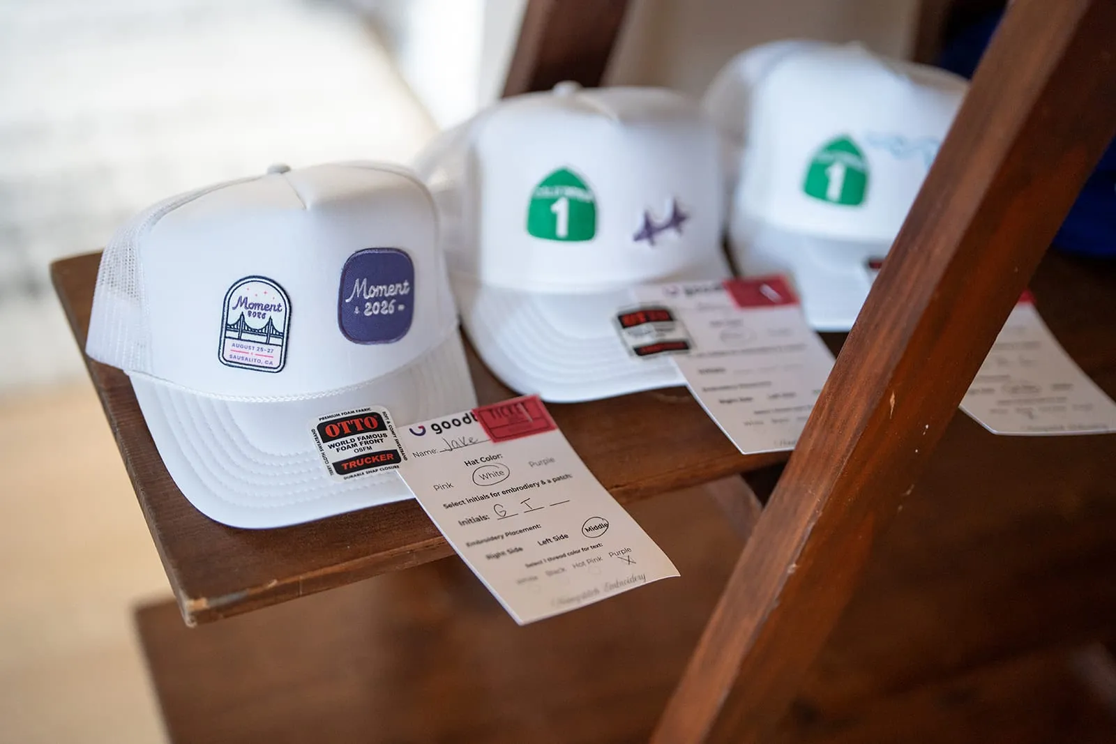
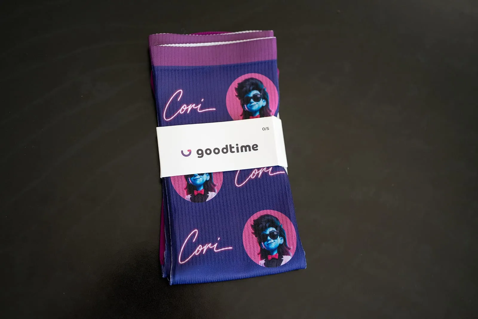
Name badges, patches, socks, a T-shirt, a custom hat bar, activity souvenirs, and speaker gifts. Small surprise moments (a candle night drop, seat drops, coffee, and ice cream) kept the experience feeling generous rather than programmed.
Designing for utility
Product, not mascot
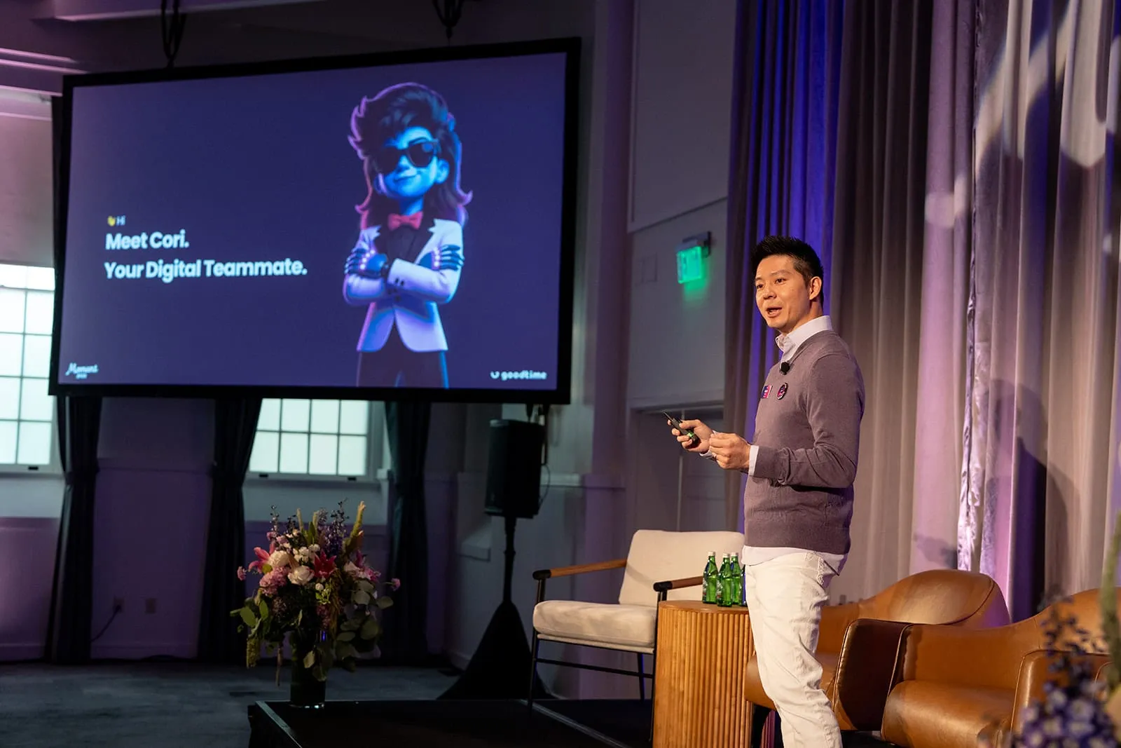
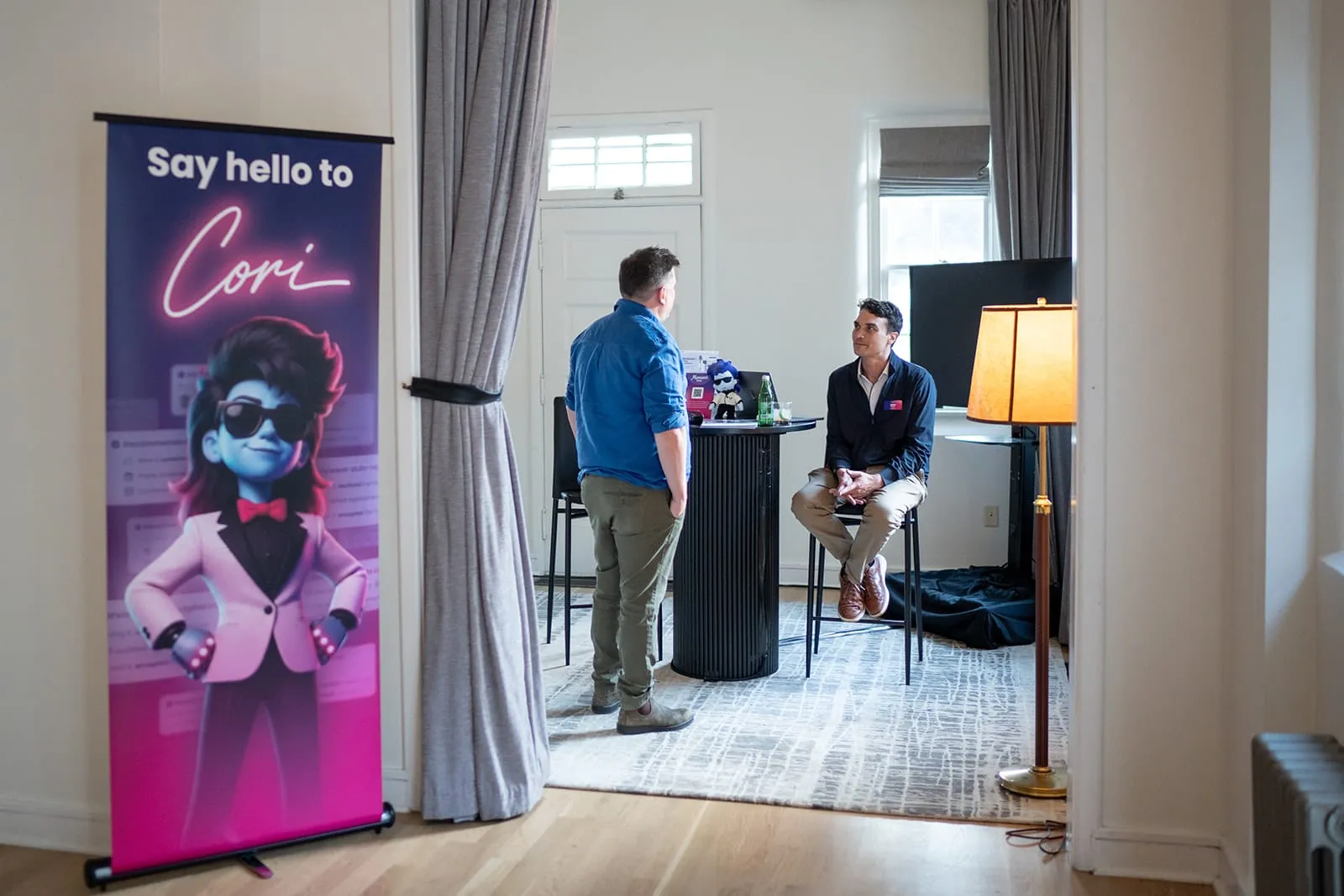
Cori is GoodTime’s AI teammate, and the talent leaders at Moment came to talk about the future of AI in hiring. That made her an obvious draw, and an easy way to overdo it: making Cori the hero or mascot of the event would have turned Moment into a product conference.
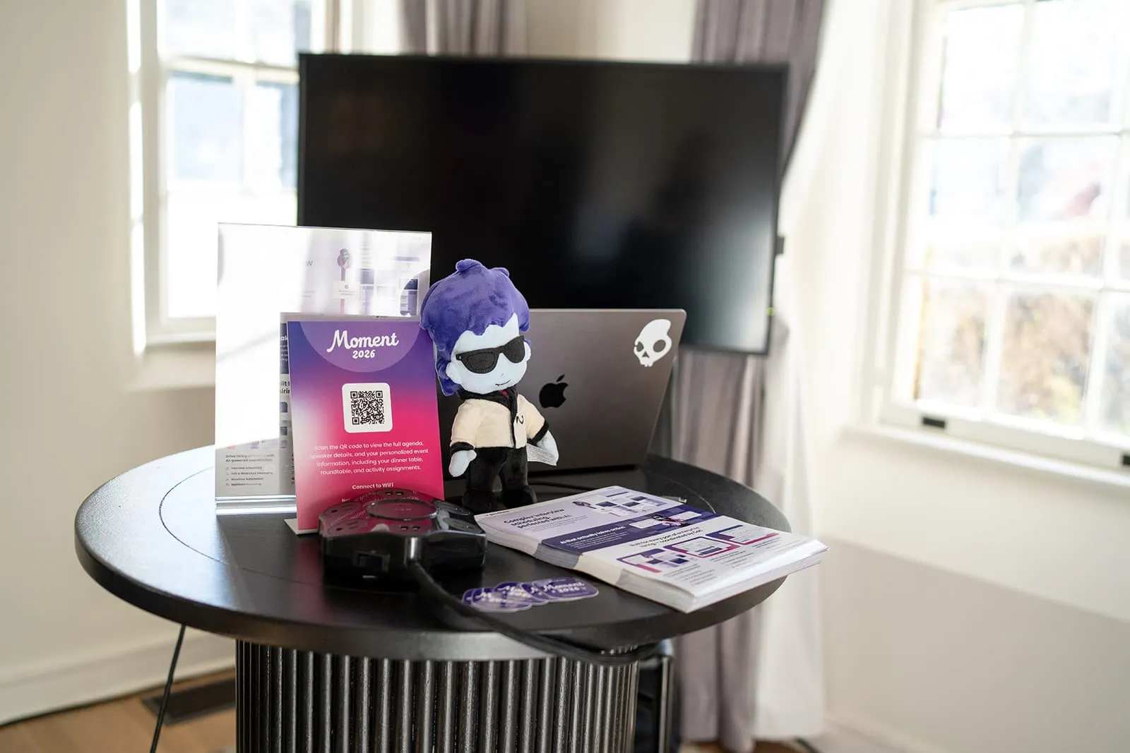
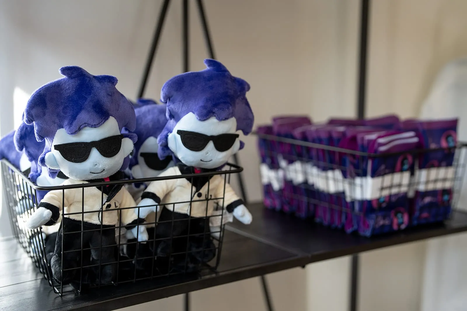
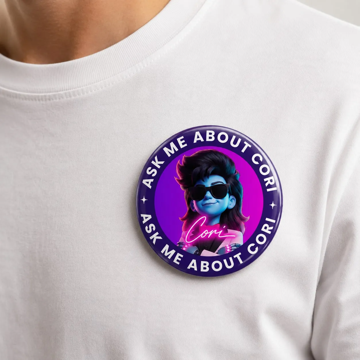
So Cori became a product awareness layer, a product hero clearly tied to GoodTime Hire rather than to the event brand. She was introduced on the main stage and anchored Cori’s Corner, a small demo station where every demo started with her. Around it, subtle branded moments did the rest: Cori business cards, a plushie in every arrival tote, a Cori cocktail, and “Ask me about Cori” pins that turned GoodTime employees into conversation starters.
The people are the payoff
The system disappears into the experience.
Ultimately, none of the individual pieces were the point.
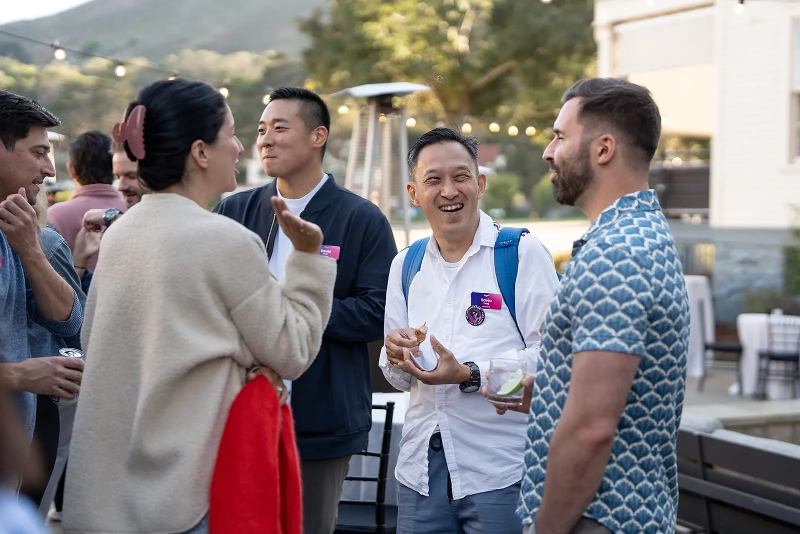
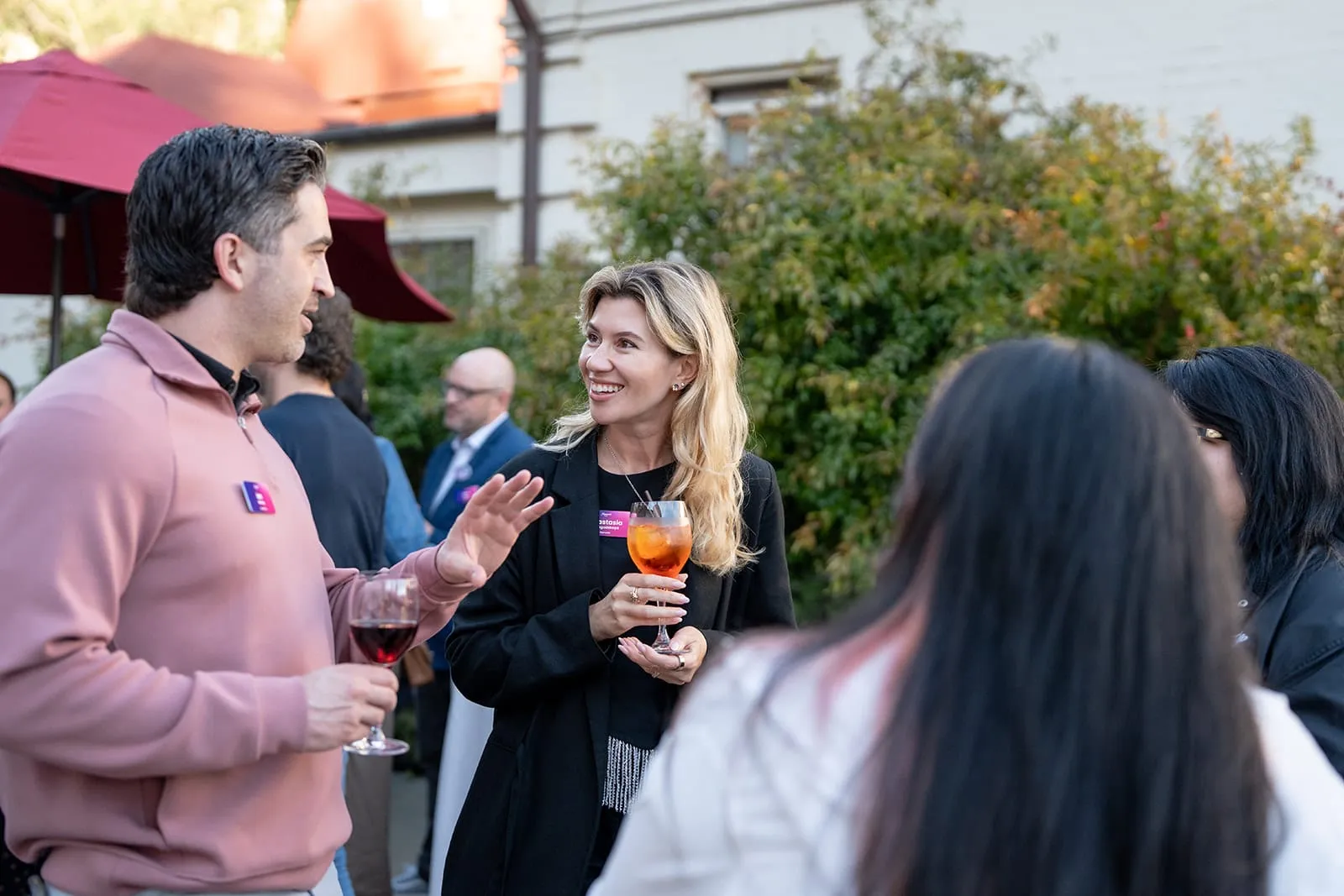
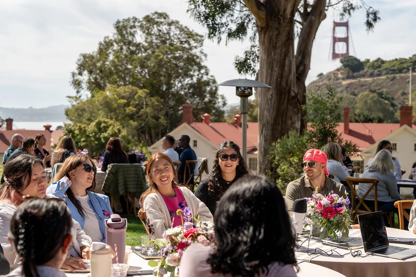
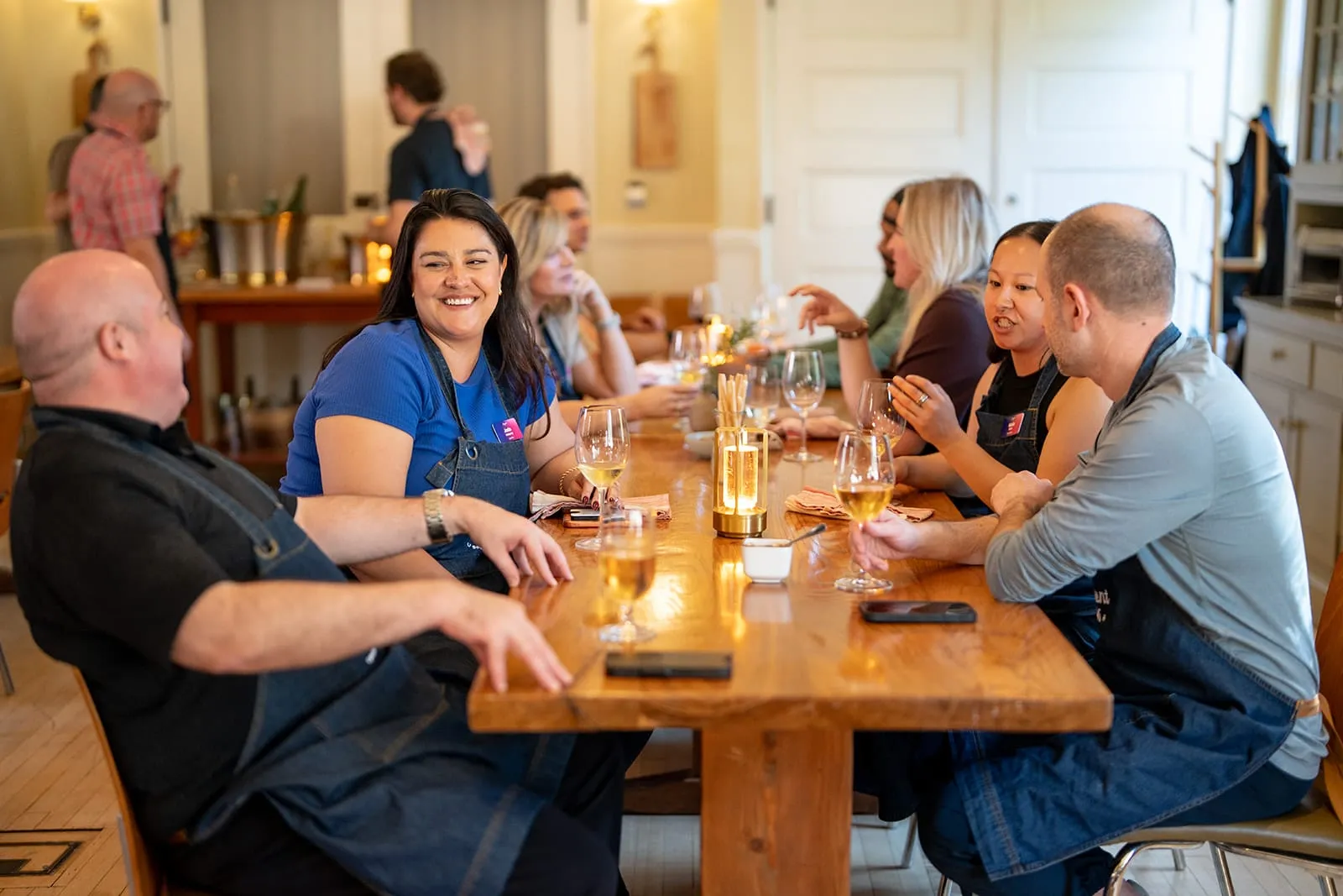
The job of the design system was to create the conditions for the event itself: a place where people could slow down, connect, and have the kinds of conversations that rarely happen at a conventional conference.
By the time Moment was underway, the best outcome was that the brand no longer needed to demand attention. It simply made the experience feel considered.
Results
Intimate by design, and it showed.
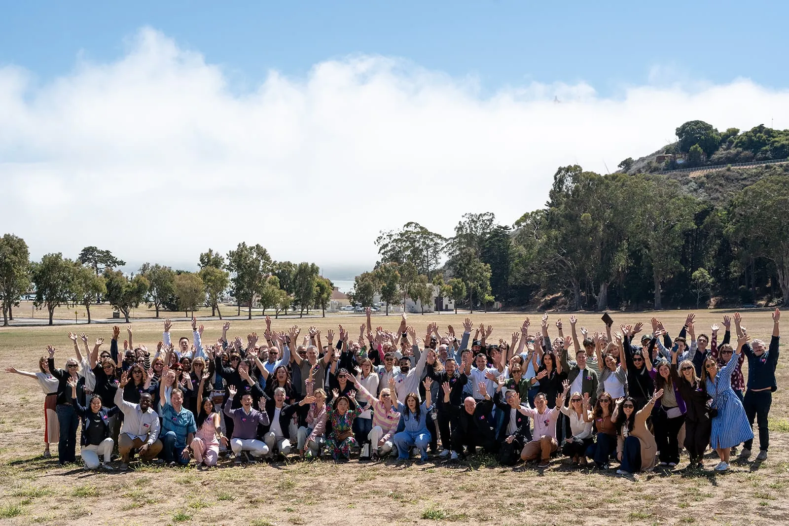
Moment earned a Net Promoter Score of 89: 39 promoters, 5 passives, and zero detractors among the nearly half of guests who completed the post-event survey.
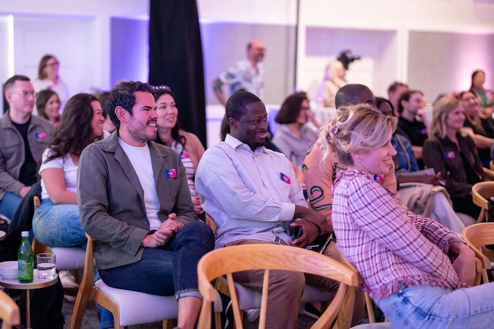
Guests consistently singled out the venue, the programming, and the attention to detail. The smaller group created the candid, peer-to-peer conversation the brief called for, and the activities and open space let people learn without feeling over-programmed.
- Net Promoter Score
- 89
- Promoters
- 89%
- Detractors
- 0
- Sales handraisers
- 20+
The feedback also pointed to what’s next: tighter panels, better room audio, and clearer expectations before arrival, with more detail on activities, attire, and schedules. That last one is a design problem too, and it starts long before anyone reaches the venue.
Reflection
A lesson in restraint
Moment was one of the most fulfilling projects I’ve led.
It required creative direction across brand, environmental design, digital, motion, production, and dozens of tiny decisions that most attendees would never consciously notice.
The biggest lesson was also the simplest: creating a memorable brand experience doesn’t always mean adding more brand. Sometimes the most important creative decision is knowing when to pull back and let the people, place, and moment take over.